Notes on game UI
Everything here comes out of client work: the questions studios actually ask before they hire, and the problems I keep fixing on other people's screens. No trend roundups.
49 articles
All articles
How long does it take to design a game's UI?
Design time and calendar time are two different numbers, and the gap between them is where launch dates go wrong. Here is how long each stage really takes, what makes it longer, and how to schedule interface work so it lands before your milestone rather than after it.
Read the article
What a game actually costs to make
Most budgets I see are the cost of building the game and nothing else. The problem is that building it is the part everyone remembers to count, and it is rarely the part that sinks a project.
Read the article
uGUI or UI Toolkit: which to build your game's UI in
Unity ships two UI systems and the internet will tell you the new one wins. It is not that simple: one of them is still what Unity recommends for runtime, and the other is where the development is going. Here is how to choose without betting the project on a forum post.
Read the article
The first ten minutes: onboarding that does not feel like a tutorial
Most of the players who will ever quit your game quit in the first session, and most of them quit before anything you were proud of has happened. Onboarding is not the tutorial. It is the shortest path from the icon to the reason they downloaded it.
Read the article
Your UI problem is usually a systems problem
When a screen will not come together, the instinct is to redesign the screen. Often the screen is fine and it is being asked to display something that cannot be displayed clearly, because a decision two months upstream made it impossible.
Read the article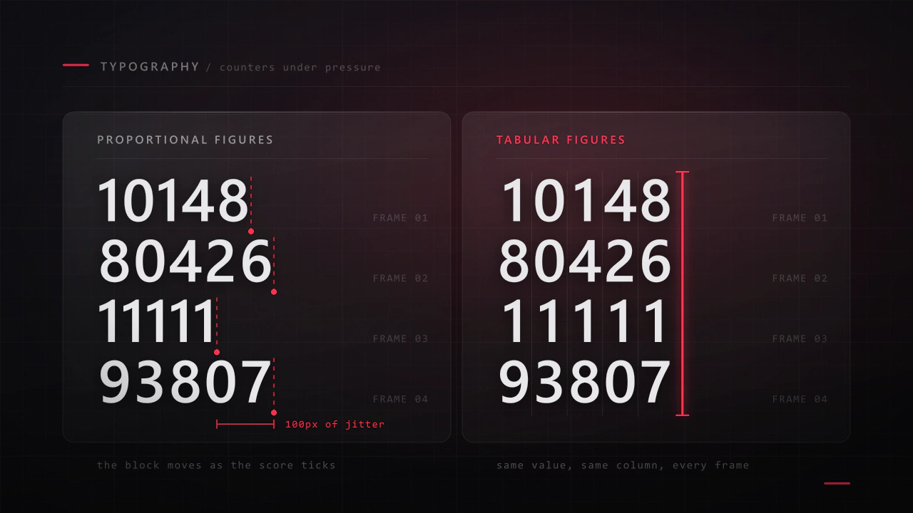
Typography for game UI: the part players read under pressure
Interface type is read in half a second, at speed, over moving artwork, by somebody who did not come to your game to read. Almost every rule that applies to a book works against you here, and the fixes are specific.
Read the article
Wireframes to prototype: how game UI actually gets designed
Clients often expect the first thing they see to look like the game. What they get is grey boxes, and that grey is the point: it is the stage where changing your mind is free, and it is the only stage where anyone reads the layout instead of the art.
Read the article
Freelance, studio, or asset store: who should design your game's UI?
I am a freelancer, so treat my conclusion with appropriate suspicion and check the reasoning instead. Here are the three options compared on cost, risk and what actually arrives, including the cases where a kit or a studio beats hiring someone like me.
Read the article
How long a game takes: prototype to gold
Every project I join has a date. Roughly a third of them hit it. The difference is almost never how fast the team works, it is whether the schedule was built from the phases or from the deadline backwards with hope in the gaps.
Read the article
Why your Unity menus tank the frame rate
The menu opens and the frame time doubles. Nothing in it moves, nothing is expensive to draw, and yet the profiler says the interface is costing more than the game. Here is what is actually happening, in the order it usually happens.
Read the article
What to send your UI designer: the brief and asset checklist
Two studios send me the same project on the same day. One gets a firm price and a start date, the other gets a range twice as wide and a list of questions. The difference is almost never the game. It is what was in the first message.
Read the article
Your Steam store page: capsules, screenshots and the first three seconds
Your capsule is a few hundred pixels wide in a scrolling list, next to forty other games, and it gets about a second. That image decides whether any of the years you spent on the game are ever seen.
Read the article
How to run a playtest that tells you something
You cannot play your own game for the first time, and neither can anyone who built it. A playtest is the only way to see the game the way a stranger sees it, and most teams either skip it or run it in a way that produces reassurance instead of information.
Read the article
Progression that keeps players: unlocks, upgrades and pacing
Progression is the reason a player opens the game tomorrow. It is also the system most often designed as a list of numbers and then handed to somebody to fit on a screen, which is why so many upgrade trees feel like admin rather than reward.
Read the article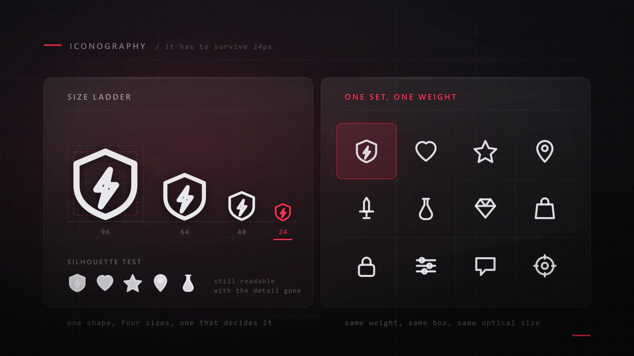
Icon design for games: sets that still work at 32 pixels
An icon has about a fifth of a second and a few hundred pixels to say what a thing is. Most game icon sets fail not because the drawings are bad, but because they were drawn large, one at a time, by different rules.
Read the article
Where to find a game UI/UX designer: every channel, compared
There are about ten places worth looking, and they are good at different things. Here is what each one is actually like, how to search it properly, what you should expect to pay, and the outreach message that gets a reply.
Read the article
Running milestones: definitions of done, sign-off and slippage
A milestone that says "UI pass" is not a milestone, it is a hope with a date attached. I have delivered against both kinds, and the difference in how the month goes is not small.
Read the article
Your game UI looks amateur. Here is usually why
It is almost never talent, and it is almost never the artwork. It is eight small failures of consistency that stack up until a screen looks unfinished. Here is each one, why it happens, and the order I would fix them in.
Read the article
Prefabs, variants and a Unity UI kit that survives the project
Six months in, changing a button means opening forty screens. That is not a Unity problem, it is a structure problem, and it is decided in the first week by whether the interface was built as components or as pictures of screens.
Read the article
Where do I go? Navigation, menus and wayfinding
Players say they are lost about two completely different things: they cannot find the screen they want, and they cannot find the place they are meant to go. Both are navigation, both are cheap to fix early, and both are invisible to the people who built the game.
Read the article
How to find a game development team you can trust
"I need a team" usually means one of four very different things, each with a different cost, a different risk and a different place to look. Here is how to work out which one you need, who to hire first, and how to check that the people you find can actually deliver.
Read the article
Difficulty, failure and the moment players quit
Players will fail your game hundreds of times and keep playing. They will also fail once and close it forever. The difference is not how hard the game is, it is what failing costs them and whether they understood it.
Read the article
The vertical slice: what goes in it, and what to leave out
A vertical slice is one narrow column of your game taken through every layer at shipping quality. Not a demo of everything at sixty percent, which is what most teams build and what no publisher is asking for.
Read the article
Inventories, shops and leaderboards: fast lists in Unity
The inventory opens and the game stutters. Five hundred items became five hundred GameObjects, each with a layout group, all instantiated in one frame. Long lists are the most common performance and usability failure in game interfaces, and both halves are fixable at design time.
Read the article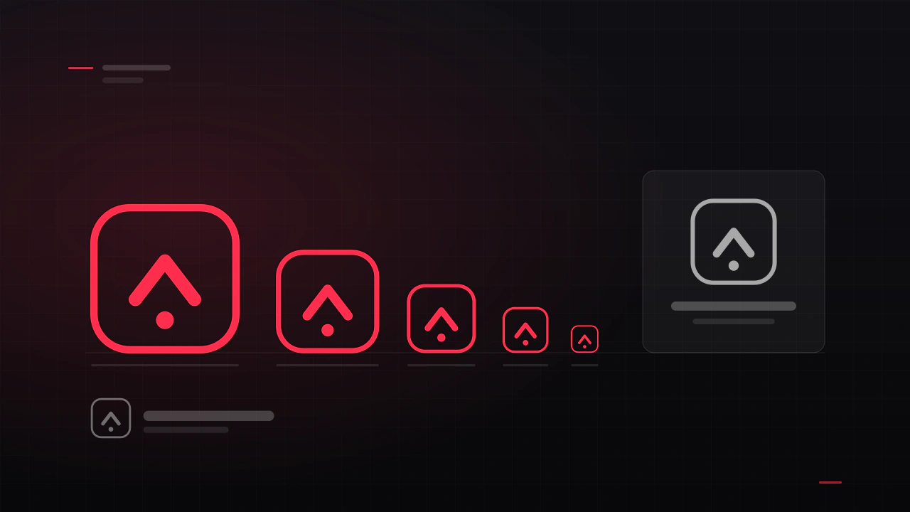
Game logo design: what makes one work, and what it costs
A game logo has a harder job than a company logo. It has to work as a Steam capsule, an app icon, a 16-pixel favicon, a watermark on a stream and a print on a t-shirt, often in one colour. Here is what makes one survive that, and what it costs to get.
Read the article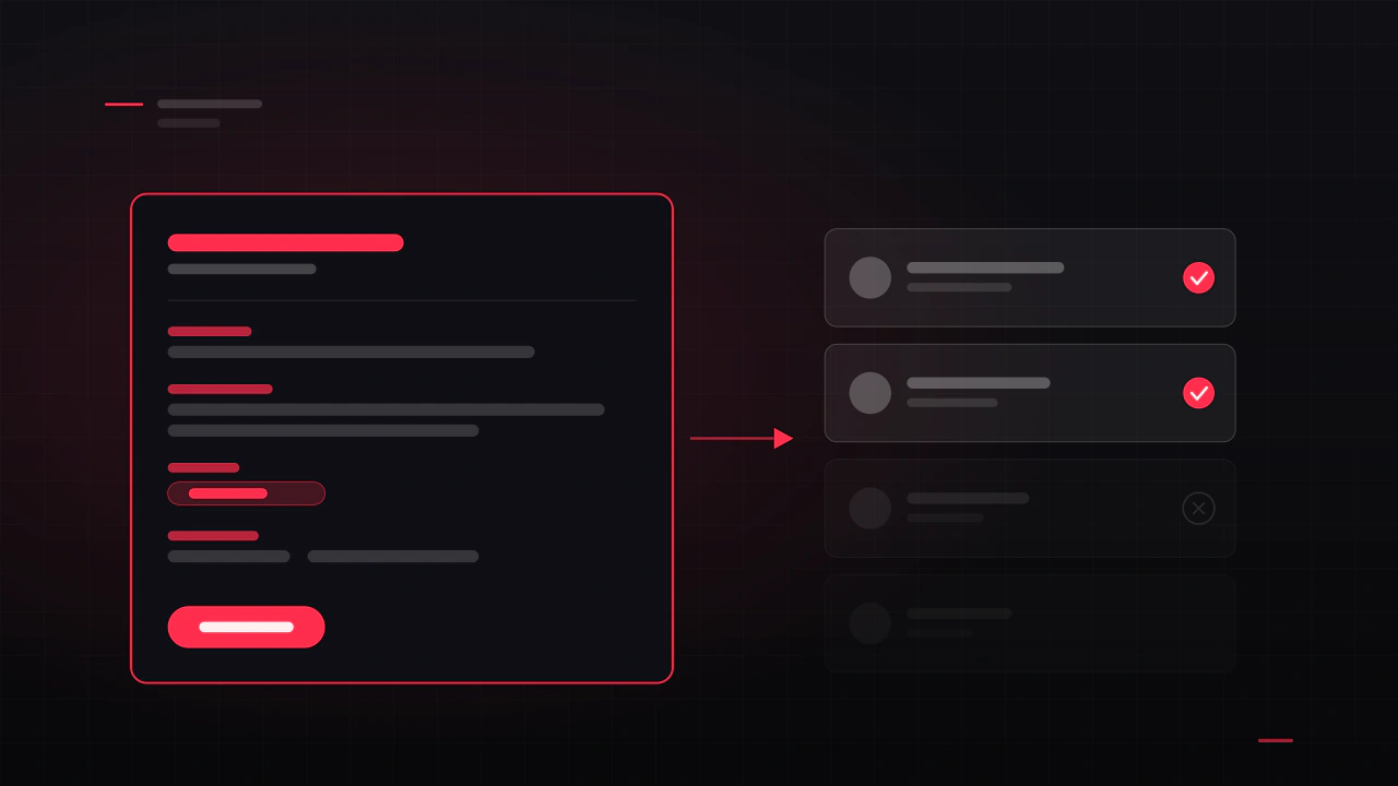
How to write a game UI job post that gets good applicants
Experienced designers read twenty posts a week and reply to two. The difference is never the budget, it is whether the post shows that you know what you are asking for. Here is what to include, a template you can copy, and the phrases to delete.
Read the article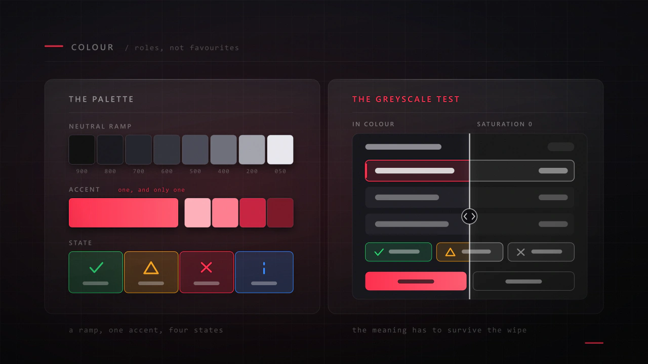
Colour in game UI: a palette that sits on top of your game
Your interface sits on top of artwork somebody spent months on, in a scene whose colours change every second. That is a different colour problem from designing a poster, and most game palettes fail because they were built like one.
Read the article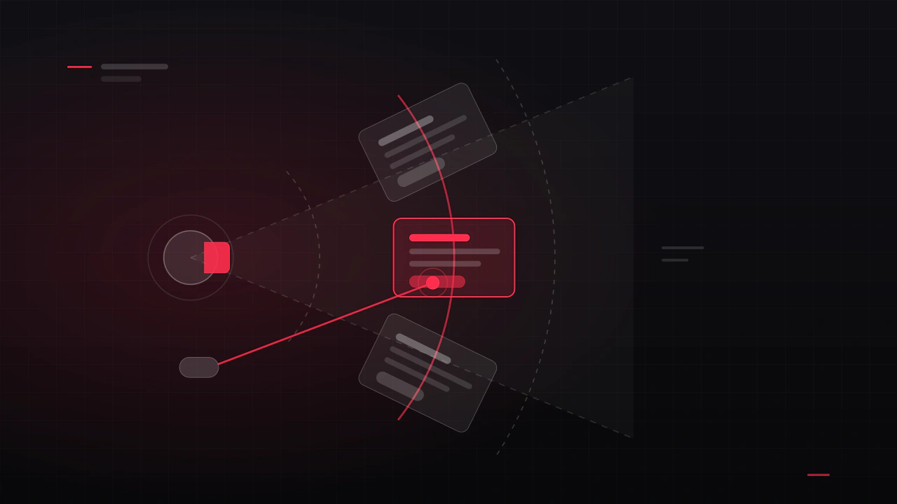
VR UI/UX design: what changes when the interface is in the room
In VR the interface is not on the screen, it is in the room with the player, and most flat-screen habits actively hurt. Here is what changes, which rules are comfort constraints rather than preferences, and how to design an interface people can use for an hour without taking the headset off.
Read the article
Main menu design: what every game menu needs
It is the first screen anyone sees, it appears in every screenshot you will ever take, and it is usually designed in an afternoon near the end of production. Here is what belongs on it, in what order, and the decisions that make it feel like a real game rather than a template.
Read the article
Feedback: how a game tells the player it heard them
A player presses a button and nothing happens for a quarter of a second. In that silence they press again. Everything that goes wrong next, the double purchase, the cancelled action, the sense that the game is unresponsive, comes from a gap that was never designed.
Read the article
Currencies, sinks and prices: an economy players understand
An economy is a set of numbers with a communication problem attached. Players do not experience your spreadsheet, they experience whether they can afford the thing they want and whether earning it felt worth the time. Both of those are decided as much on the screen as in the balance.
Read the article
Mobile game UI design: thumb zones, safe areas and the screens that pay
A phone is not a small monitor. It is held in one hand, in motion, often in daylight, and part of the screen is covered by the thumb that is playing the game. This is what actually changes when you design a game interface for mobile, and which screens are worth the most of your budget.
Read the article
Game development outsourcing: what it costs and how to manage it
Outsourcing is priced as a fee and paid for in fee plus management. Here is what each discipline actually costs, how that compares to hiring once you count everything an employee costs, the line items that never appear in a quote, and how to run the work so it lands.
Read the article
Scope: cutting a game down to something you can finish
Almost every unfinished game was finishable at some point. The moment it stopped being finishable is rarely dramatic: it is a series of reasonable additions, each of which made the game better and the project longer.
Read the article
World-space UI in Unity: screens in the room, not on the glass
A canvas set to World Space arrives one thousand units wide, blurry, and behind the wall. None of that is a bug. World-space UI has its own rules for scale, legibility and interaction, and they are the difference between a hologram and a smeared texture.
Read the article
Designing game UI for controllers: focus, navigation and console requirements
A gamepad has no cursor. The player cannot point at anything, so every screen has to know where focus starts, where it goes next, and what it looks like when it lands. Get that wrong and a menu that looked perfect in Figma feels broken in the hand.
Read the article
The last eight weeks: a launch checklist
The last eight weeks are not the last eight weeks of development. They are a different job: freezing, checking, submitting, and resisting the urge to add one more thing.
Read the article
How to hire a game UI/UX designer
Most bad UI hires are decided before anyone talks money. They come from hiring the wrong role, judging a portfolio on its prettiest image, and writing a brief too vague to quote against. Here is how to avoid all three, and how to run the project once someone is on it.
Read the article
Game UI accessibility: the settings players actually ask for
Most accessibility complaints about games are complaints about the interface, and most of them are cheap to prevent and expensive to retrofit. This is what to build in while the screens are being designed, in the order that helps the most players per hour of work.
Read the article
UI animation: motion that helps, and motion that shows off
Good interface motion is invisible: the player knows where they are and never waits. Bad interface motion is the first thing a reviewer mentions, and it is almost always the same handful of mistakes made with good intentions.
Read the article
The words in your game: buttons, tooltips, errors and item text
Every string in your game is interface. The button that says OK, the tooltip that describes a stat nobody understands, the error that says something went wrong. These are the cheapest things in the game to fix and among the most expensive to get wrong.
Read the article
Shop, battle pass and offers: designing monetisation players do not resent
The shop is the screen where a player decides whether they trust you. It is also, in most free-to-play games, the screen that was designed last, by whoever was free. Here is how to design one that sells well because it is clear, rather than in spite of being confusing.
Read the article
Tools and pipeline for a small game team
Nothing about tooling is interesting until the day someone overwrites three days of work, or the build machine turns out to be one laptop. The setup that prevents both is a couple of days at the start of a project and it is never a couple of days later.
Read the article
Game UX design: what it actually is, and when your game needs it
UX is the part people cannot see and cannot stop feeling. It is not how the menu looks, it is whether players understand your game, get through the first ten minutes, and can find the thing they came for. Here is what the work is, and how to tell whether your game needs it.
Read the article
From core loop to screen list: turning a design into something you can build
A design document says what the game is. A screen list says what has to be built, in what order, and what it will cost. Turning the first into the second is a half-day of work that most projects skip, and then spend the rest of production paying for.
Read the article
Designing game UI for Unity: a handoff that actually gets built
The gap between a design and a built interface is where most game UI quality is lost. This is what Unity actually needs from a design, why layouts break when they hit a real resolution, and the handoff package that gets your screens built the way you drew them.
Read the article
What game UI/UX design actually costs in 2026
The honest answer is a range, not a number. My rate is $30 an hour, so here is what each kind of job costs at that rate, what sits behind it, how the price moves with platform and genre, and how to write a brief that gets you an accurate quote instead of a guess.
Read the article
Indie game UI on a budget: what to design first
If you can only afford to get four screens right, these are the four. Here is the order I would spend an indie budget in, what each of those screens has to contain, where a kit will do, and what you can fix yourself for nothing.
Read the article
Seven HUD mistakes that make players quit
Players rarely say "the HUD is bad". They say the game feels cluttered, or confusing, or cheap, and then they refund it. These are the seven causes I find most often, what each one is really costing you, and how to check your own game against them.
Read the articleNothing on that topic yet.