World-space UI in Unity: screens in the room, not on the glass
A canvas set to World Space arrives one thousand units wide, blurry, and behind the wall. None of that is a bug. World-space UI has its own rules for scale, legibility and interaction, and they are the difference between a hologram and a smeared texture.
In this article
Open to new projects
Hadjoudj Idris
Game UI/UX Designer
Upwork100% Job Success
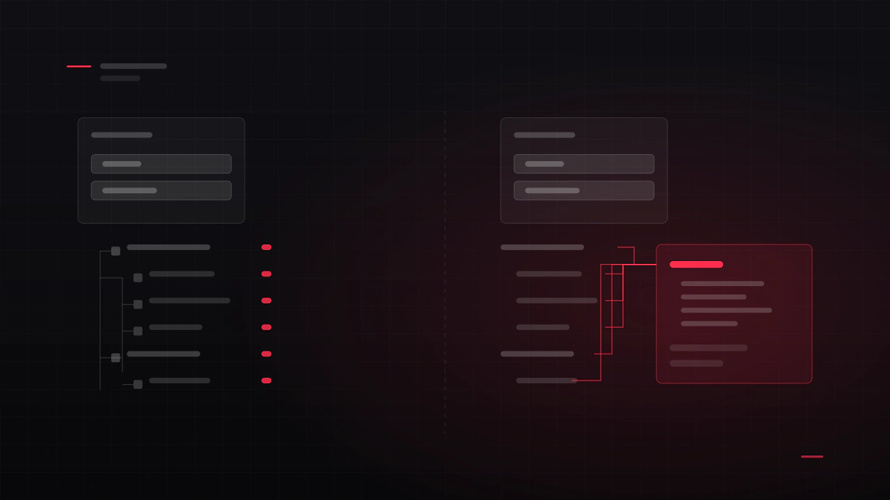
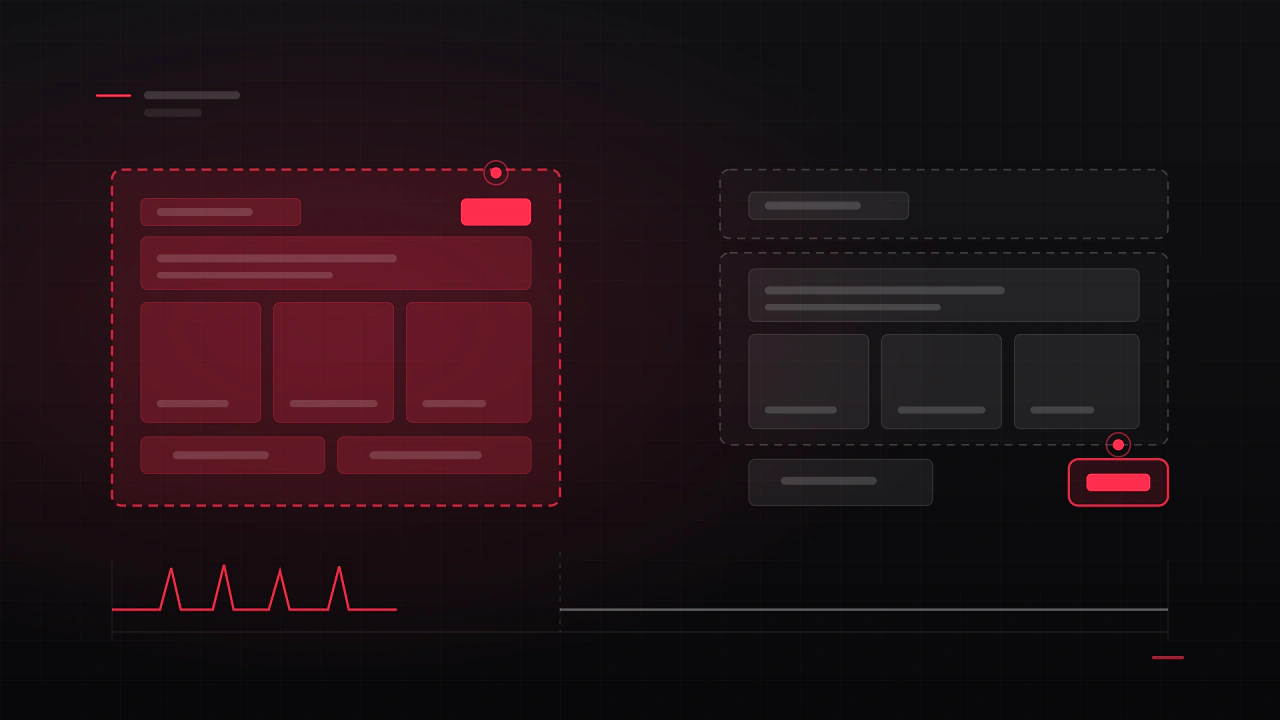
Hire me Browse the workScreen-space interface sits on the glass between the player and the game. World-space interface is part of the game: a panel standing in a room, a display on a weapon, a marker floating over an objective, a menu you reach out and touch in VR. The design problems change completely, and so do the technical ones.
Three render modes, three different problems
| Render mode | What it is | Use for |
|---|---|---|
| Screen Space, Overlay | Drawn on top of everything, after the camera. Ignores the scene entirely | Standard HUD and menus |
| Screen Space, Camera | Still flat to the screen, but rendered by a camera, so it can take post-processing and sit at a distance | HUDs that need effects, or perspective on flat elements |
| World Space | The canvas is an object in the scene, with a position, a rotation and a size in metres | Diegetic screens, VR menus, world markers, in-world displays |
Only the third one is the subject of this article, and switching to it changes every assumption in the design: the interface can now be far away, at an angle, behind something, lit, occluded, and viewed from a position the player chooses.
Scale: the canvas is enormous by default
A world-space canvas keeps its width and height in canvas units, so a 1920 by 1080 canvas is 1920 metres wide until you tell it otherwise. The convention that works is to design at pixel dimensions and then scale the canvas down so one canvas unit becomes a small fraction of a metre.
- Set the RectTransform to your design resolution, for example 1920 by 1080, so the layout inside is authored in familiar numbers.
- Scale the canvas uniformly to bring it to physical size. A scale of 0.001 turns that canvas into a panel roughly 1.9 metres wide, which is a large wall display.
- Then think in metres, not pixels. A tablet in the player's hands is about 0.25 metres wide. A weapon display is 0.1. A wall screen is 2 to 3.
- Keep one scale convention across the project, so components can move between panels without being resized by hand.
Why the text goes soft, and how to fix it
This is the most common complaint about world-space UI and it has three causes that are easy to confuse.
- Not enough texel density. The canvas is scaled down, so a 24-pixel font is being drawn into very few screen pixels. The fix is counter-intuitive: use large font sizes in canvas units and scale the canvas down further, rather than small fonts on a large canvas.
- Dynamic Pixels Per Unit left at 1. On a world-space canvas this controls the resolution at which dynamic elements are rasterised. Raising it sharpens text and dynamic graphics at a memory cost.
- Reference Pixels Per Unit mismatched with your sprites, which makes sliced sprites and borders render at the wrong density and look soft in a different way from the text.
- Use TextMeshPro, always, in world space. Signed distance field text stays crisp across distances and angles in a way bitmap text does not, and it gives you outlines and glow that survive being viewed from three metres away.
Design by angular size, not by pixels
A screen-space element has a fixed size on the display. A world-space element gets smaller as the player walks away, which means legibility is a function of distance, and the design has to declare the distance it is for.
| Panel | Typical distance | Design consequence |
|---|---|---|
| Held device, VR tablet | 0.4 to 0.7 m | Phone-level density. Large type, few elements |
| Console or terminal in the world | 1 to 2 m | Poster-level density. One idea per screen, big headings |
| Wall display or signage | 3 to 10 m | Signage rules: a handful of words, extreme contrast |
| Objective marker or nameplate | 5 to 50 m | An icon and a number. Scale with distance, or clamp a minimum size |
For anything the player approaches and leaves, decide whether it keeps a constant world size (it shrinks with distance, which is realistic) or a constant apparent size (it scales with distance, which is readable). Markers almost always want the second, with a clamp so they never dominate the screen. In VR both of these interact with comfort, which is covered in VR UI/UX design.
Interaction: rays, hands, gaze and the raycaster
A world-space canvas is not clickable by default. It needs a raycaster, and which one depends on how the player is pointing at it.
- The canvas needs a Graphic Raycaster and the scene needs an EventSystem, the same as any other canvas.
- The event camera must be set on the canvas, or hit testing has no idea where the player is looking from. This is the single most common reason a world-space panel does not respond at all.
- In VR or AR, use the XR interaction ray, and give the ray a visible endpoint on the surface. A ray without a cursor is a guess.
- Direct touch needs a collider and forgiveness. Fingers in the air are imprecise, so targets should be physically larger than a mouse would require and separated by more space than a flat screen needs.
- Gaze and dwell need visible progress. If looking at something for a second selects it, the player must see the second passing, and be able to look away to cancel.
- Objects in front of the panel should block it. Without a physics raycaster in the mix, players will click straight through geometry, which reads as a bug even when it is convenient.
Diegetic UI: when the interface belongs to the world
Diegetic interface exists inside the fiction: the display on the weapon, the monitor in the room, the watch on the character's wrist. It is immersive and it is slower to read, so it is a trade, not an upgrade.
- Use it for information the player consults, not for information they need under pressure. Ammo on the gun works because the gun is already in view. Health on a wall panel does not.
- Two implementations. A world-space canvas placed on the object, or a camera rendering to a render texture applied to the object's material. The canvas is simpler and better for interaction; the render texture is better when the surface is curved, animated, or needs to be a material property.
- Give it a reason to exist in the fiction. A screen with no housing, no bezel, no light and no wear reads as an overlay that got lost.
- Keep a non-diegetic fallback for critical information and for accessibility. Some players cannot read a panel angled away from them, and some panels are occluded by whatever the level designer put in front of them.
- The FireFall HUD study sits on this line: what belongs in the world, what has to stay on the glass, and why moving something from one to the other changes how fast it can be read.
Lighting, depth and things in the way
Once interface is in the scene, the scene happens to it. This is where world-space UI starts looking wrong in ways that are hard to name.
- Use unlit materials for anything that must stay legible. A lit canvas goes dark in a dark room, which is realistic and unreadable.
- Decide about occlusion deliberately. Interface that draws through walls is useful for markers and wrong for terminals. That is a depth-test decision, and it should be made per element type rather than globally.
- Sorting between panels and transparent scene objects is a real problem. Smoke, glass and particles will interleave with your canvas in ways that vary by camera angle.
- Angle panels towards the player rather than leaving them flat on a wall the player approaches from the side. A panel read at forty-five degrees loses most of its legibility.
- Beware of glow in dark scenes. Additive interface elements bloom aggressively and turn text into a smear at exactly the distance the player reads it from.
Screen-space interface competes with the game for attention. World-space interface competes with the room for light, angle and distance.
Performance in world space
- Every world-space canvas is its own rendering and rebuild unit, so the same change-rate rules apply as anywhere else: keep the animating parts on a small canvas of their own. See why your Unity menus tank the frame rate.
- Cull by distance. A panel nobody can read at thirty metres does not need to be updating.
- Reduce update rate with distance. A terminal across the room can refresh a few times a second instead of every frame.
- Render textures are not free. Each one is a camera rendering a scene. Update them on demand rather than continuously where the content is mostly static.
- In VR everything is drawn twice. Interface cost is doubled, and the frame budget is the tightest of any platform you ship on.
uGUI or UI Toolkit for world space
This has changed recently and is worth checking rather than assuming. Unity's current comparison of UI systems lists world-space UI and VR under UI Toolkit, alongside multi-resolution menus and UI needing custom shaders and materials. uGUI keeps in-scene authoring, serialized events and Animation Clip integration, none of which UI Toolkit has.
- Choose uGUI when the interface is attached to scene objects and you want to place and preview it in the scene, or when it is animated with clips and Timeline.
- Choose UI Toolkit when the panel is a dense data screen, when you want custom shaders and vector graphics on it, or when the rest of your interface is already there.
- Check the manual for your Unity version before committing, because this specific page is one of the ones that changes between releases. The wider decision is in uGUI or UI Toolkit.
Before it ships
- Stand at the closest and furthest distance the player can read the panel from. Is it legible at both?
- Approach it from the side. At what angle does it stop working?
- Look at it in your darkest scene and your brightest one.
- Put an object between the player and the panel. Does the interaction still behave the way you intended?
- Check the event camera is assigned on every world-space canvas.
- In VR, check it at seated and standing height, and with the player standing too close.
- Turn off every light in the scene. Anything that vanished is lit when it should be unlit.
- Profile with every world-space panel in the level visible at once.
- Read every string at the furthest supported distance, in the smallest supported headset resolution or the lowest supported display resolution.
- Confirm there is a non-diegetic route to any information a player must have.
Why is my world-space canvas enormous?
Because canvas units are world units in World Space mode, so a 1920 by 1080 canvas is 1920 metres wide. Keep the RectTransform at your design resolution and scale the canvas down, typically around 0.001, so the layout is authored in pixels and exists in metres.
Why does my world-space text look blurry?
Usually texel density. Use TextMeshPro, use large font sizes in canvas units with the canvas scaled down further, and raise Dynamic Pixels Per Unit on the canvas. Check Reference Pixels Per Unit too, since a mismatch makes sliced sprites soft in a way that looks like the same problem.
Why does clicking my world-space UI do nothing?
The three usual causes are a missing Graphic Raycaster on the canvas, no event camera assigned on the canvas, or no EventSystem in the scene. In VR, add whichever interaction ray your XR toolkit provides. If clicks land through walls instead, you are missing a physics raycaster in the chain.
Should the interface be readable through walls?
Decide it per element type. Objective markers and teammate indicators usually should, because their job is to be found. Terminals, shop panels and anything the player interacts with should not, because interface floating through geometry breaks the sense that it is part of the world.
Is diegetic UI better than a normal HUD?
It is more immersive and slower to read, so it suits information the player consults at their own pace and not information they need in a fight. Most games that do it well use a hybrid: diegetic where it is convincing, overlay where it is time-critical.
How is this different for VR?
Everything is stricter: text needs to be larger, panels need to sit within a comfortable arc and at a comfortable distance, nothing should be attached rigidly to the head, and the frame budget is halved because both eyes are rendered. The comfort and layout rules are in VR UI/UX design; this article is the Unity implementation side of the same problem.
Can I reuse my screen-space UI in world space?
The components usually transfer, the layouts usually do not. A screen-space layout assumes a fixed apparent size, a straight-on viewing angle and unlimited legibility, and world space breaks all three. Expect to redesign density and type scale even when you keep the same component kit.
Hadjoudj Idris
Game UI/UX Designer, Remote, worldwide
Need this done properly on your game?
Menus, HUDs, a full UI system, or one screen that isn't working. Tell me what you're building and I'll tell you honestly whether I'm the right fit, and what it would cost.
Upwork100% Job Success