Indie game UI on a budget: what to design first
If you can only afford to get four screens right, these are the four. Here is the order I would spend an indie budget in, what each of those screens has to contain, where a kit will do, and what you can fix yourself for nothing.
In this article
Open to new projects
Hadjoudj Idris
Game UI/UX Designer
Upwork100% Job Success
Hire me Browse the workMost indie teams do not have a UI budget problem, they have a UI sequencing problem. The money gets spread evenly across twenty screens instead of concentrated on the four that decide whether anyone buys the game.
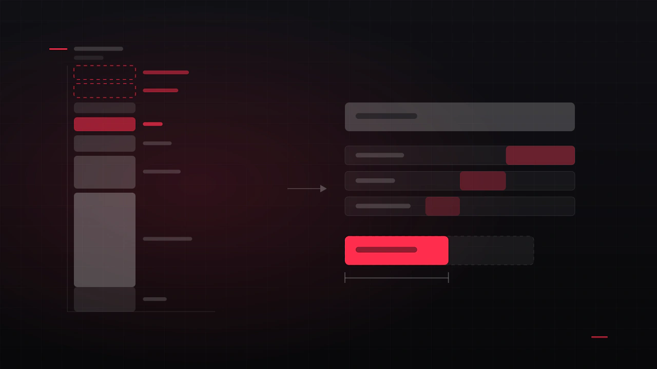
Spend in this order
- 01
The first sixty seconds
Splash, main menu, and whatever the player touches before gameplay starts. This is where refund decisions begin, and it is the screen every screenshot and thumbnail is taken from.
- 02
The HUD
On screen for the entire playtime and the single biggest driver of whether the game feels professional. Also the thing most likely to be blamed for problems it did not cause.
- 03
The one system screen your game is about
The garage, the skill tree, the deck builder, the shop. Whichever screen carries your hook deserves real design. The rest can be consistent rather than special.
- 04
Settings and pause
Unglamorous, universally used, and where a cheap UI is most obvious. A tidy settings screen buys more credibility per hour than another menu flourish.
Everything after that, credits, achievements, secondary lists, can inherit the system rather than be individually designed. That is the whole trick: pay for the language, then speak it yourself.
What each of those four has to contain
"Design the main menu" is not a brief. These are the checklists I would hand to a designer, or work through myself.
| Screen | Must contain | Usually forgotten |
|---|---|---|
| Main menu | One obvious primary action, the game's name and tone, a visible route to settings and quit. | The returning-player state: Continue above New Game, and what the screen looks like before any save exists. |
| HUD | Health or equivalent, the one resource the player spends, current objective, input acknowledgement. | The empty and maximum states, and how it reads on your brightest level. |
| Your system screen | Current state, what changed, the cost of the next action, an unmistakable way back. | Locked, owned, unaffordable and just-purchased states. |
| Settings and pause | Audio, graphics preset, controls, resume, quit to menu, and a real confirmation on anything destructive. | Key rebinding, and confirmation that a setting actually applied. |
The store page and the trailer come first commercially
Worth saying plainly: the screens that sell your game are seen by far more people than the screens inside it. A wishlist is won on a capsule image, six screenshots and thirty seconds of footage.
- Your main menu and HUD appear in almost every screenshot you will ever take. That is the real return on designing them first.
- Take screenshots at a busy but readable moment, not an empty one. Empty scenes read as unfinished games.
- Turn off debug overlays and placeholder text before capture. This sounds obvious and it is the single most common mistake on indie store pages.
- If a screen is not designed yet, do not screenshot it. Six good screenshots beat ten mixed ones.
Where a UI kit is genuinely fine
Asset store kits get more criticism than they deserve. Used honestly they are a real budget tool. The distinction is between structure and skin.
| Use a kit for | Design it properly for |
|---|---|
| Prototypes and playtest builds | Anything in your trailer or store page |
| Settings, credits, secondary lists | Main menu and first-run experience |
| Standard components: sliders, toggles, tabs | The HUD, and your signature system screen |
| Debug and dev tools | Anything that carries the game's identity |
Using a kit without looking like you used one
If a kit is the right call for your budget, these five changes do most of the work of making it yours. They are cheap, and they are mostly find-and-replace.
- Change the typeface. Nothing identifies a kit faster than its default font. One substitution changes the character of every screen at once.
- Rebuild the corner radius and border language. Kits ship with a distinctive rounding and stroke weight. Pick your own and apply it everywhere.
- Replace the palette entirely, including the greys. Kit greys are usually neutral; a slight warm or cool cast ties the interface to your art direction.
- Redraw the icons you actually use. Usually a dozen or fewer. This is the highest-impact hour in the whole exercise.
- Change the spacing scale. Kits have a signature rhythm. Re-spacing on your own scale breaks the resemblance more than any colour change.
The free pass you can run this week
Before spending anything, do this. It regularly gets a game most of the way from "amateur" to "clean", and it costs a weekend.
- Pick one font and two weights. Mixed typefaces are the fastest way to look unfinished. One family, a regular and a bold, everywhere.
- Build a spacing scale and use only it. 4, 8, 12, 16, 24, 32, 48. No arbitrary values. Inconsistent gaps are what people perceive as sloppiness without being able to name it.
- Align everything to one grid. Most amateur screens are three near-misses away from looking designed.
- Cut your palette to three colours plus greys. One accent, and use it only for the thing you want pressed.
- Give every interactive element four states. Default, hover or focus, pressed, disabled. Missing states are why a UI feels dead.
- Make one thing per screen obviously primary. If two elements are competing to be the main action, the player hesitates on every screen.
- Delete one element per screen. Then check whether anyone missed it. Usually nobody does.
- Check contrast. Any free contrast checker. Aim for 4.5:1 on body text. This one fix improves more screens than any other.
None of that requires a designer, an asset purchase or a new tool. It requires deciding on rules and then actually following them, which is most of what design discipline is.
Tools that cost nothing
| Need | Free option | Note |
|---|---|---|
| Designing screens | Figma free tier | More than enough for a solo dev or a small team. |
| Fonts | Google Fonts | Check the licence covers embedding in a game build. |
| Icons | Lucide, Feather, Material Symbols | Restyle them to your stroke weight so they stop looking generic. |
| Contrast checking | Any WCAG contrast checker | Test the smallest text on the busiest background. |
| Colourblind checking | Built-in simulators in most design tools | Check deuteranopia first, it is the most common. |
| Playtest capture | OBS | Record the player's screen and their hesitations, not just the gameplay. |
What to hand a designer so you pay for design, not archaeology
A meaningful share of the cost on small projects is a designer working out what the game is. You can remove almost all of that.
- A playable build, or failing that a five-minute gameplay video.
- A numbered screen list, even if it is wrong. Wrong is far easier to correct than absent.
- Real content: the longest item name, the biggest number, the most crowded inventory.
- Your target resolutions and inputs, written down.
- Three references you like and one sentence each on why.
- Whatever UI already exists, including the parts you are embarrassed by. Especially those.
A realistic timeline for a small team
Assuming a solo or small indie project with a part-time designer, roughly six weeks of elapsed time and far fewer working days.
- 01
Week 1: flow and wireframes
Every screen listed, the tree drawn, the four priority screens wireframed in greyscale. Cheapest week of the project and the one that decides the other five.
- 02
Week 2: one screen to final quality
The main menu, taken all the way with its states. It establishes the visual language everything else inherits.
- 03
Weeks 3 – 4: the remaining priority screens
HUD and the system screen, reviewed against real gameplay footage rather than stills.
- 04
Week 5: components and handoff
The reusable set, exported assets, naming and a short spec. This is what lets you build the other fifteen screens yourself.
- 05
Week 6: implementation support and a pass on what shipped
The gap between the design and the build is always bigger than expected. Budget for it deliberately rather than discovering it.
The mistakes that cost the most
- Designing the UI last. Retrofitting an interface onto finished systems costs more than designing it alongside them, every time.
- Skipping wireframes to save money. Wireframes are the cheapest hours in the project and they prevent the expensive ones.
- Buying screens instead of a system. Twenty individually designed screens with no shared components is twenty maintenance problems.
- Ignoring the controller until the end. Covered in more detail in seven HUD mistakes that make players quit, and it is the number one cause of full UI rebuilds.
- Spreading a small budget evenly. Four excellent screens and sixteen consistent ones beats twenty mediocre ones, commercially and critically.
- Hiring on price alone. The full breakdown of what things cost and why is in what game UI/UX design actually costs.
What is the minimum realistic budget for indie game UI?
Around $2,500 to $3,000 buys a wireframed flow, the four priority screens designed properly, a small component set and exported assets. Below that, you are better off spending nothing and running the free pass above, then hiring once for a focused review.
Can I design my game's UI myself?
Yes, and plenty of good games prove it. The free pass in this article is most of what separates a self-designed UI that reads as clean from one that reads as unfinished. Where it usually breaks down is flow on complex systems and readability in motion.
Is it worth paying for UI before a Steam page or a demo?
The main menu and the HUD, yes, because they appear in every screenshot, the trailer and the first minute of any stream. The rest can wait until after the page is up.
How do I know if my UI is actually the problem?
Watch a first-time player without saying anything. Every pause, wrong click and moment of hesitation is a UI problem, not a player problem. Three playtests will tell you more than any opinion, including mine.
Should I hire for the whole UI or just a review?
If the budget is tight, a paid review of what you already have is the highest-value first purchase. It tells you which of your screens are actually fine, which is usually more than you expect, and concentrates the rest of the money where it matters.
How many screens does a small indie game actually need?
Most premium indie titles land between twelve and twenty-five once every state is counted, and teams almost always underestimate by about a third. Counting them honestly is the first thing to do, because it is the number every quote depends on.
Do I need a designer if I am using an engine's default UI?
Default UI is fine for a prototype and reads as unfinished in a release. If you are shipping with it, at minimum apply the free pass: your own font, spacing scale, palette and states. That alone moves it a long way.
What is the cheapest change with the biggest visual payoff?
Consistent spacing. Not colour, not fonts, not effects. Almost every screen that reads as amateur has arbitrary gaps, and fixing them costs nothing but attention.
Hadjoudj Idris
Game UI/UX Designer, Remote, worldwide
Need this done properly on your game?
Menus, HUDs, a full UI system, or one screen that isn't working. Tell me what you're building and I'll tell you honestly whether I'm the right fit, and what it would cost.
Upwork100% Job Success