Seven HUD mistakes that make players quit
Players rarely say "the HUD is bad". They say the game feels cluttered, or confusing, or cheap, and then they refund it. These are the seven causes I find most often, what each one is really costing you, and how to check your own game against them.
In this article
Open to new projects
Hadjoudj Idris
Game UI/UX Designer
Upwork100% Job Success
Hire me Browse the workA HUD is the only part of your game that is on screen every second the player is playing. It gets judged more than any other screen, and it is usually the last thing anyone designs. Here is what goes wrong.
What a HUD is actually for
Before the mistakes, the standard they are being measured against. A HUD has exactly three jobs, and everything on screen should be doing one of them.
- Answer the question the player is about to ask. Am I in danger? Can I use this yet? Where am I going? If an element does not answer a question the player actually has at that moment, it is decoration.
- Confirm that the game heard the input. Every press, hit, purchase and pickup needs an acknowledgement, and it needs to arrive immediately.
- Stay out of the way the rest of the time. The game is the thing the player paid for. Interface is rent charged against it, and the rent should be low.
Almost every mistake below is a failure of one of those three, usually the third.
1. The HUD competes with the game
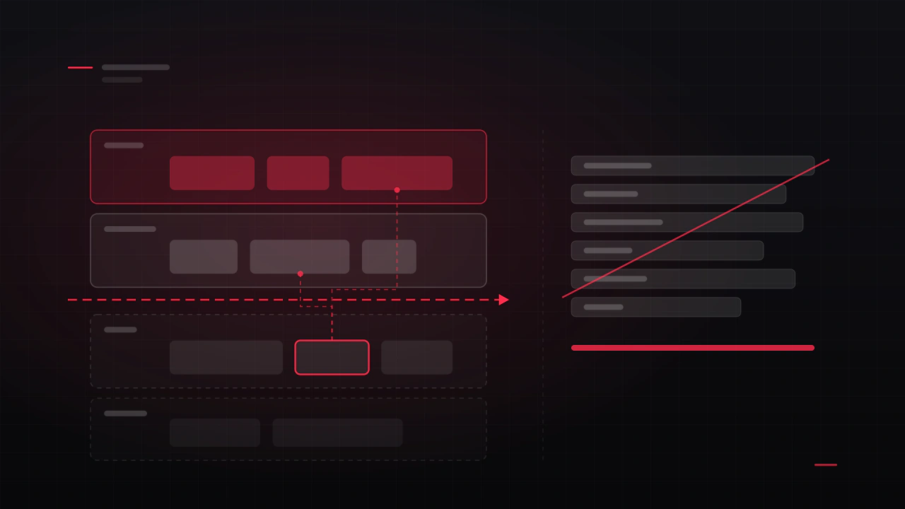
Opaque panels, heavy borders and saturated colours in the corners. Every element wins its local fight for attention and the whole screen loses. Meanwhile the world your art team built is fighting a bezel.
Why it happens: elements are designed one at a time, each on its own artboard, each made to look good in isolation. Nobody ever evaluates them together over real gameplay, so twelve individually reasonable decisions add up to an unreasonable screen.
The fix: the interface should be the quietest thing on screen until it has something to say. Drop opacity, remove the container entirely wherever the content can survive without it, and reserve your accent colour for state changes rather than decoration. If you cannot delete a panel background without losing legibility, the real problem is contrast, not the panel.
How to test it: screenshot a busy moment, then desaturate it. If the interface is still the first thing your eye lands on, it is too loud, because you have removed the one advantage colour gave the game world.
2. Information with no fixed home
Ammo sits bottom-right in gameplay, mid-left in the vehicle, and top-centre in the boss fight. Every relocation costs the player a fraction of a second of search, and those fractions are the difference between an interface that disappears and one that nags.
Why it happens: each mode gets designed by whoever built it, at the time they built it, and the layout is optimised for that mode alone. It is a coordination failure rather than a design failure, which is why it survives so long.
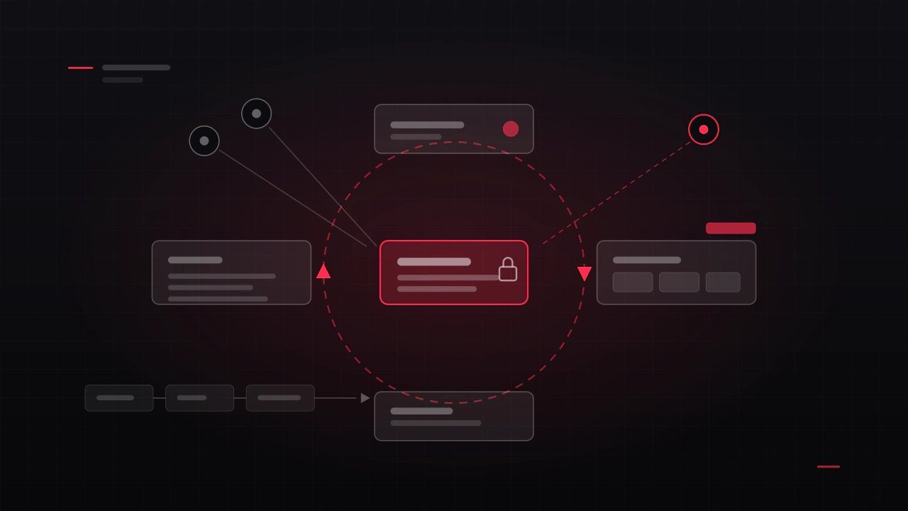
The fix: assign each information type a permanent screen region and defend it across every mode. On Astro Protocol resource counters live in a fixed top bar and primary confirmations sit bottom-right on every single screen, so players stop hunting and start planning. Consistency is worth more than local optimisation, every time.
How to test it: print one screenshot per mode and lay them side by side. Any element that moves between them needs a reason better than "it fitted here".
3. Everything is the same size
Health, ammo, score, minimap, quest tracker, currency, buff icons, all rendered at roughly the same weight. With no hierarchy, the player's eye has to read the entire HUD to find one number.
Why it happens: every system owner wants their system represented, and equal size feels like the fair answer. Fairness between systems is not a player-facing value.
The fix: rank your elements into three tiers, and be ruthless. Tier one is what the player checks under pressure, usually one or two things. Tier two is glanceable. Tier three is available on demand and does not need to be on screen at all. Then make the differences in size, contrast and position obvious rather than polite.
4. Designed at 100 percent zoom on a 27-inch monitor
The designer sits two feet from a large display. The player is on a handheld, or ten feet from a TV, or on a phone in daylight. Text that felt generous in Figma becomes unreadable, and touch targets become a coin toss.
Why it happens: the design tool shows the layout at a comfortable size on a comfortable screen, and nothing in the process forces a check at the real one.
| Target | Viewing distance | What to check |
|---|---|---|
| Desktop PC | About 2 feet | Smallest text legible at native resolution, not zoomed in. |
| Console on a TV | About 10 feet | Stand across the room. Body text usually needs to be roughly double desktop size. |
| Handheld | About 1 foot, small panel | View your layout at 50 percent scale. That approximates it well. |
| Mobile | About 1 foot, thumb input | Nothing interactive under roughly 44 × 44 points; assume a thumb covers the bottom third. |
How to test it: whichever platform you ship on, check at the lowest resolution you officially support, not on your dev machine. Then check it again in a bright room.
5. Feedback that arrives late, or not at all
The player presses a button and nothing acknowledges it for 200 milliseconds while a system resolves. In that silence they press again. Now they have bought two, or cancelled the thing they wanted.
Why it happens: feedback is treated as a consequence of the action rather than a response to the input. The engineering is correct and the experience is wrong.
The fix: acknowledge input immediately and separately from resolving it. A press state, a sound, a small movement, anything within about 100 milliseconds. Then show the result when it arrives. Damage, cost and reward all need to register at the moment they happen, not in a summary screen afterwards.
How to test it: record gameplay and step through it frame by frame at the moment of a press. If nothing on screen changes within a handful of frames, you have found the problem.
6. Numbers where a shape would do
Health as 847 / 1200 forces arithmetic during combat. Players do not do arithmetic during combat, they estimate, and a bar answers "am I in trouble?" in a glance while the number does not.
Why it happens: the number is what the code has. Rendering it is the shortest path from data to screen, and it never gets revisited.
The fix: use shape and colour for anything the player judges by feel, and reserve exact numbers for decisions that genuinely need precision, like costs and inventory counts. If you need both, make the shape primary and the number secondary in size and contrast. The same logic applies to cooldowns, ammo reserves and progress towards a goal.
| Judged by feel, use a shape | Needs precision, use a number |
|---|---|
| Health, shields, stamina | Currency and prices |
| Cooldown progress | Inventory counts and stack sizes |
| Distance to objective | Timers the player is racing |
| Charge or heat level | Damage numbers in a stat-driven RPG |
7. Never tested in motion
This is the one that catches almost everyone. A HUD is reviewed as a still image, in a slide, sitting still. Then it ships into a game where the camera shakes, the background is bright one second and black the next, and the player is at 200 km/h.
Why it happens: stills are how design work gets reviewed and approved everywhere else, so that is how it gets reviewed here too.
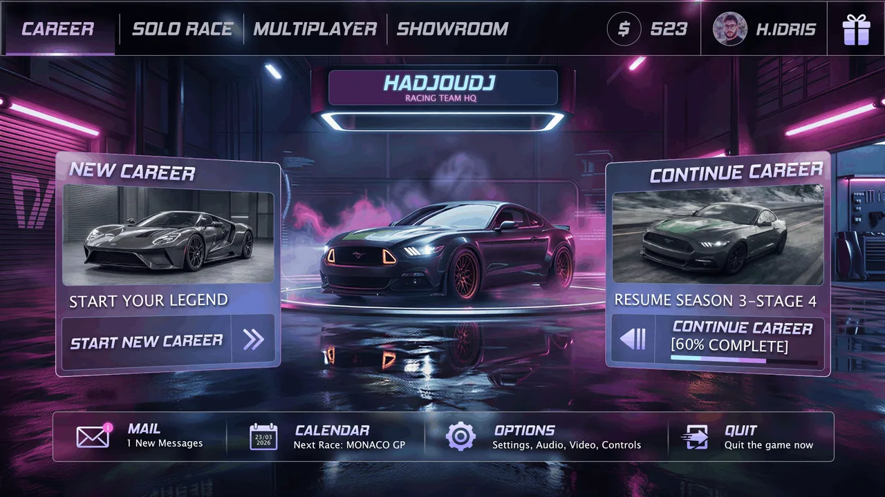
The fix: review HUD work as video, over real gameplay, at real speed, on the worst-case backgrounds. Snow levels, explosions and white skyboxes destroy more HUDs than any other single factor. This is exactly the constraint the Nocturne Drive HUD was built around, and it is why the layout decisions look conservative in a still frame and work in motion.
How to test it: capture sixty seconds across your brightest and darkest levels, then watch it at half speed with the sound off. Anything that disappears, vibrates or fights the background is a fix, not a preference.
Genre changes what belongs on screen
There is no universal HUD. What earns permanent screen space depends entirely on what the player is deciding, and how fast.
| Genre | Tier one, always visible | Push off screen |
|---|---|---|
| Shooter | Health, ammo, crosshair state | Full inventory, detailed stats, map |
| Racing | Speed, position, lap, next corner | Car stats, tuning, full leaderboard |
| Strategy, 4X | Resources, turn state, selection | Deep tooltips, tech trees, diplomacy detail |
| Survival, crafting | Health, hunger, threat, equipped item | Full crafting tree, base management |
| Mobile casual | Score, lives, one primary action | Almost everything else |
Accessibility is a HUD problem first
Most accessibility complaints about games are complaints about the HUD, and most of them are cheap to prevent while it is being designed.
- Never encode meaning in colour alone. Roughly one in twelve men has some form of colour vision deficiency. Pair every colour cue with a shape, an icon or a position.
- Contrast against the worst background, not the average one. The snow level is the real test, not the grey box scene.
- Give text a scale option. A HUD text size setting is one of the highest-value accessibility features per hour of work.
- Do not rely on motion alone to signal something important. Pair it with a persistent state change.
- Let players toggle elements off. Individual toggles cost little if they are planned for, and they turn a divisive HUD into a personal one.
None of this is a substitute for a good default. Most players never open settings, so the default layout is still the design.
A ten-minute HUD audit
Record sixty seconds of real gameplay and run through this list. It costs nothing and it usually finds three of the seven.
- Pause on a busy frame. Count the elements. Can you name what each one is for in under a second?
- Blur the frame. What survives? Is that what should survive?
- Find your brightest, most saturated pixel. Is it interface or is it game?
- Play the clip and watch only the corners. Does anything move, jitter or overlap?
- Pause on your brightest background. Is every element still legible?
- Desaturate the frame. Does anything become ambiguous? That element is encoding meaning in colour alone.
- Press three buttons. Does each acknowledge you before the result resolves?
- Switch to a controller. Can you reach everything without a cursor?
- Scale the window to 50 percent. What becomes unreadable first? Fix that one thing.
- Ask someone who has never played to point at their health. Time it.
How much of the screen should a HUD take up?
There is no universal percentage, but a useful discipline is that the HUD should occupy the smallest area that still answers the player's questions without them pausing. In practice that means fixed edges and corners, and a clear centre. If elements are drifting towards the middle of the screen, something in the hierarchy has failed.
Should I let players customise or hide the HUD?
Toggles for individual elements, opacity and scale are increasingly expected, and they are cheap to build if you plan for them. They are not a substitute for a good default. Most players never open settings, so the default layout is still the design.
Diegetic HUD or traditional overlay?
Diegetic elements are immersive and slow to read. Overlays are fast and less immersive. Fast-paced games generally need an overlay for anything time-critical, and can afford diegetic treatment for information the player consults at their own pace.
When should the HUD be designed?
Once the core loop is playable, because you cannot judge a HUD without motion, and before the systems are locked, because the HUD frequently reveals that a system asks the player for too much. Late HUD work almost always turns into rework.
How do I make a HUD readable on both light and dark backgrounds?
Give elements their own contrast rather than borrowing it from the scene: a subtle dark scrim behind text, an outline or shadow on icons, or a solid but low-opacity plate. Test against your brightest level, because that is where borrowed contrast fails.
Is animating the HUD worth it?
Small, fast animation on state changes is worth a lot, because it is how the player notices something happened without watching for it. Continuous animation on idle elements is worth less than nothing: it draws the eye repeatedly to information that has not changed.
How many elements is too many?
Count how many the player has to check to make their next decision. If that number is above three or four in a fast game, the HUD is doing the systems' job of simplification. The fix is usually upstream in the design, not in the layout.
Can I fix a bad HUD without redesigning it?
Often, yes. Opacity, spacing, size hierarchy and colour discipline account for most of the perceived quality, and none of those require new artwork. Structural problems, such as elements moving between modes, are the ones that need real redesign.
Hadjoudj Idris
Game UI/UX Designer, Remote, worldwide
Need this done properly on your game?
Menus, HUDs, a full UI system, or one screen that isn't working. Tell me what you're building and I'll tell you honestly whether I'm the right fit, and what it would cost.
Upwork100% Job Success