Mobile game UI design: thumb zones, safe areas and the screens that pay
A phone is not a small monitor. It is held in one hand, in motion, often in daylight, and part of the screen is covered by the thumb that is playing the game. This is what actually changes when you design a game interface for mobile, and which screens are worth the most of your budget.
In this article
Open to new projects
Hadjoudj Idris
Game UI/UX Designer
Upwork100% Job Success
Hire me Browse the workMost mobile game interfaces are designed the way a PC interface is designed: on a large monitor, with a mouse, at a comfortable size, then scaled down and shipped. Everything that makes mobile different happens after that scaling, on a device nobody in the process is holding.
What actually changes on a phone
Five constraints do most of the work. None of them are aesthetic, and all of them are settled before a single pixel is drawn.
- The input device covers the screen. A cursor is one pixel. A thumb is roughly a centimetre wide and attached to a hand that hides whatever is under it.
- Reach is limited. The corners of a modern phone are genuinely hard to touch one-handed, and the far top corner is close to impossible.
- The rectangle is not the screen. Notches, camera cutouts, rounded corners and the gesture bar all take bites out of it, and they differ per device.
- The viewing conditions are hostile. Sunlight, a smeared screen, a bus, one eye on something else. Contrast that passes indoors fails outdoors.
- Sessions are short and interrupted. A phone game is played in three-minute pieces between other things, so the interface has to re-orient a returning player instantly.
Every recommendation below comes out of one of those five.
The thumb map: where controls can actually go
Hold a phone in one hand and sweep your thumb. The area it covers comfortably is an arc, roughly centred on the bottom corner of the side you hold it, and it does not reach the top of the screen at all. That arc is the single most useful piece of layout information you have.
| Zone | Where it is | What belongs there |
|---|---|---|
| Natural | Bottom third, centre and holding side | The primary action, the thing pressed most often, movement and fire controls |
| Stretch | Middle band, and the far bottom corner | Secondary actions, tabs, item slots, anything used a few times per session |
| Hard | Top third, especially the far top corner | Status only: score, currency, level. Nothing the player has to hit under pressure |
| Leave empty | Directly under the resting thumb during play | Nothing at all. This is where accidental presses come from |
The most common mobile layout mistake is a close button alone in the far top corner of a full-screen panel. It is the hardest pixel on the phone to reach, and it is the control every player needs. Keep it in the corner if the convention demands it, but also let a tap outside the panel dismiss it, and never make the corner the only way out.
Safe areas: the screen is smaller than the screen
Since notched displays arrived, the usable rectangle has been a per-device value the operating system reports at runtime. Design against the safe area and let the background fill the rest, rather than designing against the full frame and hoping.
- Top inset: the status bar plus the notch or camera cutout. Nothing readable goes there, and nothing tappable goes beside the cutout.
- Bottom inset: the home indicator or gesture bar, around 34 points on current iPhones. A button under it gets swiped instead of pressed.
- Rounded corners: the corner radius clips content. Keep a margin so a counter is not sliced diagonally.
- In landscape the insets move to the sides, where racing and action games like to put their controls.
- Tablets are a different aspect ratio entirely. A 4:3 tablet next to a 20:9 phone will break any layout that assumes a fixed height.
The practical rule: build a full-bleed background layer, then place every interactive and readable element inside a safe-area container with its own margin. That is one decision at the start of a project, and it removes an entire class of device-specific bugs. The panel set in the Cartoon Space UI kit is built this way, so the same screens survive a notch, a cutout and a tablet without anything being redrawn.
Touch targets and the cost of a missed tap
Apple's guidance is a minimum of 44 × 44 points, Android's is 48 × 48 density-independent pixels. Those are minimums written for productivity apps, where a mistake costs a tap. In a game where a mistake costs a run, go bigger.
| Control | Platform minimum | What I actually use |
|---|---|---|
| Primary action during play | 48 dp | 64 to 80 dp, with a generous invisible hit area |
| Menu buttons and list rows | 44 pt | 56 dp tall, full width where the layout allows |
| Icon buttons: settings, close, info | 44 pt | 48 dp visual, 56 dp hit area |
| Destructive actions: sell, delete, spend | 44 pt | Same size as neighbours, never adjacent to a frequent action |
| Spacing between any two targets | 8 dp | 12 to 16 dp, more if either one is destructive |
The hit area and the artwork are separate things. A 40-pixel icon can sit inside a 56-pixel transparent button, and the player feels the difference without ever seeing it. This is the cheapest quality improvement available on mobile, and it costs nothing but the decision to specify it.
Density: what to cut when the screen is six inches
A monitor at arm's length and a phone in a hand can hold a similar number of pixels and nothing like the same amount of information. Shrinking a PC layout is how mobile interfaces end up looking cheap: everything becomes too small and too close together at the same time.
- Show one thing per screen. Where PC puts a list and a detail panel side by side, mobile shows the list, then the detail. Tabs and sheets are not a compromise, they are the correct pattern.
- Cut the tier-three information. If the player consults it once a session, it belongs behind a tap. The three-tier hierarchy in Seven HUD mistakes applies here with less room for mercy.
- Type has a floor. Around 14 to 16 points for anything a player reads, larger for anything they read while moving. Below that you are not designing, you are hiding.
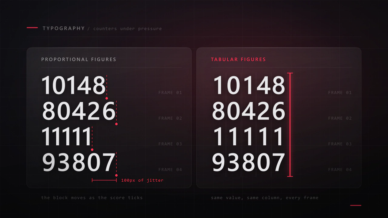
- Numbers get shorter. 12.4K, not 12,437. Precision nobody uses costs width you do not have.
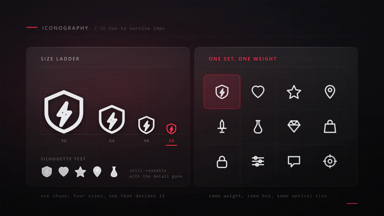
- Icons need labels, or a tutorial. A bare icon set is a memory test, on a screen too small for tooltips.
Portrait or landscape, decided once
This is an early decision with consequences everywhere, and changing it later is close to a redesign. Portrait is one-handed, matches how the phone is already being held, and suits vertical lists and tap-driven play. Landscape gives you the width for a world view and two-thumb control, and asks the player to commit to the session.
| Choose portrait when | Choose landscape when |
|---|---|
| Play is one-handed and tap-driven | Both thumbs are on controls |
| Sessions are short and interruptible | The player commits to a session |
| The interface is lists, cards and menus | A wide view of the world matters |
| Idle, puzzle, card, management | Racing, action, shooter, strategy |
| You want the lowest barrier to a first session | You want the game to feel like a console game |
Supporting both is a real cost, roughly a third again on layout work, because it is two layouts rather than one that rotates. It is usually worth it for menu-heavy games and rarely worth it for action games. Cartoon Racing plays in landscape with menus that stay comfortable in the hand, which is the compromise that most often survives contact with a schedule.
The screens that carry the revenue
On a premium PC game the main menu is the front door. On a free-to-play mobile game the front door is the first session, and the money is made on three or four screens that most teams design last. Budget accordingly.
- 01
The first sixty seconds
From the tap on the icon to the player doing the fun thing. Every extra splash, login prompt and permission dialog in that path costs installs that never become players. This is the highest-value sequence in the entire game.
- 02
The end-of-run screen
The most viewed screen in the game after the play surface itself. It has to show what happened, what progress was made, and what to do next, in that order. This is where the retry loop is either tight or broken.
- 03
The shop and the offer
Every currency, price and bundle in the game passes through here, and confusion costs conversions more reliably than pressure wins them. The economy underneath those prices is its own design problem. That has its own article: monetisation screens players do not resent.
- 04
The progression screen
The upgrade tree, the collection, the roster. This is the reason players come back tomorrow, so it needs to be legible at a glance and satisfying to open.
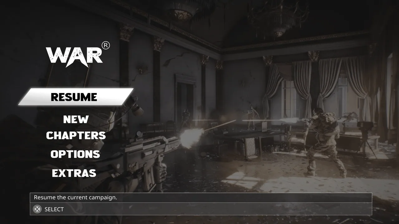
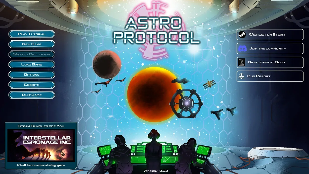
On mobile the main menu is a corridor. Design the room the player actually spends time in.
Feedback has to work harder
The thumb covers the button it is pressing. On a mouse-driven interface the cursor confirms the target and the hover state confirms the intent. Mobile has neither, so that confirmation has to be rebuilt somewhere the finger is not.
- Show the press state outside the contact patch: a border, a glow, a scale change, something visible around the thumb rather than under it.
- Acknowledge within about 100 milliseconds, before the action resolves, or the player taps again.
- Use haptics for the moments that matter, sparingly. A short tick on a purchase confirmation or a hit lands well. Constant vibration gets the game uninstalled.
- Animate transitions with direction. Where a screen comes from tells the player where they are, and on a small screen that is often the only navigation cue they get.
- Never put a confirmation button exactly where the previous button was. Double taps happen, and an accidental purchase becomes a refund and a one-star review.
Daylight, dirt, and one eye elsewhere
Test in sunlight. Not as a metaphor: take the device outside. Contrast that felt subtle and premium on a calibrated monitor in a dark studio is invisible on a phone at a bus stop, and that is where a large share of your sessions happen.
- Give text its own contrast, from a scrim or an outline, rather than borrowing it from the artwork behind it.
- Test at half brightness. Battery saving and auto-dimming are the normal state of a phone, not the exception.
- Do not rely on colour alone for state. Daylight takes saturation first. See game UI accessibility.
- Check with the screen slightly dirty and held at an angle, which is how a real phone is used.
A one-device test that finds most of it
Twenty minutes, one phone, no equipment. I run this on every mobile project before anything is called finished.
- Play one-handed for five minutes. Note every control you had to shift your grip to reach.
- Do the same with the other hand. Note what got worse.
- Take the phone outside and photograph the HUD. Is everything still readable?
- Open every full-screen panel. Can each one be dismissed without reaching the far top corner?
- Check every screen on a device with a cutout and one without, in every orientation you support.
- Find the two nearest tappable elements in the game and measure the gap. Under 8 dp is a misfire waiting to happen.
- Tap the primary action twenty times quickly. Does anything double-fire?
- Look at the end-of-run screen. Can a returning player tell what happened and what to do next within two seconds?
- Reinstall and play the first sixty seconds as a new player. Count the taps before the fun starts.
- Hand it to someone who has never played, and say nothing for two minutes.
What resolution should I design mobile game UI at?
Design in points or density-independent pixels rather than device pixels, at a common reference frame such as 390 × 844 for portrait, then export assets at 2× and 3×. What matters far more than the exact frame is that the layout is built from anchors and safe-area margins rather than fixed coordinates, so it survives every other device.
How small can text be on a phone?
Around 14 points is the practical floor for anything a player reads, and 16 or more for body text or anything read while the game is moving. HUD numbers can go smaller if they are high contrast and in a fixed position, because there the player is recognising a shape rather than reading.
Should mobile game UI follow iOS and Android conventions?
Follow platform conventions for system-level behaviour: back gestures, safe areas, permission prompts, the share sheet. Do not follow them for the game's own interface, which should look like your game. Players expect a game to have its own visual language and expect the phone's gestures to keep working.
How much does mobile game UI design cost compared to PC?
Per screen it is broadly similar, but mobile projects usually need more screens, more states and two orientations more often, and free-to-play adds shop, offer and progression surfaces a premium game does not have. The ranges in the cost article apply, with the screen count doing most of the work.
Do I need separate designs for tablets?
Usually not separate designs, but you do need a plan. A tablet is a different aspect ratio with far more area, so a stretched phone layout looks empty and oversized. The common answer is one layout that reflows: fixed-size controls anchored to the edges, content areas that grow, and a maximum width on anything that would otherwise become a very long line.
Where should the pause button go on mobile?
Top corner, small, and deliberately slightly awkward to reach, because an accidental pause during play is worse than a slow one. It is the one control where the hard-to-reach zone is the correct choice rather than a mistake.
How do I stop players mis-tapping during action?
Increase spacing before you increase size, keep destructive and frequent actions apart, add a short input lock after a screen change so a queued tap does not land on a new button, and never place a dialog's confirm button under the position the previous button occupied.
Is an asset store UI kit good enough for a mobile game?
For a prototype or a jam, yes. For a commercial release it gives you components but not layout, and layout is where mobile is won or lost, because a kit cannot know your thumb map, your safe areas or your screen list. The hybrid approach in freelance, studio, or asset store is usually the right call.
Hadjoudj Idris
Game UI/UX Designer, Remote, worldwide
Need this done properly on your game?
Menus, HUDs, a full UI system, or one screen that isn't working. Tell me what you're building and I'll tell you honestly whether I'm the right fit, and what it would cost.
Upwork100% Job Success