01
The hero
The name lit in amber on a black LED panel, the unlit grid around it, and four tags in cyan, green, magenta and red.
A dot-matrix LED font for the screens inside your game · v1.000
Lumadot is the lettering of the screens a game world is full of: lap timers, stadium scoreboards, bus signs, ship terminals and phone status bars. Every character is made of round dots on a five-by-seven cell, and a second font lays the unlit dots behind them so the panel looks switched on.
Type tester
The lit dots are stacked over the Grid in the hero's amber, with a soft LED glow. Every row is a whole multiple of 10 px. Try the other colours, switch Effects off for flat dots, or the layers off for the lit dots alone.
Best lap 1:24.37Best lap 1:24.37
Best lap 1:24.37Best lap 1:24.37
Best lap 1:24.37Best lap 1:24.37
Best lap 1:24.37Best lap 1:24.37
This preview covers Basic Latin, the icons, the bars and the frame lines. The full font adds every accented letter.
Features
A 5×7 dot-matrix LED font for race timers, scoreboards and terminals, with a Grid layer for the unlit dots, 40 display icons and progress-bar segments.
Each character is built from round dots on the classic five-by-seven cell, with true descenders on g, j, p, q and y and accented capitals kept inside the cell.
Lumadot Grid fills every dot of every cell, spaces included. Set it under the text in a dim colour and the whole panel reads as one display.
Every character has the same width, so lap times, scores and countdowns never shift, and the two layers line up dot for dot.
Hearts, stars, batteries, signal bars, a race flag, a clock, a lock, media controls, arrows and more, drawn on the same dot grid as the letters.
Progress-bar segments that fill one dot column at a time, level meters that rise one row at a time, and single and double frame lines that join up across characters and lines.
Turn on the slashed zero when a 0 and an O sit side by side, as they do in codes, gates and serial numbers.
Built-in icons
Each icon is a character in the font. Click one to copy it, then paste it into anything set in Lumadot.
Case study
Game worlds are full of small screens: the timer on a race car's wheel, the board over a stadium, the sign at a bus stop, the readout on a ship's console. They are often set in whatever pixel font is at hand, and they end up looking printed rather than lit.
I wanted a font that behaves like the hardware: dots on a fixed matrix, every character the same width, and the dark dots between letters visible the way they are on a real panel.
Lumadot is two fonts. Regular draws only the dots that are on. Grid draws every dot of the cell, under spaces too. Type a line in both, put Grid underneath in a dark version of the colour, and you get the full panel; change the two colours and the same screen turns amber, green, red, cyan, white or magenta.
Because the font is monospaced, the layers can't drift apart, and a timer counting down never nudges the text beside it.
The 40 icons at U+E000 to U+E027 cover what status screens show: batteries in four states, signal bars, a clock, a lock, a race flag, play, pause, stop and record, and arrows. Many of them also sit on their usual Unicode symbols, like ♥, ★, ✓, ⏸ and ⚙.
Above them are bar segments at U+E100 that fill one dot column at a time and meter steps at U+E111 that rise one row at a time, plus block elements and frame lines that join across characters, so a fuel gauge or a boxed menu is just more text. The grid is a tenth of an em, so it is pixel-perfect at every multiple of 10 px, and the engine pack has bitmap fonts at 30, 60 and 120 px.
The name lit in amber on a black LED panel, the unlit grid around it, and four tags in cyan, green, magenta and red.
The editable hero layout from the download, with a glowing amber title and a green lap readout.
Lap and position, a best lap time, a speedometer, a fuel bar with tyre meters, and a yellow-flag warning.
Capitals, lowercase with true descenders, figures, punctuation and the accented letters, 512 in all.
Grid plus the lit dots makes the panel, then GAME OVER in amber, green, red, cyan, white and magenta.
The 40 display icons on a red panel, an HP and MP screen with bars and a double frame, and a cyan level meter.
A scoreboard, a sci-fi terminal, a bus sign, a music player and a phone status bar, each in its own colour.
What you get
Included with every purchase
Ask me first
Please don't share or resell the font files. For anything the license doesn't cover, email me. idris.hadjoudj@gmail.com
FAQ
Lumadot comes as two fonts, Regular and Grid, with the same widths. Type the same text in both, put Grid underneath in a dim colour and Regular on top in the bright one, aligned exactly. Regular also works alone when you only want the lit dots.
Add an outer glow or a blurred drop shadow in the lit colour to the Regular layer only, in your design app or engine. Keep it small: a tenth of the text size or less, so the dots stay round and separate.
The icons are at U+E000 to U+E027, the progress-bar segments at U+E100 to U+E106 and the meter steps at U+E111 to U+E117, so in code you write them as escapes such as \uE000. You can also copy any of them from the grid on this page.
Yes. Commercial use is included for games, apps, logos, merch, videos, streams and print, with no limit on sales, and you can embed the fonts and bitmap fonts in games and apps for unlimited copies. Products where your customers type their own text, and resale in asset packs, need an extended license: just ask.
Yes. Use the TTF files in any engine that imports fonts, or the included game engine pack: BMFont bitmap fonts at 30, 60 and 120 px for Godot, Unity, GameMaker, LibGDX, Phaser, MonoGame and Love2D.
Yes. WOFF2 web fonts are included, and web use is unlimited, with no cap on page views or traffic.
Each font has 512 characters, covering Western and Central European languages.
Yes. Lumadot is in The Complete Font Collection, every font I've made in one download.
Related reading
Longer write-ups on the craft this font draws on.
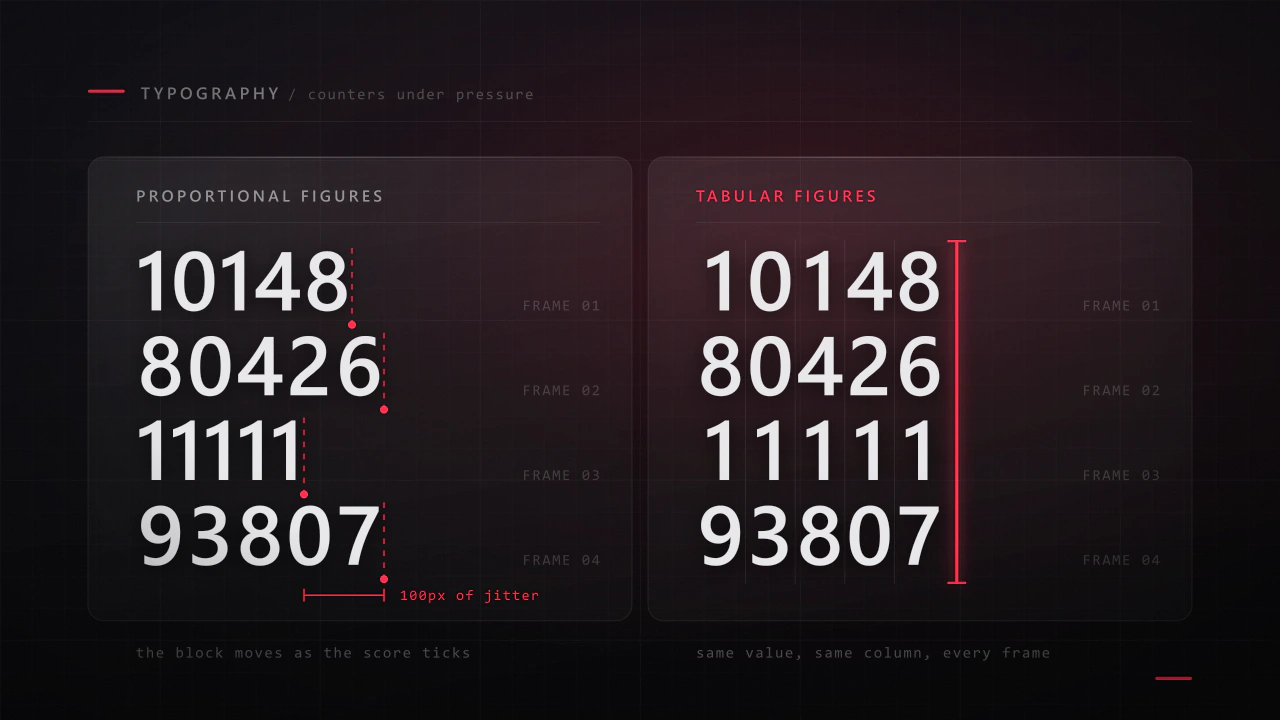
Interface type is read in half a second, at speed, over moving artwork, by somebody who did not come to your game to read. Almost every rule that applies to a book works against you here, and the fixes are specific.
Read the article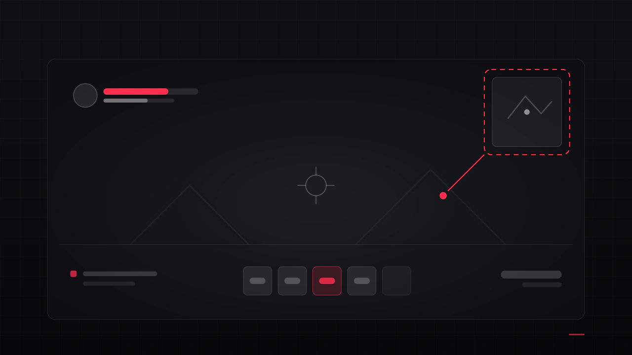
Players rarely say "the HUD is bad". They say the game feels cluttered, or confusing, or cheap, and then they refund it. These are the seven causes I find most often, what each one is really costing you, and how to check your own game against them.
Read the articleMore fonts
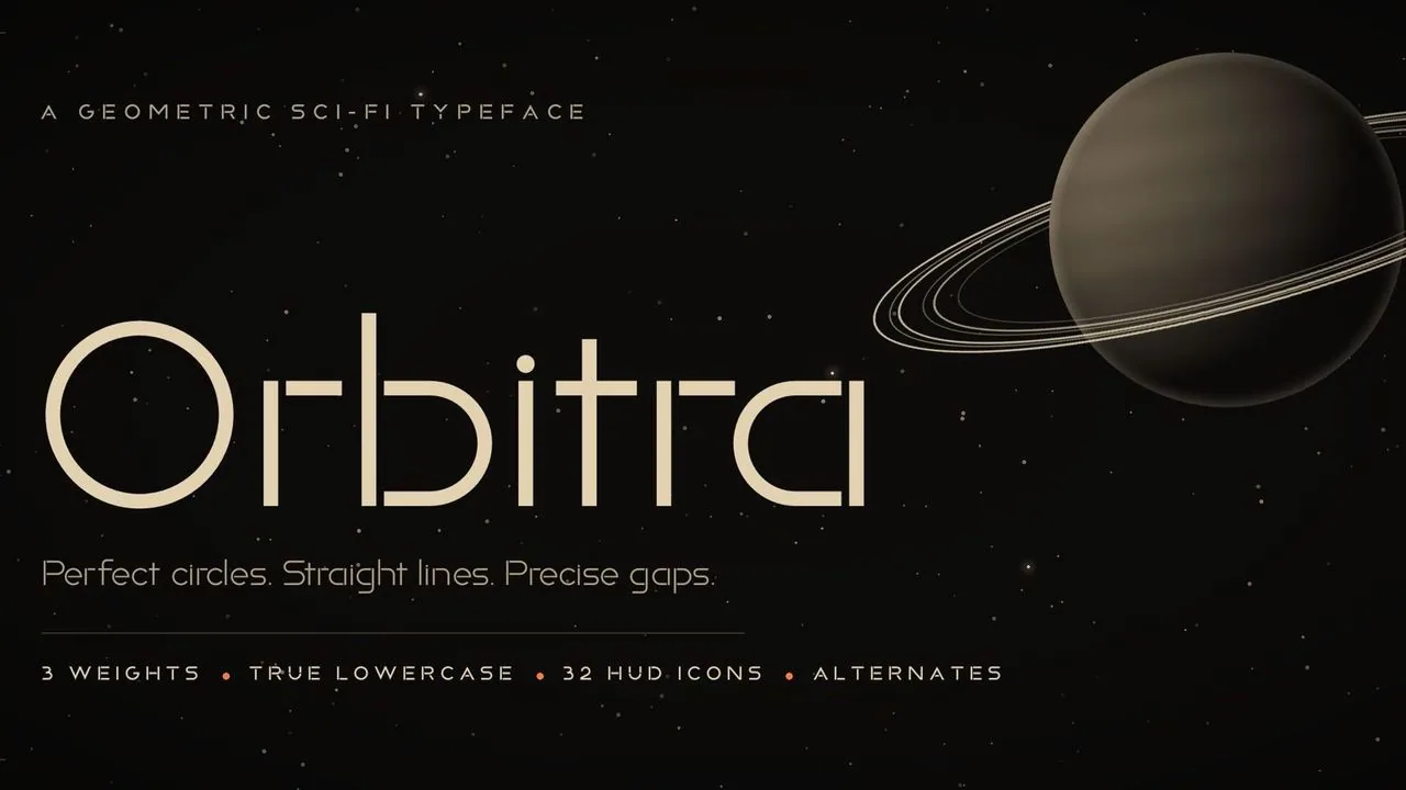 Font · $6.99
A geometric sci-fi font of true circles, straight bars and small gaps, in three weights, with 32 matching HUD icons you type like letters, for space games.
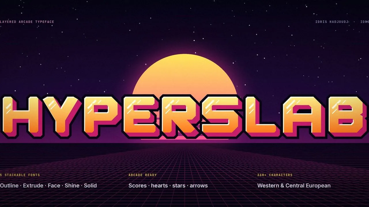 Font · $6.99
Heavy, chamfered 80s arcade letters in five layer fonts that stack into full-colour 3D titles, with tabular scores and arcade symbols.
Contact
Menus, HUDs, full UI systems or a single screen that isn't working. Tell me what you're building and I'll tell you honestly whether I'm the right fit.