01
The hero
The name in Kryvane Regular, flat pale grey on a dark blueprint grid, with the seam running through every letter.
A cold, wide industrial sans with a seam through every letter · v1.000
Kryvane is a wide, engineered sans for science fiction that feels a little ominous: derelict starships, survival horror, quarantine signs and tech brands. A thin seam cuts across every letter at one height, like the joint between two hull plates.
Type tester
Regular is the weight of the hero. Switch to a Solid style to close the seam, and try the alternate G and Q or the tabular figures.
Hull breach on Deck 07. Seal the airlock.
Hull breach on Deck 07. Seal the airlock.
Hull breach on Deck 07. Seal the airlock.
Hull breach on Deck 07. Seal the airlock.
This preview covers Basic Latin and the arrows. The full fonts add every accented letter and the rest of the punctuation.
Features
A cold, wide industrial sci-fi font in six styles: Kryvane, with a hull seam through every letter, for titles, and Kryvane Solid for HUDs and small text.
A thin horizontal cut crosses every letter and figure at one fixed height, so a word reads like a run of riveted hull plates.
Kryvane keeps the seam for titles and big headings; Kryvane Solid closes it for menus, labels and dense HUDs. Each comes in Light, Regular and Bold.
Wide capitals and four arrows for deck numbers, wayfinding and hazard warnings, the walls of the ship as well as its screens.
Extended proportions, rounds drawn as superellipses and terminals cut flat give it a cold, engineered feel rather than a glossy one.
Proportional figures by default, and tabular figures that hold timers, oxygen levels and scores still while they count.
Capitals and a full lowercase in 369 characters per style, with Western and Central European languages, and an alternate G and Q in Stylistic Set 1.
Case study
Most sci-fi type is built to look fast and shiny: neon, racing stripes, chrome. The games I kept thinking about were the opposite, abandoned salvage ships, flickering corridors, a door that should stay shut. They need lettering that feels built and a bit cold, the kind you'd find stencilled on a bulkhead.
I also wanted one face that could carry a whole game of that kind: the title card, the warning signs on the walls and the oxygen counter in the corner of the screen.
The idea that shapes Kryvane is a single seam. Every letter is cut by a thin horizontal gap at the same height, about two sevenths of the way up the capitals, so the line runs unbroken through capitals, lowercase and figures alike. Set a word and it reads as one plated surface.
The gap gets a little wider as the weight goes up, so it stays visible in Bold instead of filling in. In the art I let it do the work on its own: the hero is flat grey type on a dark grid, with nothing added.
A hairline seam is lovely at title size and turns to noise in a twelve-pixel HUD label. So Kryvane has a second family, Kryvane Solid, with the same letters and the seam closed.
Because the Solid styles are the same drawings with the seam closed, you can set the logo in Kryvane Bold, the menu in Solid Regular and the readouts in Solid Light, and everything still feels like one ship.
The rounds are superellipses rather than circles, squarer at the shoulders, and the stroke ends are cut flat, which keeps letters like a, e and s tight and mechanical. The diagonals of A, K and V are sliced square where they meet the baseline.
Stylistic Set 1 holds a G with a short spur and a Q whose tail drops straight down instead of crossing out to the right. The figures are proportional by default, with a tabular set for timers and counters.
The name in Kryvane Regular, flat pale grey on a dark blueprint grid, with the seam running through every letter.
The editable hero layout from the download, here with a chrome fill and an amber glow on the capitals.
A survival-horror title screen: the name in capitals over a dark red glow, with the menu and the life-signs readout below.
Capitals, lowercase, figures, punctuation, the arrows and the accented letters of Latin-1 and Latin Extended-A, all in Regular.
A vitals panel, an airlock status card and a containment alert, with the air-supply timer set in tabular figures.
Deck numbers, wayfinding signs with arrows and a hazard-striped warning, the places an industrial face feels at home.
The seamed and Solid families side by side, the three weights, tabular figures for timers, the alternate G and Q, and European accents.
What you get
Included with every purchase
Ask me first
Please don't share or resell the font files. For anything the license doesn't cover, email me. idris.hadjoudj@gmail.com
FAQ
Six styles in two families: Kryvane Light, Regular and Bold, with the seam, and Kryvane Solid Light, Regular and Bold, without it.
Use the seamed Kryvane for titles, logos and headings, where the seam has room to show. At small sizes the seam thins to a flicker, so switch to Kryvane Solid for menus, labels and HUD text. The letters are the same drawings, so the two mix in one layout.
Switch on Stylistic Set 1 (ss01) in your design app, or font-feature-settings: "ss01" on the web. It works in both families and every weight.
Yes. Commercial use is included for games, apps, logos, merch, videos, streams and print, with no limit on sales, and you can embed the fonts and bitmap fonts in games and apps for unlimited copies. Products where your customers type their own text, and resale in asset packs, need an extended license: just ask.
Yes. Use the TTF files in any engine that imports fonts, or the included game engine pack: BMFont bitmap fonts at 32, 64 and 128 px for Godot, Unity, GameMaker, LibGDX, Phaser, MonoGame and Love2D.
Yes. WOFF2 web fonts are included, and web use is unlimited, with no cap on page views or traffic.
Each font has 369 characters, covering Western and Central European languages.
Yes. Kryvane is in The Complete Font Collection, every font I've made in one download.
Related reading
Longer write-ups on the craft this font draws on.
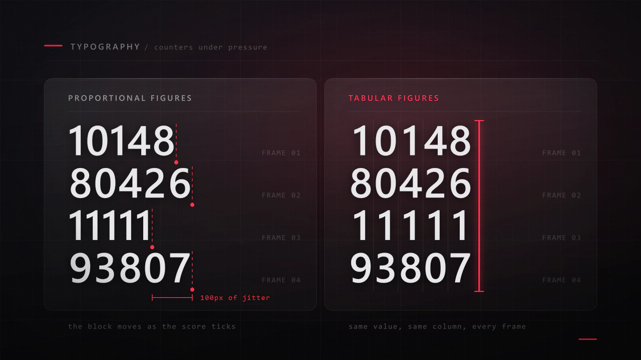
Interface type is read in half a second, at speed, over moving artwork, by somebody who did not come to your game to read. Almost every rule that applies to a book works against you here, and the fixes are specific.
Read the article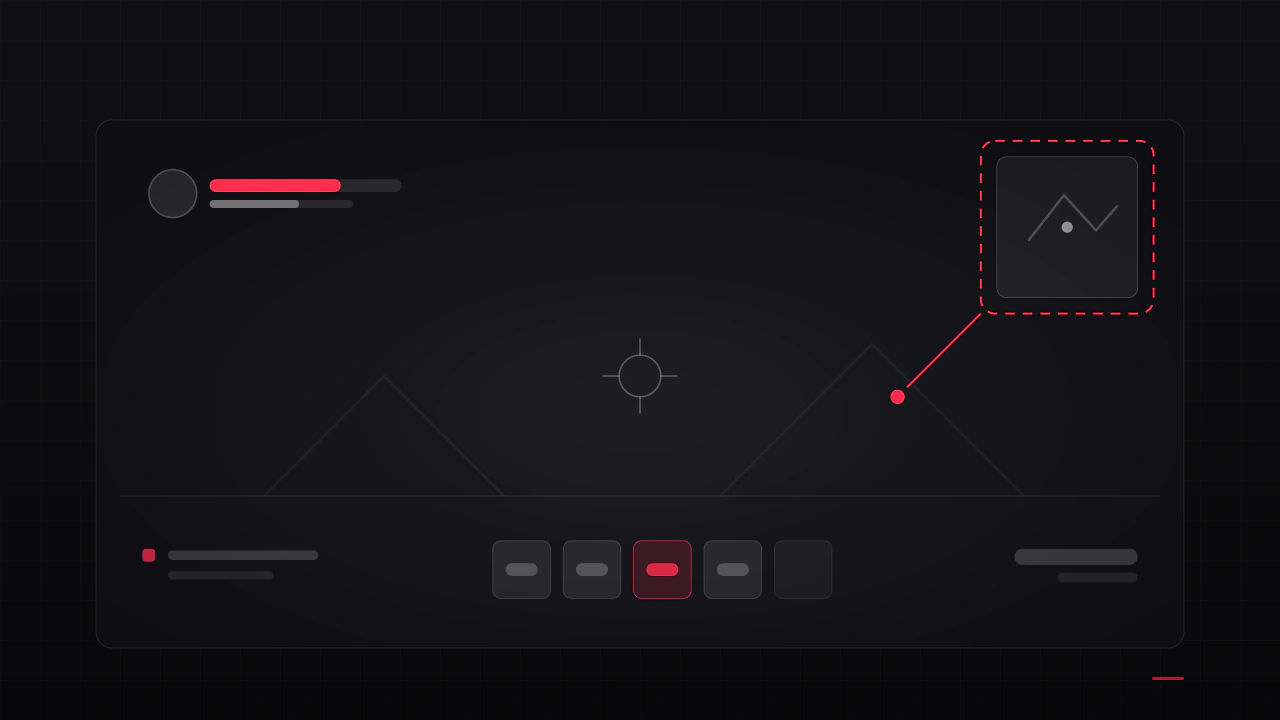
Players rarely say "the HUD is bad". They say the game feels cluttered, or confusing, or cheap, and then they refund it. These are the seven causes I find most often, what each one is really costing you, and how to check your own game against them.
Read the articleMore fonts
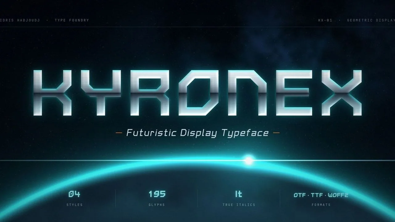 Font · $6.99
A geometric sci-fi font of straight strokes and 45° chamfers for HUDs, menus and space titles, in Regular, Bold and two true italics drawn for the slant.
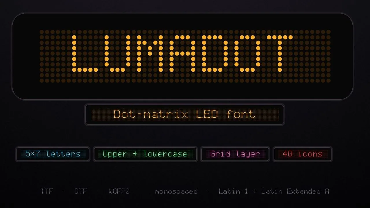 Font · $6.99
A 5×7 dot-matrix LED font for race timers, scoreboards and terminals, with a Grid layer for the unlit dots, 40 display icons and progress-bar segments.
Contact
Menus, HUDs, full UI systems or a single screen that isn't working. Tell me what you're building and I'll tell you honestly whether I'm the right fit.