01
The hero
The name in brushed silver over orange speed lines, with a red underline and the weights, HUD features and coverage listed below.
A wide, clean racing italic in three weights · v1.000
Nitrovex is a wide italic for racing games, liveries, leaderboards and motorsport graphics. It leans at 12 degrees and rounds only the trailing corners of each letter, so a title looks fast standing still, and it comes with the figures and marks a race HUD needs.
Type tester
Set here in the hero's brushed chrome. Switch weights, try the other colours, or turn Effects off for flat type. Turn on Race ordinals and type 1st or 2nd to see the letters rise.
Apex Rush ▲ 1st
Apex Rush ▲ 1st
Apex Rush ▲ 1st
Apex Rush ▲ 1st
This preview covers Basic Latin and the race symbols. The full font adds every accented letter.
Features
A wide racing italic in Regular, Bold and Black, built for race HUDs: tabular lap times, raised race ordinals, position triangles, primes and a numero sign.
Regular and Bold are style-linked for menus and readouts; Black is the heavy cut for titles, logos and liveries.
Each round letter has two long, soft curves trailing behind and two tight corners pointing ahead, set on opposite diagonals of the slant.
Tabular figures give every digit the same width, so a running clock or a gap to the leader never shuffles sideways.
Type 1st, 2nd or 3rd and the letters after the figure rise into small superiors, as on a position board.
Up, down, left and right triangles for position changes, four arrows, prime and double prime for lap times, and a numero sign for car numbers.
Capitals and a true lowercase, 376 characters per weight, for Western and Central European languages.
Built-in icons
Each icon is a character in the font. Click one to copy it, then paste it into anything set in Nitrovex.
Case study
Racing games ask a lot of one typeface. The same letters have to work as a big title on the start screen, on the side of a car, and as tiny lap times and gaps that change many times a second.
Most racing fonts are built for the poster and break down in the HUD. I wanted one that is wide and quick for the title but stays calm and readable in a leaderboard, with the race-specific details already inside.
Every letter leans forward at 12 degrees. On round letters such as O, C, D and G, the two corners on one diagonal of the slant get long, soft curves and the two on the other diagonal stay tight. The soft corners trail behind and the sharp ones point ahead.
That one rule runs through capitals, lowercase and figures, so the whole set looks shaped by the same wind tunnel rather than stretched or skewed after the fact.
The figures come in two sets. Proportional figures are the default for text and titles, and tabular figures line up a lap time such as 1:11.111 so it doesn't shift as it counts. Race ordinals turn 1st, 2nd and 3rd into raised letters after the figure, which is how position boards set them.
The extras are small but specific: triangles for gaining and losing places, arrows, prime and double prime for minutes and seconds, and a numero sign for car numbers.
The name in brushed silver over orange speed lines, with a red underline and the weights, HUD features and coverage listed below.
The editable hero layout from the download: the name in a chrome gradient with an orange glow, above a Racing Italic plate.
Apex Rush on a night road, with a season line, a subtitle and a row of menu buttons set in Nitrovex.
The O in outline view at a 12° slant, with its soft and tight corners marked, and the same rule across other round letters.
Position with a raised ordinal, lap count, lap time and delta, a leaderboard with gaps, a track map, gear and speed.
Regular, Bold and Black on slanted plates, with a large Rg in each weight.
Tabular against proportional lap times, race ordinals, position triangles, arrows and lap marks, and accented sample words.
The full Bold character set on a grid: capitals, lowercase, figures, symbols, triangles, arrows and accented letters.
What you get
Included with every purchase
Ask me first
Please don't share or resell the font files. For anything the license doesn't cover, email me. idris.hadjoudj@gmail.com
FAQ
Three: Regular, Bold and Black. Regular and Bold are style-linked, and Black is meant for titles.
Both are OpenType features. Turn on Ordinals (ordn) and type 1st, 2nd or 3rd to raise the letters, and Tabular figures (tnum) for timers and scores. On the web, use font-feature-settings "ordn" and "tnum".
It's a colour finish, not part of the font: fill the letters with a light-to-grey gradient running from the top of the capitals to the baseline, and add a little noise if you want the brushed feel.
Yes. Commercial use is included for games, apps, logos, merch, videos, streams and print, with no limit on sales, and you can embed the fonts and bitmap fonts in games and apps for unlimited copies. Products where your customers type their own text, and resale in asset packs, need an extended license: just ask.
Yes. Use the TTF files in any engine that imports fonts, or the included game engine pack: BMFont bitmap fonts at 32, 64 and 128 px for Godot, Unity, GameMaker, LibGDX, Phaser, MonoGame and Love2D.
Yes. WOFF2 web fonts are included, and web use is unlimited, with no cap on page views or traffic.
Each font has 376 characters, covering Western and Central European languages.
Yes. Nitrovex is in The Complete Font Collection, every font I've made in one download.
Related reading
Longer write-ups on the craft this font draws on.
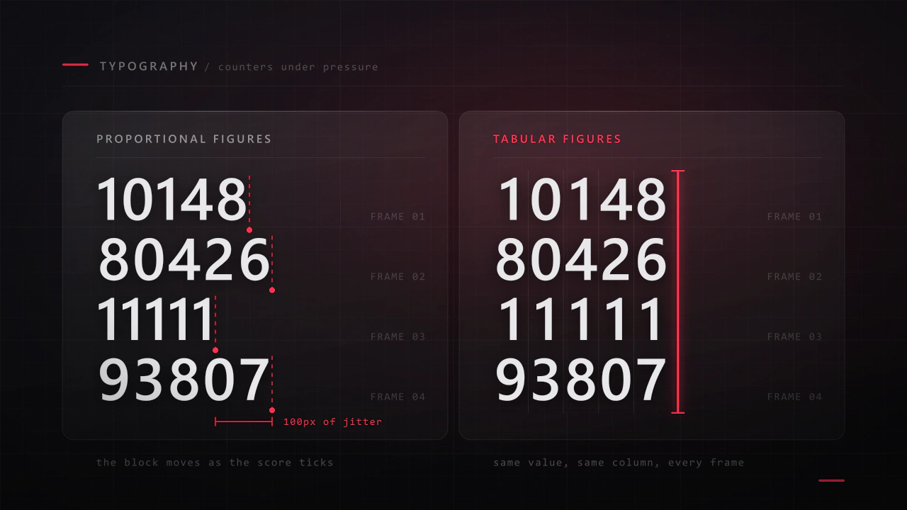
Interface type is read in half a second, at speed, over moving artwork, by somebody who did not come to your game to read. Almost every rule that applies to a book works against you here, and the fixes are specific.
Read the article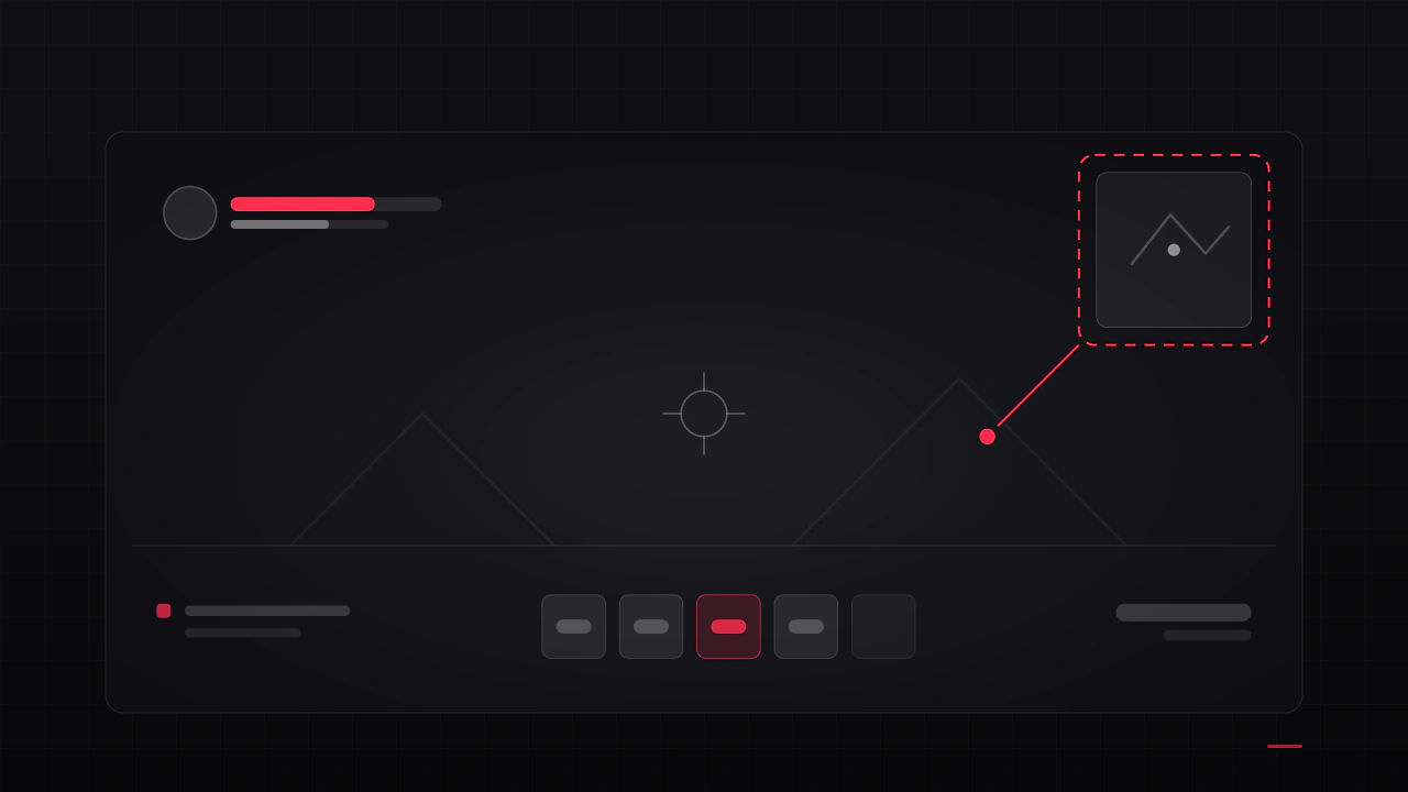
Players rarely say "the HUD is bad". They say the game feels cluttered, or confusing, or cheap, and then they refund it. These are the seven causes I find most often, what each one is really costing you, and how to check your own game against them.
Read the articleMore fonts
 Font · $6.99
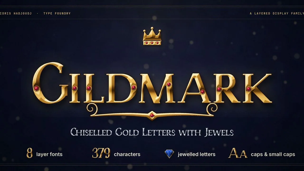
Chiselled gold capitals and small caps in eight layer fonts that stack into lit metal, with a jewelled set and treasure extras for fantasy game titles.
 Font · $6.99
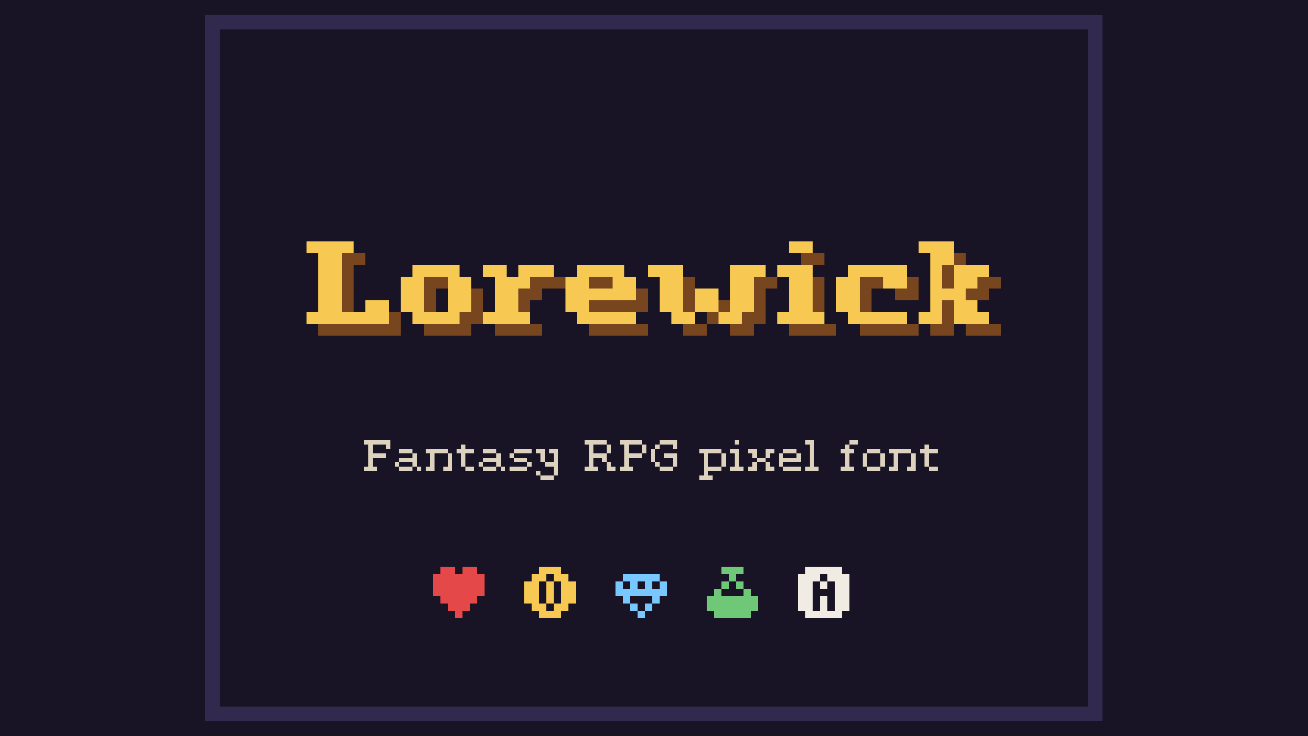
A 7-pixel medieval-serif font built for dialogue boxes, menus, quest logs and title screens, with 28 RPG icons you can type like letters.
Contact
Menus, HUDs, full UI systems or a single screen that isn't working. Tell me what you're building and I'll tell you honestly whether I'm the right fit.