01
The hero
The name in brushed metal with a cyan glow above a glowing planet rim, with the styles, glyph count and formats listed below.
A geometric sci-fi typeface with true italics, in four styles · v1.000
Kyronex is built from straight strokes, squared counters and corners clipped at 45 degrees, the kind of lettering you'd find stencilled on a hull or glowing in a cockpit display. It holds up in small interface text as well as in a title, and its italics are drawn, not slanted.
Type tester
Set here in the hero's metal finish with its cyan glow. Switch between the four styles, try the other colours, or turn Effects off for plain type.
Hyperdrive Engaged 07
Hyperdrive Engaged 07
Hyperdrive Engaged 07
Hyperdrive Engaged 07
This preview covers Basic Latin. The full font adds the Western European accented letters and the currency signs.
Features
A geometric sci-fi font of straight strokes and 45° chamfers for HUDs, menus and space titles, in Regular, Bold and two true italics drawn for the slant.
Regular for interface text, Bold for titles and readouts, and an italic for each, so one family covers a whole sci-fi UI.
The italics lean 10 degrees and are redrawn for the slant rather than skewed, so the chamfers and joins stay clean.
Corners are cut at one angle across the set, giving words the panelled look of a ship's hull or a cockpit screen.
Bowls and counters are rectangles, which keeps letters open and easy to tell apart at small HUD sizes.
The zero carries a small diamond in its centre, so 0 and O never get confused in codes, coordinates or timers.
One stroke weight throughout each style, with flat hooked descenders, so text sits evenly in panels and bars.
Case study
Sci-fi interfaces need a typeface that looks engineered but still reads at the small sizes a HUD runs at: hull percentages, coordinates, timers, mission text. A lot of futuristic fonts look great as a logo and turn into noise in a status panel.
I wanted Kyronex to work at both ends, as a big title on a planet horizon and as the labels on a fuel gauge, with real italics for the moments that need speed.
Every letter is drawn from straight strokes of one weight. Where a curve would normally go, the corner is clipped at 45 degrees, and counters are squared off rather than round. That limited set of moves is what makes a word look like it belongs on a panel.
Descenders end in a flat hook, and the zero gets a small diamond in its middle so it never reads as an O in a serial number or a readout.
The Italic and Bold Italic lean at 10 degrees, and I redrew their shapes rather than skewing the uprights. A slanted copy of a geometric font tends to look broken at the chamfers; drawing them again keeps the angles clean.
The italics are useful for the fast or urgent parts of an interface, such as taglines, incoming messages and esports scorelines, next to Regular and Bold for everything else.
The name in brushed metal with a cyan glow above a glowing planet rim, with the styles, glyph count and formats listed below.
A ship's HUD with a compass strip, vessel status bars, a velocity readout, a target label, a transmission alert and a docking timer.
The editable hero layout from the download: the name in Bold Italic with a white-to-teal gradient and cyan glow, above a Futuristic Display plate.
Regular, Bold, Italic and Bold Italic, each with a sample line and a large Aa.
Rogue in Bold with its squared counters, 45° chamfers, flat hooked descender and even strokes marked, beside the diamond-dot zero and the redrawn italic a.
A game poster, an esports broadcast scoreline and a website header, all set in Kyronex.
Capitals, lowercase, figures, punctuation, currency and the Western European accented letters.
A one-page overview: the name, the alphabet and figures, and a sample line in each of the four styles.
What you get
Included with every purchase
Ask me first
Please don't share or resell the font files. For anything the license doesn't cover, email me. idris.hadjoudj@gmail.com
FAQ
Four: Regular, Bold, Italic and Bold Italic. The italics are true italics, redrawn rather than slanted.
It's a finish you add, not part of the font: fill the letters with a gradient that runs light at the top to darker steel just above the middle, breaks to a dark band, then climbs back to a bright base, and add a soft outer glow in cyan.
Yes. Commercial use is included for games, apps, logos, merch, videos, streams and print, with no limit on sales, and you can embed the fonts and bitmap fonts in games and apps for unlimited copies. Products where your customers type their own text, and resale in asset packs, need an extended license: just ask.
Yes. Use the TTF files in any engine that imports fonts, or the included game engine pack: BMFont bitmap fonts at 32, 64 and 128 px for Godot, Unity, GameMaker, LibGDX, Phaser, MonoGame and Love2D.
Yes. WOFF2 web fonts are included, and web use is unlimited, with no cap on page views or traffic.
Each font has 195 characters, covering Western European languages.
Yes. Kyronex is in The Complete Font Collection, every font I've made in one download.
Related reading
Longer write-ups on the craft this font draws on.
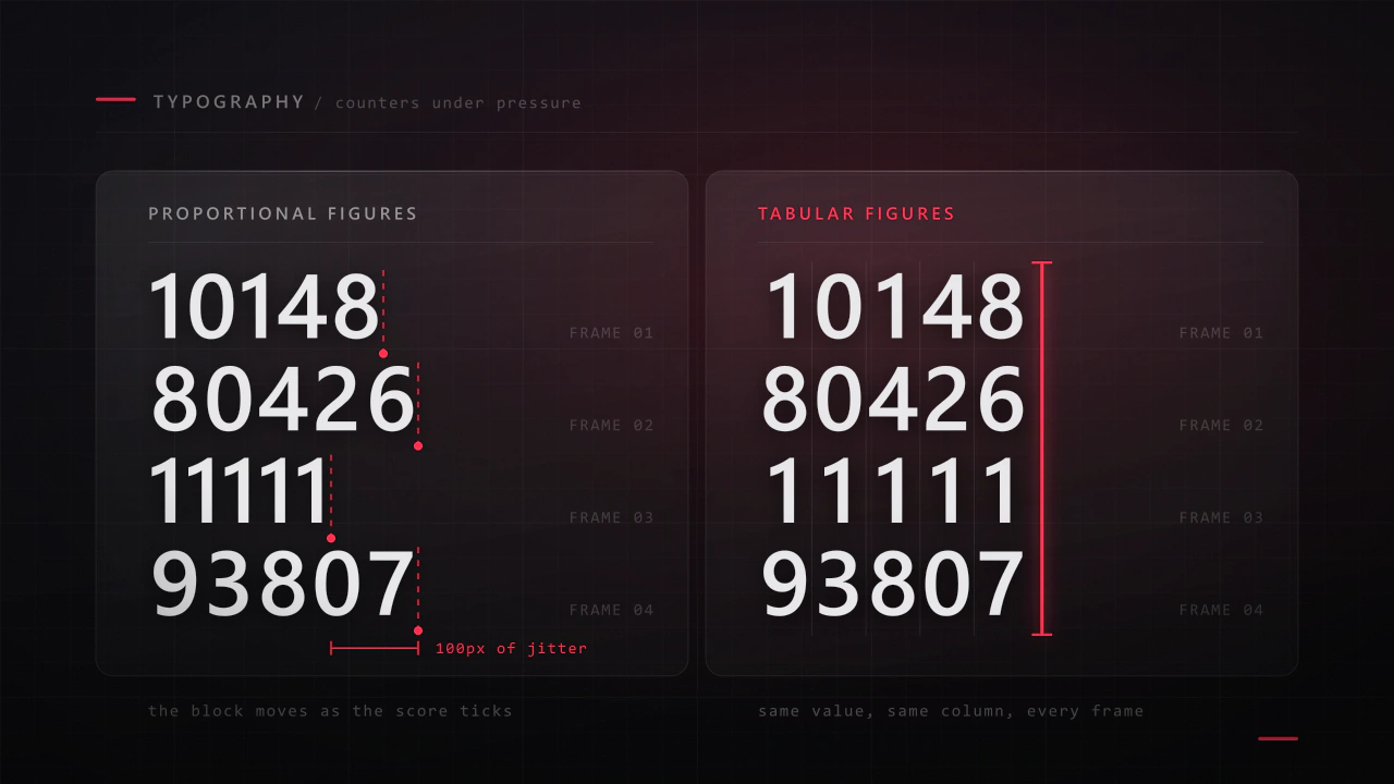
Interface type is read in half a second, at speed, over moving artwork, by somebody who did not come to your game to read. Almost every rule that applies to a book works against you here, and the fixes are specific.
Read the article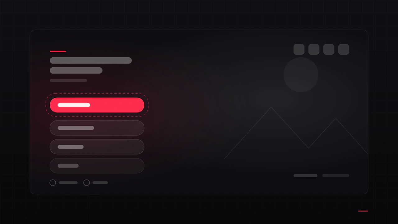
It is the first screen anyone sees, it appears in every screenshot you will ever take, and it is usually designed in an afternoon near the end of production. Here is what belongs on it, in what order, and the decisions that make it feel like a real game rather than a template.
Read the articleMore fonts
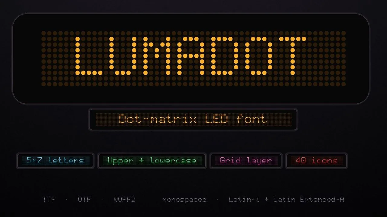 Font · $6.99
A 5×7 dot-matrix LED font for race timers, scoreboards and terminals, with a Grid layer for the unlit dots, 40 display icons and progress-bar segments.
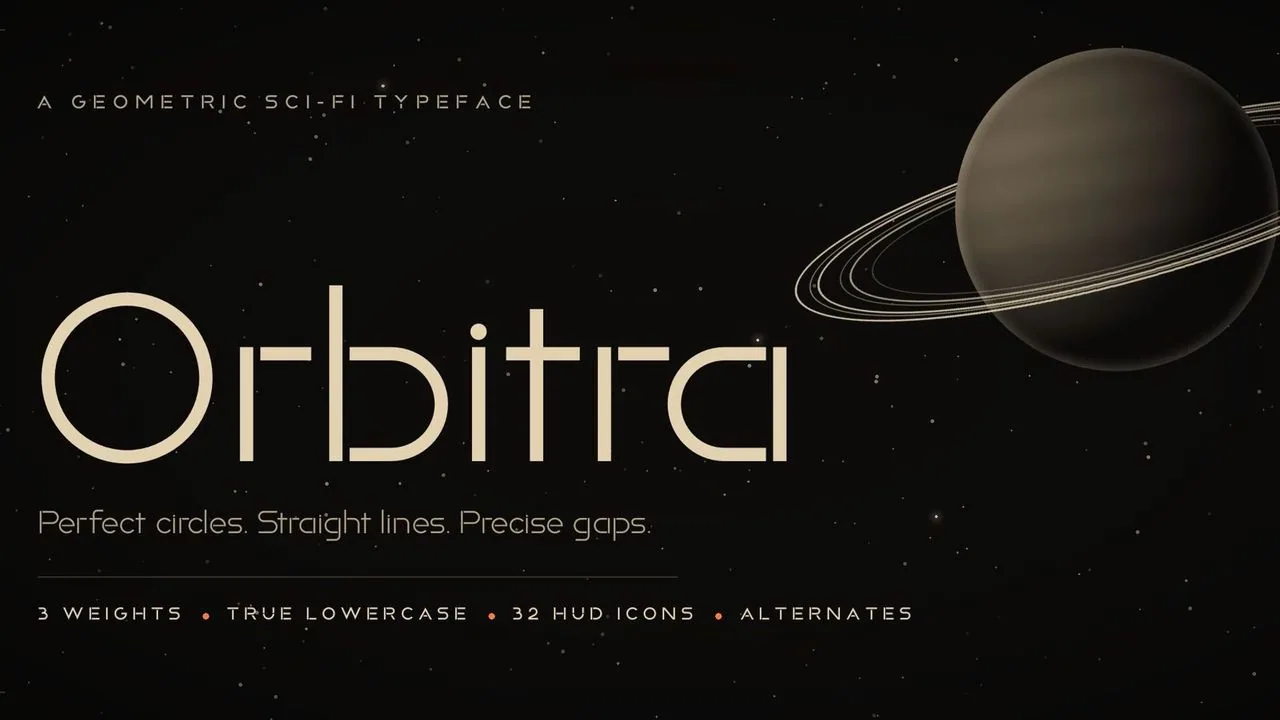 Font · $6.99
A geometric sci-fi font of true circles, straight bars and small gaps, in three weights, with 32 matching HUD icons you type like letters, for space games.
Contact
Menus, HUDs, full UI systems or a single screen that isn't working. Tell me what you're building and I'll tell you honestly whether I'm the right fit.