01
As a game title
A haunted-manor title screen: the name set large, the chapter subtitle in lilac, and the menu in the same face at a small size, still easy to read.
A gothic horror typeface with living thorns · v1.000
Hollowthorn is a gothic horror typeface for dark games, haunted stories and Halloween designs. Tall, narrow letters with sharp spear points and curved thorns that grow out of the strokes, and unlike most blackletter, it stays easy to read.
Type tester
Type a repeated letter, like HHH or ooo: every copy grows different thorns. Switch them off for the clean set.
The candles went out at midnight
The candles went out at midnight
The candles went out at midnight
The candles went out at midnight
This preview covers Basic Latin and the icons. The full font adds every accented letter, the arrows and the fractions.
Features
A readable gothic horror typeface for dark games and haunted stories, whose thorns change as you type, with 20 matching spooky icons.
Every letter has three thorn designs, and Contextual Alternates switch between them as you type, so repeated letters never look copy-pasted.
Stylistic Set 1 gives every letter a clean, thornless version for small sizes and longer passages.
Tall, narrow letters with spear points that stay easy to read, so the same face works for the logo, the menus, the journal and the inventory.
Skulls, bats, ghosts, pumpkins, candles, spiders, coffins, ravens, cauldrons, potions, lanterns and more, typed right next to the text.
Proportional figures by default for text, and tabular figures for timers, counters and anything that must not jump.
Upper and lowercase with the accented letters Western and Central European languages need, plus 6,845 kerning class pairs that take the thorns into account.
Built-in icons
Each icon is a character in the font. Click one to copy it, then paste it into anything set in Hollowthorn.
Case study
Horror games want gothic type, and gothic type usually means blackletter: gorgeous on a title card, unreadable by the third line of a journal entry. So the logo gets the blackletter, everything else falls back to a plain font, and the dread drains out of the interface.
With Hollowthorn I kept the gothic shape, the tall narrow letters and sharp spear points, but built it on a readable skeleton, so one typeface can run the title screen, the menus, the journal and the inventory.
The thorns are what make it feel alive, and a font that repeats the same thorn on every H looks stamped. So I gave each letter three thorn designs, and the font switches between them on its own as you type, using OpenType Contextual Alternates. Type HHH and you get three different letters.
Each thorn grows from a fixed height on its side of the letter, so the thorns line up across a word and never cross into the next letter. For small sizes or long passages, there's a thornless version of every letter in Stylistic Set 1, so the journal can stay calm while the title stays sharp.
I carried the spear motif into the small things too: a pointed A and V, chamfered corners, and diamond-shaped dots, accents and punctuation. Even < and > are single pointed strokes, so they match the rest and stay clear of the numbers beside them.
The 20 icons are solid silhouettes built from straight lines and true circular arcs, drawn at one optical size and centred on the cap height. I made the spider web out of thick threads with open gaps so it stays clear at small sizes, and every icon lives on a Private Use code that never turns into a colour emoji.
The font files pass the OpenType Sanitizer that Chrome and Firefox use, and Font Bakery reports no failures. I checked 133,621 glyph pairs with kerning, including every combination of thorn variants. Each letter is measured by the outline of all its variants together, so the result holds whichever thorns meet, and letters never touch.
Kerning runs to 6,845 class pairs, checked in HarfBuzz and with FreeType's classic kerning call. I tested the living thorns, the thornless set, both kinds of numbers and all 20 icons in a browser, and went through every glyph and all three thorn variants at large size.
A haunted-manor title screen: the name set large, the chapter subtitle in lilac, and the menu in the same face at a small size, still easy to read.
A journal entry, an inventory and a light and sanity panel. Long passages stay readable, and the key, candles, elixir and knife are icons typed from the font.
Thorns that change on repeated letters, the thornless set for smaller text, Western and Central European languages, and proportional figures with tabular ones on demand.
Every icon with its Private Use code, from the skull and bat to the broken heart and the moon.
Upper and lowercase, numbers, punctuation, currency and the accented letters of Latin-1 and Latin Extended-A.
What you get
Included with every purchase
Ask me first
Please don't share or resell the font files. For anything the license doesn't cover, email me. idris.hadjoudj@gmail.com
FAQ
They use Contextual Alternates (calt), which is on by default in most apps, browsers and engines, so there is nothing to set up. Turn on Stylistic Set 1 (ss01) for the thornless letters.
In engines that apply OpenType features they will. Engines that can't switch features on, such as Unity's TextMeshPro, show the default thorns on every letter and proportional numbers; everything else works normally.
Every icon has a Private Use code from U+E101 to U+E114, which always shows the Hollowthorn drawing; the README lists them all, with examples for Unity, Godot and CSS. You can also copy any icon from the grid on this page.
Yes. Games and apps are included with unlimited copies sold, as long as the font files are packaged inside the game rather than handed to players as installable fonts. Logos and brand identities are included with no extra fee.
Western and Central European languages written in the Latin alphabet, from French, German and Spanish to Polish, Czech, Hungarian, Romanian and Turkish.
Related reading
Longer write-ups on the craft this font draws on.
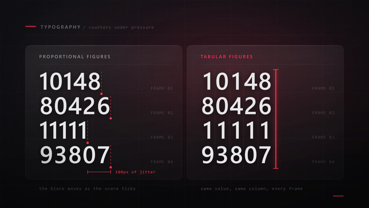
Interface type is read in half a second, at speed, over moving artwork, by somebody who did not come to your game to read. Almost every rule that applies to a book works against you here, and the fixes are specific.
Read the article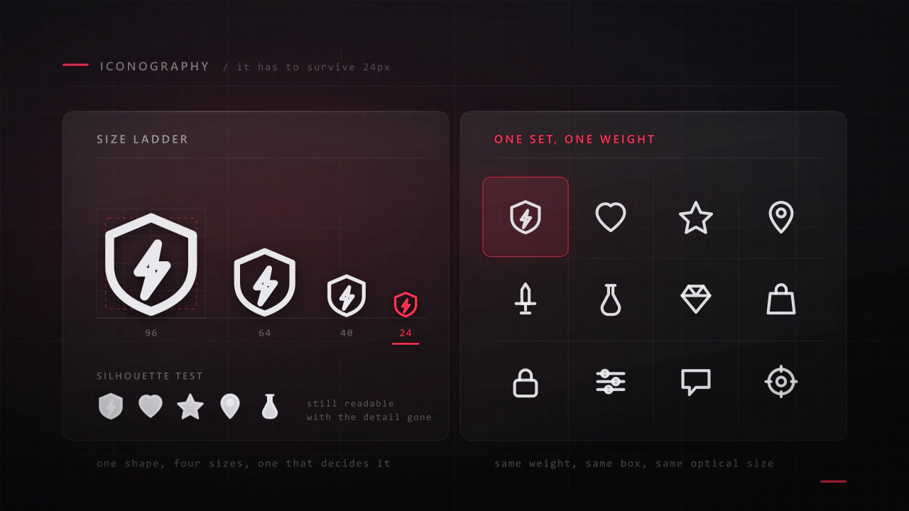
An icon has about a fifth of a second and a few hundred pixels to say what a thing is. Most game icon sets fail not because the drawings are bad, but because they were drawn large, one at a time, by different rules.
Read the articleMore fonts
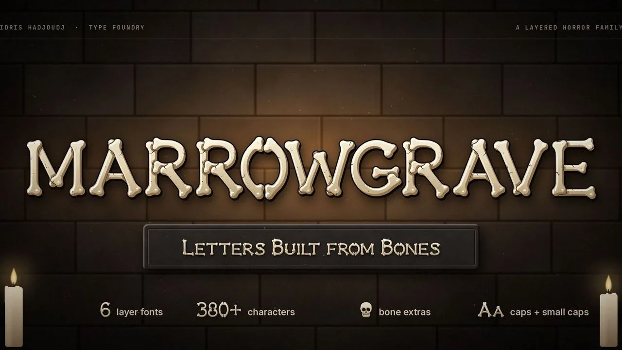 Font · $6.99
Horror capitals assembled from bones, with knuckled ends, seams and cracks, in five layers that stack into shaded bone, a one-colour Solid and crypt extras.
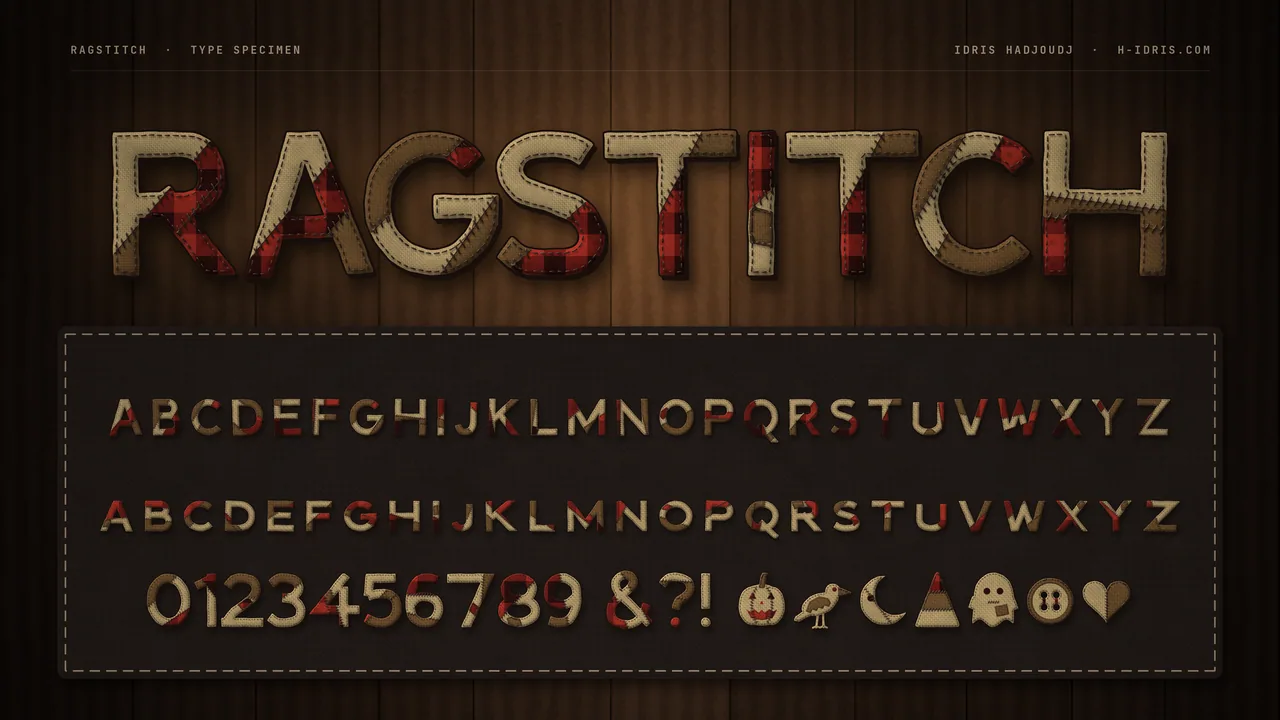 Font · $6.99
A patchwork horror display family for Halloween and harvest games: five layer fonts that stack into full-colour stitched letters, a one-colour Solid style, and 15 harvest extras.
Contact
Menus, HUDs, full UI systems or a single screen that isn't working. Tell me what you're building and I'll tell you honestly whether I'm the right fit.