01
As a game title
A survival-horror title screen: Torn layered over Solid in red for the name, small capitals for the subtitle, and the menu set in Solid where it has to be read quickly.
A horror typeface torn by claws · v1.000
Feralmark is a heavy horror display typeface for creature features, survival horror and anything that should look like something got to it first. Wide, blade-cut capitals, and in the Torn style every letter ripped by three curved claw marks.
Type tester
Lowercase keys type small capitals. Torn is layered over Solid in red here: switch it off to see Torn alone.
Survive the Night
Survive the Night
Survive the Night
Survive the Night
This preview covers Basic Latin and the icons. The full font adds every accented letter, the arrows and the fractions.
Features
A heavy horror display face for creature features and survival horror, in Torn and Solid styles that stack for colour in the claw marks, with 20 survival icons.
Two styles with exactly the same spacing. Use Torn alone, or stack it over Solid in a second colour so blood red, toxic green or firelight shows through every claw mark.
Every letter and figure has three different claw patterns that switch automatically as you type, so EEE or 000 never look copy-pasted.
The lowercase keys type small capitals, so a title like Survive the Night reads clearly and all-caps text stays heavy and even.
Claw marks, paw print, skull, bone, blood drop, med kit, syringe, ammo, flashlight, battery, key card, radiation, crosshair, warning sign and more, never torn so they stay clear in a HUD.
Proportional figures by default, and tabular figures for scores, timers and ammo counters that must not jump.
Western and Central European languages, with 4,357 kerning class pairs plus exceptions for accents, shared by both styles.
Built-in icons
Each icon is a character in the font. Click one to copy it, then paste it into anything set in Feralmark.
Case study
Creature horror needs a title that looks attacked. The usual answer is a grunge font with random scratches, which reads as damage but not as anything with claws, and turns into noise the moment you use it for a HUD or a menu.
So I started from a clean, heavy, wide capital and tore it on purpose: three curved claw marks per letter, all raking in the same direction, so a word looks like a single swipe went straight through it.
Everything is cut the same way. The free ends of strokes are sliced 26 degrees off square in the same direction as the claws, and round letters get a steep cut on two opposite corners, so the letters feel blade-cut even in the Solid style.
I drew the claw marks as curved crescents, pointed at both ends and widest in the middle, because straight slits read as speed lines rather than wounds. Each letter has three claw patterns, each one placed so every gash cuts through ink without leaving crumbs, hairline slivers or grazed corners, and the font rotates between them as you type.
Torn is Solid minus the claw marks, glyph for glyph, with identical widths and kerning, so you can stack the two: Solid underneath in red, toxic green or firelight, and Torn on top. The same line measures exactly the same in both styles, so the layers never drift apart.
I never tear accents or punctuation, so they stay clear at small sizes. The 20 survival icons are identical in both styles and never torn either, so they read cleanly in a HUD.
All six font files pass the OpenType Sanitizer that Chrome and Firefox use, and Font Bakery reports no failures. I checked 134,426 glyph pairs with kerning, and letters never touch.
Kerning runs to 4,357 class pairs plus 389 exceptions for accents, checked in HarfBuzz and stored as a classic kern table for older engines. I tested the rotating claws, both kinds of numbers, the Turkish and Romanian letter forms and all 20 icons in a browser and in HarfBuzz, and went through every glyph in both styles and all three claw patterns.
A survival-horror title screen: Torn layered over Solid in red for the name, small capitals for the subtitle, and the menu set in Solid where it has to be read quickly.
An objective panel, an inventory, health and light bars, and an ammo count with a timer. Every icon is a character from the font, and the numbers stay in place with tabular figures.
Torn over Solid, claw patterns that rotate on repeated letters, small capitals on the lowercase keys, and proportional figures with tabular ones on demand.
Every icon with its Private Use code, from the claw marks and paw print to the radiation sign and the lock.
Both styles: capitals, small capitals, numbers, punctuation, currency and the accented letters of Latin-1 and Latin Extended-A.
What you get
Included with every purchase
Ask me first
Please don't share or resell the font files. For anything the license doesn't cover, email me. idris.hadjoudj@gmail.com
FAQ
Set the text in Feralmark Solid in the colour you want inside the marks, duplicate it on top, switch the copy to Feralmark Torn and give it the main colour. The styles share every width and kerning pair, so the layers line up exactly. The README has a ready-made web example.
Solid. Torn is a display style: below about 24 px the claw marks get busy, so menus, stats and dialogue read better in Solid.
In engines that apply OpenType features they will, with nothing to set up. Engines that can't switch features on, such as Unity's TextMeshPro, use the first claw pattern on every letter and proportional numbers; layering and everything else work normally.
Yes. Games and apps are included with unlimited copies sold, as long as the font files are packaged inside the game rather than handed to players as installable fonts. Logos and brand identities are included with no extra fee.
Most Latin-script languages, including French, German, Spanish, Portuguese, Italian, Dutch, the Nordic languages, Polish, Czech, Slovak, Hungarian, Romanian, Croatian, Turkish and the Baltic languages.
Related reading
Longer write-ups on the craft this font draws on.
A game logo has a harder job than a company logo. It has to work as a Steam capsule, an app icon, a 16-pixel favicon, a watermark on a stream and a print on a t-shirt, often in one colour. Here is what makes one survive that, and what it costs to get.
Read the article
Players rarely say "the HUD is bad". They say the game feels cluttered, or confusing, or cheap, and then they refund it. These are the seven causes I find most often, what each one is really costing you, and how to check your own game against them.
Read the articleMore fonts
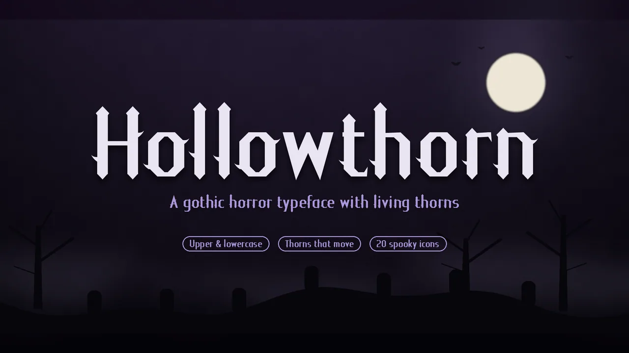 Font · $6.99
A readable gothic horror typeface for dark games and haunted stories, whose thorns change as you type, with 20 matching spooky icons.
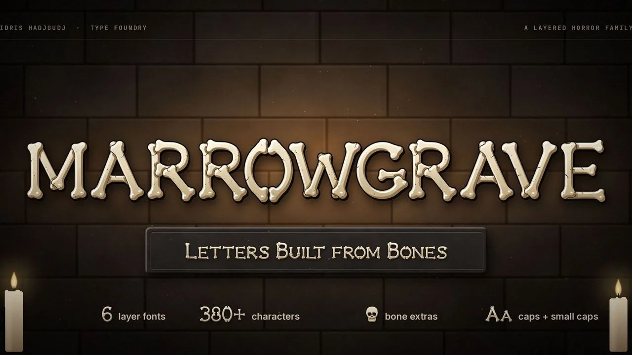 Font · $6.99
Horror capitals assembled from bones, with knuckled ends, seams and cracks, in five layers that stack into shaded bone, a one-colour Solid and crypt extras.
Contact
Menus, HUDs, full UI systems or a single screen that isn't working. Tell me what you're building and I'll tell you honestly whether I'm the right fit.