Typography for game UI: the part players read under pressure
Interface type is read in half a second, at speed, over moving artwork, by somebody who did not come to your game to read. Almost every rule that applies to a book works against you here, and the fixes are specific.
In this article
Open to new projects
Hadjoudj Idris
Game UI/UX Designer
Upwork100% Job Success
Hire me Browse the workTypography is the fastest way to tell whether an interface was designed or assembled. It is also the part most often decided by whoever needed a font that Tuesday, usually by picking the one that matched the logo, which is the single most reliable way to make a HUD hard to read.
Two typefaces, two jobs
Your game needs a display face and an interface face, and they are almost never the same thing.
- The display face carries the identity: the logo, the title screen, chapter cards, key art. It can be heavy, distressed, condensed, strange. It is read once, large, slowly.
- The interface face carries everything else: the HUD, menus, item names, numbers, settings, subtitles. It is read hundreds of times, small, in motion. It has to be boring, and boring is the compliment.
- Using the display face for interface is the most common typographic mistake in indie games. A face designed to look like carved stone at 200px becomes mud at 16px over a gameplay background.
- The relationship is the design. The two faces should feel like they belong to the same game without doing the same job, which is usually a matter of shared proportion rather than shared style.
The logo has its own rules and its own article: game logo design. Everything below is about the second face.
Choosing an interface face
The criteria are unglamorous and they are what separates a face that survives production from one that gets replaced in month four.
- Open apertures. The gaps in a, c, e, s stay open at small sizes. Closed apertures fill in and every letter starts to look like an o.
- Unambiguous characters. Check 1, l and I together, and 0 against O. Players read item codes, server names and seeds, and a face that confuses those creates support tickets.
- Real weights, at least three. Regular, medium and bold. Hierarchy built from weight is cheaper than hierarchy built from size, and it costs no space.
- Good numerals, which is the next section and is more important than it sounds.
- Language coverage for everywhere you ship, including the extended Latin your European languages need.
- No personality at small sizes. Whatever charm the face has should live in the display face. Interface type should disappear.
Numerals: the fix nobody knows about
This one costs nothing and improves every counter in your game. Most fonts default to proportional figures, where a 1 is narrower than a 8. In running text that is correct and invisible. In a HUD it means the number physically changes width as it counts, so your ammo counter, timer and score jitter and shift every frame.
- Use tabular figures for anything that changes: timers, ammo, health values, currency, scores, damage numbers, stats in a list.
- Use them for anything in a column, so prices and stats line up on the decimal rather than drifting.
- Most quality faces include them, either as the default or as a switchable feature. If your chosen face has no tabular set, that is a genuine reason to reject it.
- Lining figures, not old-style. Old-style numerals with descenders belong in body text, not in an interface.
- Fix the alignment too. Right-align anything counting up, so the digits grow leftwards into space rather than pushing the label around.
If your timer wobbles as it counts, that is not a layout bug. That is proportional figures, and it is one checkbox away from fixed.
The type scale
Pick four to six sizes and use only those. Games accumulate sizes the way they accumulate currencies: every screen adds one, and after a year nothing relates to anything.
| Role | Typical use | Rule |
|---|---|---|
| Display | Screen titles, results headings | One or two per screen at most |
| Heading | Section titles, item names | The thing the eye lands on first |
| Body | Descriptions, dialogue, settings labels | The floor for anything a player reads |
| Caption | Secondary values, hints, metadata | Never for anything required |
| Numeric | HUD counters, prices, stats | Tabular figures, often its own size |
Then set a floor per platform, because the same design ships to very different reading distances.
| Platform | Body text floor | Check it by |
|---|---|---|
| Desktop PC | About 16px at 1080p | Sitting at normal desk distance, not zoomed in |
| Console on a TV | Roughly double desktop | Standing across the room from a real television |
| Handheld PC | Comfortable at 1280 × 800 on a 7-inch panel | Viewing the design at 50 percent scale |
| Mobile | 14 to 16 points minimum | Outdoors, at half brightness |
Weight, and why thin fails
- Thin and light weights disintegrate over texture, at distance, and through VR lenses. They look elegant in a mockup and vanish in the game.
- Build hierarchy with weight before size. A medium next to a regular reads as a hierarchy without costing a single pixel of space.
- Do not use more than three weights in the interface. Four is where a design starts to look uncertain.
- Beware of faux bold. If the engine synthesises a bold from a regular, the result is muddy at small sizes. Ship the real weight.
Contrast: your type sits on moving art
A book's page does not change. Your background is bright one second and black the next, and any legibility borrowed from the scene will fail in the snow level.
- Give text its own contrast: a low-opacity scrim, a subtle outline, or a soft shadow. Pick one method and use it everywhere.
- Outlines need to be proportional. A heavy outline at 16px eats the letterforms; test rather than guess.
- Test against your brightest level, not the grey box scene. This is the same rule as in seven HUD mistakes, because it is the same failure.
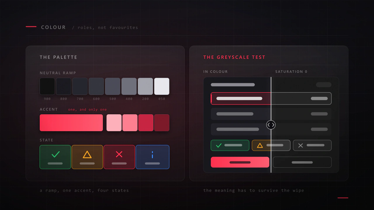
- Do not rely on colour for contrast. Desaturate a screenshot: if the text disappears, it was surviving on hue.
- Check subtitles separately, because they sit over the busiest possible background by definition. The rules are in game UI accessibility.
Blocks of text, and how little of them is read
- Cap line length. Around 45 to 75 characters is comfortable; a paragraph running the full width of a 21:9 monitor is unreadable and looks unconsidered.
- Line spacing carries more than size does. Tight leading is the fastest way to make a readable size feel unreadable.
- Break it up. Two short paragraphs beat one long one, and a list beats both.
- Assume skipping. Whatever the paragraph says, the design has to work for the player who read only the first line. That is a UX writing problem as much as a typographic one.
Case, tracking and the all-caps trap
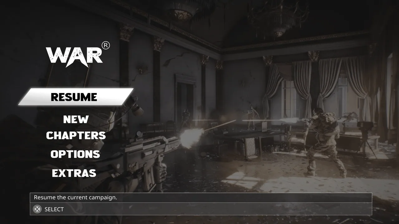
- All caps works for short labels and destroys long ones. Uppercase removes the word shapes people read by, so a sentence in caps is read letter by letter.
- Add tracking to caps, always. Uppercase set at the same tracking as lowercase looks cramped.
- Do not track small text loosely. Below body size, extra letter-spacing pulls words apart and slows reading.
- Never fake small caps by shrinking uppercase. The weights stop matching and it shows.
- Sentence case for anything explanatory, caps for short buttons and labels if the art direction wants them.
The text that is not English
Even if you never localise, designing as though you will produces a more robust layout. If you do localise, this is where typography turns into a production problem.
- Design against the longest string, not the English one. Many languages run significantly longer, and a label fitted exactly to English will break.
- Non-Latin scripts need coverage or a fallback, and a fallback face that looks nothing like the original undoes your typography in exactly the markets you paid to enter.
- Vertical metrics differ. Scripts with taller ascenders or complex diacritics need more line height than your English mock-up implied.
- Right-to-left is a layout change, not a text change. Plan for it or decide explicitly not to ship those languages.
- In Unity this lands on TextMeshPro fallbacks and atlases, covered in designing game UI for Unity.
Licensing, briefly
A desktop licence usually does not cover embedding a font in a shipped game, and game licences are priced separately. Settle this before a hundred screens are set in a face you cannot legally ship. The detail is in what to send your UI designer.
A type audit
- Screenshot a busy gameplay frame and a menu. Count the distinct type sizes. More than six is a scale problem.
- Count the typefaces. More than two in the interface needs a defence.
- Watch a counter tick up. Does anything shift? If so, switch to tabular figures.
- Set your smallest text over your brightest background. Still readable?
- Desaturate the screenshot. Does any text disappear?
- Stand at real playing distance for your platform and read the settings screen.
- Find the longest item name in the game and check it in every place it appears.
- Make one label 40 percent longer and see what breaks.
- Check whether any bold is synthesised rather than a real weight.
- Read one full paragraph of in-game text out loud. Would you have read it as a player?
What font should I use for game UI?
There is no single answer, but the criteria are consistent: open apertures, unambiguous 1, l, I and 0, at least three real weights, tabular figures, and coverage for every language you ship. A neutral, well-built interface face plus a distinctive display face for the logo and titles is the arrangement that works for most games.
Why do my HUD numbers jump around as they change?
Proportional figures, where each digit has a different width. Switch to tabular figures, which are fixed width, and right-align anything that counts up. Most quality typefaces include them, either by default or as a feature you enable.
Can I use my logo font in the interface?
For a few large moments, yes: the title screen, chapter cards, a results heading. Not for the HUD, menus, item text or anything small, because display faces are drawn for size and personality rather than for legibility at 16 pixels over moving artwork.
How big should game UI text be?
Around 16px at 1080p is a working floor for desktop body text, roughly double that for a television, and 14 to 16 points minimum on mobile. Rather than trusting a number, set real text at real size and check it on the smallest display you support, in your brightest level.
How many typefaces should a game use?
Two: one display, one interface. Three if a specific diegetic surface genuinely needs its own voice, such as terminals in the world. Beyond that you are adding inconsistency rather than range, and it is one of the eight tells listed in why game UI looks amateur.
Is all caps bad for game interfaces?
Not for short labels and buttons, where it reads as deliberate and often suits the art direction. It is bad for anything longer than a few words, because uppercase removes the word shapes people read by. If you use caps, add tracking, and never set a sentence in them.
Hadjoudj Idris
Game UI/UX Designer, Remote, worldwide
Need this done properly on your game?
Menus, HUDs, a full UI system, or one screen that isn't working. Tell me what you're building and I'll tell you honestly whether I'm the right fit, and what it would cost.
Upwork100% Job Success