01
As a game title
A title screen set entirely in Aerovant: Bold for the name, Light for the subtitle and the prompt, Regular for the HUD corners. Same-width numbers keep the shield and altitude readouts steady.
A wide sci-fi display typeface · v1.102
Aerovant is a wide, sleek sci-fi display font built for titles that need to feel fast and futuristic. Extended proportions, smooth rounded corners and flat-cut diagonals give it a confident, high-tech look.
Type tester
All caps by design: type in lowercase and Aerovant sets capitals, so every word keeps its shape.
Hyperdrive online in 00:42
Hyperdrive online in 00:42
Hyperdrive online in 00:42
Hyperdrive online in 00:42
This preview covers Basic Latin. The full font adds every accented capital, the currency symbols and the arrows.
Features
A wide, sleek sci-fi display font for titles that need to feel fast and futuristic: game titles, logos, HUDs, thumbnails and esports graphics.
Light for thin interface labels and readouts, Regular for menus and subtitles, Bold for titles and logos that have to hit hard.
Lowercase keys type capitals, so a word keeps its look however it was typed, including strings that arrive from a localisation sheet in mixed case.
Capitals, numbers, punctuation, currency and arrows, plus the accented letters Western and Central European languages need.
Every digit is the same width, and so are + − × ÷ = < >, so scores, timers and prices line up in columns and never shift as they count.
Built-in kerning, stored as modern OpenType kerning and as a classic kern table, so older apps and game engines space it correctly too.
Game titles, logos, HUDs, video thumbnails and esports graphics: the places a sci-fi face actually has to work.
Case study
A sci-fi title has to feel fast before anyone has actually read it, and wide letters do a lot of that work on their own. Stretched-out proportions read as speed and horizon, the same way they do on spacecraft hulls and race cars.
But in a game, the title font never stays in the logo. It ends up on the main menu, in HUD readouts, on a 200-pixel thumbnail and on stream overlays. I wanted Aerovant to hold up across that whole run, not just as one big word on a splash screen.
Three decisions shape every letter. The proportions are extended, so words stretch out. The outer corners all share one rounded radius, which keeps it feeling machined rather than aggressive. And the diagonals are cut flat where they end, so A, K, R and V finish on clean horizontal edges that line up with the rest of the word.
I made it all caps on purpose. A wide display face gains very little from a lowercase, and in a game it loses a lot when a string shows up in the wrong case. So the lowercase keys simply type capitals, and every word keeps its look.
The numbers are built for interfaces. All ten digits share one width, and so do the maths signs, so a score, a countdown or a column of prices never wobbles.
Wide letters make small mistakes big, and the Light weight shows everything. In the final pass I rebuilt every diagonal so it meets its stem or bar exactly at a corner. The N's diagonal now starts at the inner top corner of one stem and ends at the inner bottom corner of the other, M, Z and 7 run straight out of their bars, and V and W lost the tiny spurs at their points. B now shares one waist stroke with a single clean notch, like the 8.
I rebuilt the rounded corners too. Early versions approximated each corner with lots of short straight segments. The fonts I ship use true curves with points at their extremes, which cut the number of points by more than half and keeps the outlines clean in any font editor.
All nine font files pass the OpenType Sanitizer that Chrome and Firefox use, and Font Bakery reports no failures. I set every pair of glyphs, 54,289 per weight, with kerning applied, and no pair comes closer than 60 units in 1,000, so nothing ever touches.
I checked the kerning in HarfBuzz, which browsers, modern apps and most engines use, and with FreeType's classic kerning call for older ones. Light, Regular and Bold group as one family in design apps, and I went through every glyph at large size in all three weights.
A title screen set entirely in Aerovant: Bold for the name, Light for the subtitle and the prompt, Regular for the HUD corners. Same-width numbers keep the shield and altitude readouts steady.
Light, Regular and Bold share the same wide skeleton, so they mix in one layout: a light label above a bold value reads as one system rather than two fonts.
Wide proportions, one consistent corner radius, and diagonals cut flat where they end. The N's diagonal meets each stem exactly at its inner corner, with no beak or foot.
Capitals, same-width numbers, punctuation, currency, the © ® ™ marks and arrows, 370 characters in each weight.
Hungarian double acutes, Polish dots and strokes, Czech carons, Romanian comma-below letters, the French Œ, German ß, Danish Ø and the Turkish dotted İ, all redrawn as capitals.
What you get
Included with every purchase
Ask me first
Please don't share or resell the font files. For anything the license doesn't cover, email me. idris.hadjoudj@gmail.com
FAQ
No, and on purpose. Aerovant is an all-caps display face: lowercase keys type the capitals, so text keeps its look however it was typed.
Any engine that loads TTF or OTF fonts, including Unity, Unreal, Godot and GameMaker. Kerning is stored twice, as modern OpenType kerning and as a classic kern table, so engines that only read the older format still space it correctly.
Yes. Logos and brand identities are included with no extra fee, and so are games and apps with unlimited copies sold, as long as the font files are packaged inside the product rather than handed to players as installable fonts.
Yes. WOFF2 web fonts are included, and web use is unlimited, with no cap on page views or traffic.
Western and Central European languages written in the Latin alphabet, including French, German, Spanish, Portuguese, Italian, Dutch, the Nordic languages, Polish, Czech, Slovak, Hungarian, Romanian, Croatian, Slovenian, Turkish and the Baltic languages.
Related reading
Longer write-ups on the craft this font draws on.
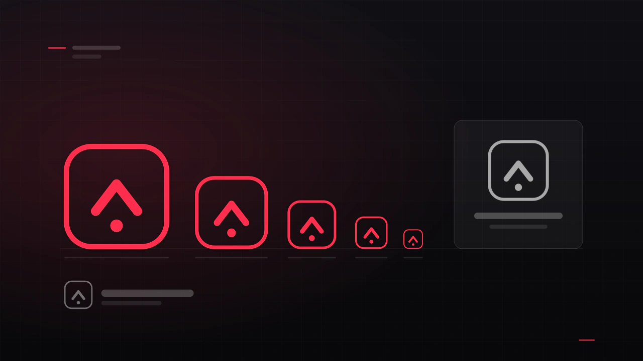
A game logo has a harder job than a company logo. It has to work as a Steam capsule, an app icon, a 16-pixel favicon, a watermark on a stream and a print on a t-shirt, often in one colour. Here is what makes one survive that, and what it costs to get.
Read the article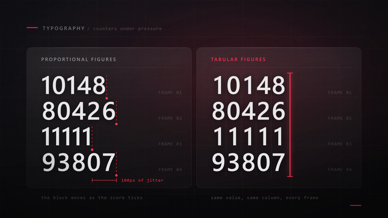
Interface type is read in half a second, at speed, over moving artwork, by somebody who did not come to your game to read. Almost every rule that applies to a book works against you here, and the fixes are specific.
Read the articleMore fonts
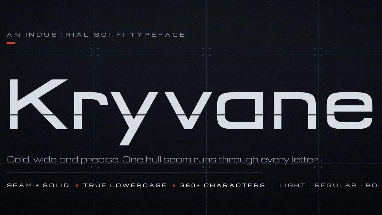 Font · $6.99
A cold, wide industrial sci-fi font in six styles: Kryvane, with a hull seam through every letter, for titles, and Kryvane Solid for HUDs and small text.
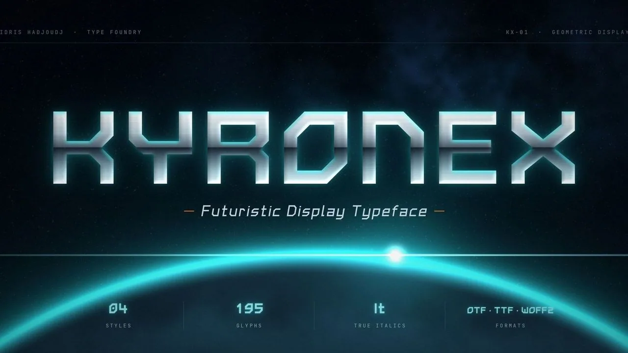 Font · $6.99
A geometric sci-fi font of straight strokes and 45° chamfers for HUDs, menus and space titles, in Regular, Bold and two true italics drawn for the slant.
Contact
Menus, HUDs, full UI systems or a single screen that isn't working. Tell me what you're building and I'll tell you honestly whether I'm the right fit.