01
As a game title
An expedition title screen: the name set large with the stencil bridges on show, an amber subtitle, and the start prompt in the same face at a much smaller size.
An expedition stencil typeface · v1.000
Ridgecut is a rugged expedition stencil for adventure games, survival titles and outdoor brands. Sturdy, slightly condensed letters, stencil bridges, chamfered crate-stamp corners and one angled cut on the top right of every letter.
Type tester
The stencil bridges show from about 24 px up, so every row here starts there.
Reach base camp by nightfall
Reach base camp by nightfall
Reach base camp by nightfall
Reach base camp by nightfall
This preview covers Basic Latin. The full font adds every accented letter, the arrows and the fractions.
Features
A rugged stencil typeface for adventure games, survival titles and outdoor brands, with a full lowercase so the same font runs from the title screen to the inventory.
Most stencil fonts are capitals only. Ridgecut has a full lowercase, so the same face works for the title, the quest log, the inventory and the packaging.
Stencil bridges, chamfered corners and a signature angled cut on the top right of every letter give it a field-gear identity of its own.
Upper and lowercase, numbers, punctuation, currency, arrows and fractions, with the accented letters Western and Central European languages need.
Every digit is the same width, and so are + − × ÷ = < >, so days, timers, altitude and ammo counts line up and never shift.
3,140 kerning class pairs plus exceptions for accents, stored as modern OpenType kerning and as a classic kern table for older engines.
Titles, inventories, quest logs, maps and outdoor branding: anywhere that should feel like it was painted onto a supply crate.
Case study
Adventure and survival games love stencil type. It says expedition, supplies, somewhere far from help. The trouble is that stencil fonts are almost always capitals only, which makes them a logo font and nothing more. The moment the game needs a quest log or an inventory, you have to switch to something else, and the world loses its voice.
I built Ridgecut to stay on screen for the whole game: a title face with a real lowercase, readable enough for interface text and still clearly stamped onto a supply crate.
A stencil lives or dies by where the bridges go, so I placed every cut where the letter still reads. The bowls of B, D, P and R share the stem with a single slit, so you see a B and a D rather than an I standing next to a bowl, and letters like b, d, p, q, a, g, h, n and u never get doubled stems.
The small things mattered too. The slits in V, W and Y end exactly at the inner corner, so no slivers show up. I kept the plus sign solid, because a split one looked like a division sign, and I left the tails of l and t attached, because a separate tail read like a full stop.
The bridges are 30 units wide, so they show from about 24 px and fade at text sizes, where the letters simply read as solid. That's deliberate: the stencil carries the title, and the small text stays easy to read.
Ridgecut is drawn entirely in straight lines, with chamfered corners instead of rounded ones, and that's what gives it the crate-stamp look. The outlines are clean in any font editor, with no overlaps, no tiny pieces and no segments shorter than 4 units.
The angled cut on the top right of every letter is the one detail that's the same everywhere. It's what makes a word set in Ridgecut look like one piece of kit instead of a row of separate stamps.
All three font files pass the OpenType Sanitizer that Chrome and Firefox use, and Font Bakery reports no failures. I set 119,439 glyph pairs with kerning applied, and no pair comes closer than 60 units, twice the width of a stencil bridge, so letters never touch or read as one shape.
I checked the kerning in HarfBuzz and with FreeType's classic kerning call for older engines, and went through every glyph at large size, with text proofs in English and in Central European languages.
An expedition title screen: the name set large with the stencil bridges on show, an amber subtitle, and the start prompt in the same face at a much smaller size.
An inventory, a quest update and a day, time and altitude readout. Lowercase item names read cleanly, and the same-width numbers keep the quantities and the clock in one column.
Stencil bridges in every letter, chamfered crate-stamp corners, the signature cut on the top right, and a full upper and lowercase for titles and interface text.
Capitals, lowercase, same-width numbers, punctuation, currency, arrows and maths signs: 371 characters.
Spanish, German, Polish, Czech, Danish, Romanian, Turkish and French, with every accent cut to match the stencil.
What you get
Included with every purchase
Ask me first
Please don't share or resell the font files. For anything the license doesn't cover, email me. idris.hadjoudj@gmail.com
FAQ
Yes. The stencil bridges show from about 24 px and fade at smaller sizes, where the letters read as solid, so menus, item names and quest text stay easy to read.
Yes, a full lowercase, which is what sets it apart from most stencil fonts. It is designed for titles and interface text alike.
Any engine that loads TTF or OTF fonts, including Unity, Unreal, Godot and GameMaker. Kerning is stored twice, as modern OpenType kerning and as a classic kern table, so older engines space it correctly too.
Yes. Games and apps are included with unlimited copies sold, as long as the font files are packaged inside the game rather than handed to players as installable fonts. Logos and brand identities are included with no extra fee.
Western and Central European languages written in the Latin alphabet, including French, German, Spanish, Portuguese, Italian, Dutch, the Nordic languages, Polish, Czech, Slovak, Hungarian, Romanian, Croatian, Slovenian, Turkish and the Baltic languages.
Related reading
Longer write-ups on the craft this font draws on.
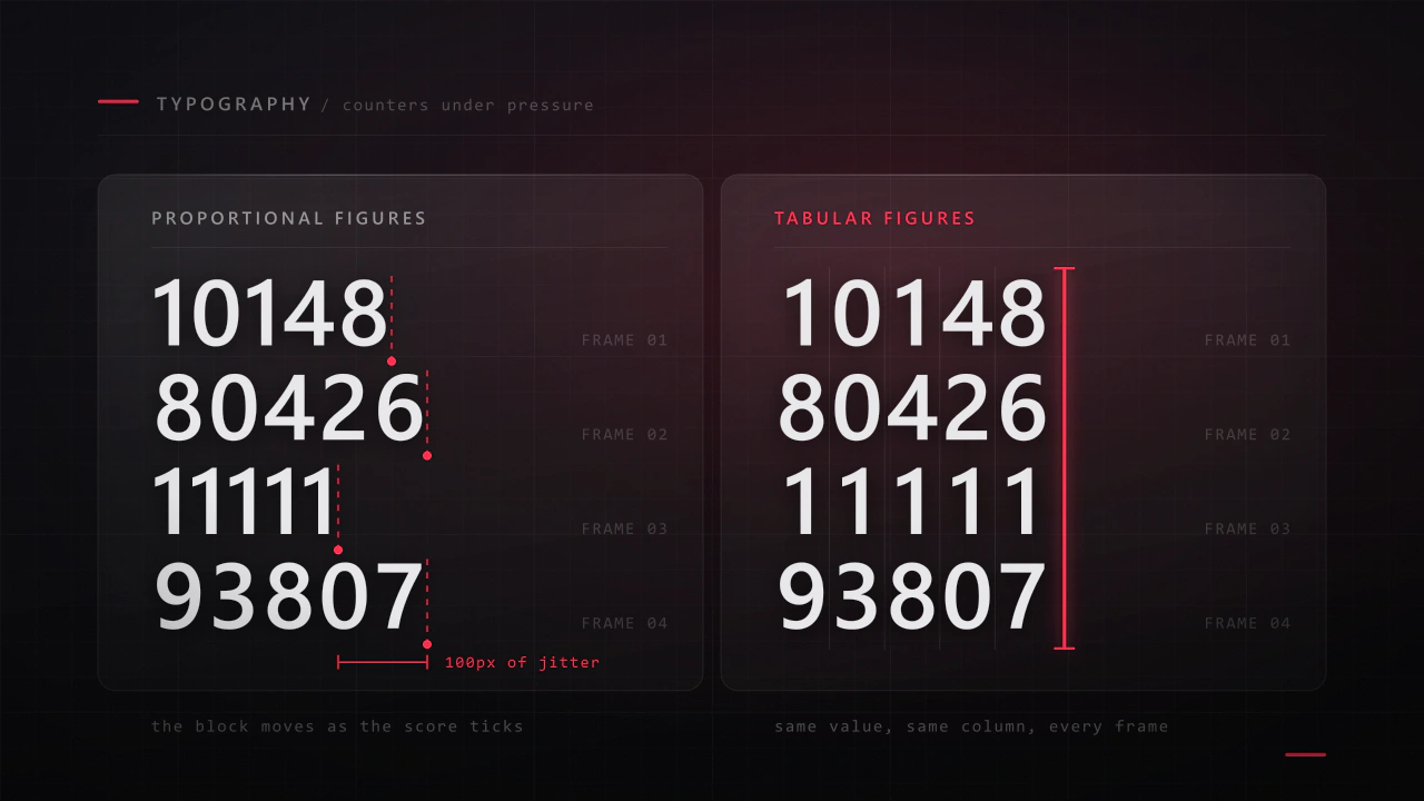
Interface type is read in half a second, at speed, over moving artwork, by somebody who did not come to your game to read. Almost every rule that applies to a book works against you here, and the fixes are specific.
Read the article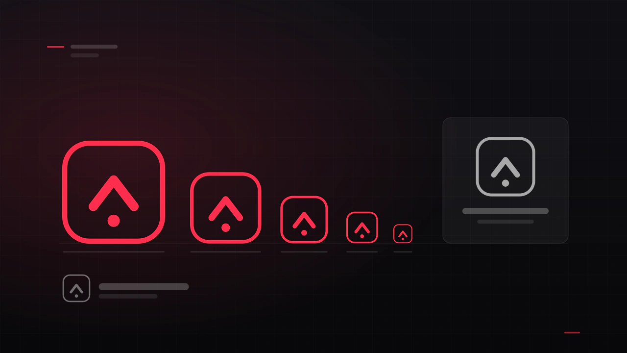
A game logo has a harder job than a company logo. It has to work as a Steam capsule, an app icon, a 16-pixel favicon, a watermark on a stream and a print on a t-shirt, often in one colour. Here is what makes one survive that, and what it costs to get.
Read the articleMore fonts
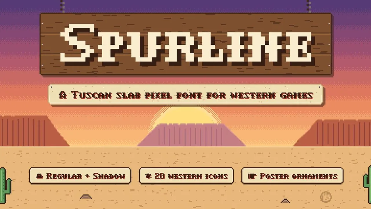 Font · $6.99
A Tuscan slab western pixel font with small caps, a Shadow layer for printed drop shadows, 20 frontier icons and wanted-poster ornaments that link up.
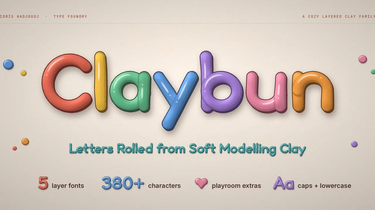 Font · $6.99
A cozy clay display font: hand-rolled letters in five layer fonts that stack into shiny 3D clay, three versions of every letter and 12 typeable playroom extras.
Contact
Menus, HUDs, full UI systems or a single screen that isn't working. Tell me what you're building and I'll tell you honestly whether I'm the right fit.