01
The hero
The name in Orbitra Light, warm cream on a starfield, with a ringed planet behind it.
A geometric sci-fi typeface of true circles and clean gaps · v1.000
Orbitra is a calm, exact sci-fi typeface for space games, HUDs, menus and technology brands. Its rounds are perfect circles, its bars stop just short of the stems, and it comes with 32 HUD icons drawn the same way.
Type tester
Light is the weight of the hero. Turn on the detached alternates to open up A, M, N, Q and y, and type the HUD icons from the row below.
Orbit locked. Next jump in 04:12:07
Orbit locked. Next jump in 04:12:07
Orbit locked. Next jump in 04:12:07
Orbit locked. Next jump in 04:12:07
This preview covers Basic Latin and the 32 icons. The full fonts add every accented letter and the rest of the symbols.
Features
A geometric sci-fi font of true circles, straight bars and small gaps, in three weights, with 32 matching HUD icons you type like letters, for space games.
Every round is a true circle and every straight is a plain bar, so the letters feel measured, like the markings on a space-agency module.
Bowls and crossbars stop just short of the stems, leaving small cuts that keep the face light and open even in Bold.
Planet, rocket, satellite, batteries, shield, radar, crosshair, arrows, warning, power and more, drawn with the same strokes and typed beside the text.
Light for big quiet titles, Regular for menus and body text, Bold for headings, labels and buttons, with the icons in all three.
Stylistic Set 1 pulls A, M, N, Q and y apart into separate strokes, for logos and titles that want an even more engineered look.
Tabular figures give every digit one width, so countdowns, fuel gauges and scores tick over without shifting.
Built-in icons
Each icon is a character in the font. Click one to copy it, then paste it into anything set in Orbitra.
Case study
Not every space game is loud. Some are about drifting between planets, reading a quiet console, waiting for a signal. For those I wanted a sci-fi face that felt calm and precise rather than aggressive, closer to mission signage than to an arcade cabinet.
And a space game's interface is full of small pictures as well as words: fuel, oxygen, shields, a target. I wanted the icons to come from the same hand as the letters, so a status panel reads as one system.
Orbitra is built from very few parts. The round letters are drawn on true circles, the straight ones on plain bars of one thickness, and where a bowl or a crossbar would meet a stem, it stops a little short and leaves a gap.
Those gaps are what give it its character. They make the letters look assembled rather than drawn, and they let a little dark space into every word, which keeps the Bold from turning heavy and the Light from looking frail.
The 32 HUD icons use the same stroke weights and the same small gaps as the letters, in Light, Regular and Bold, so a battery or a shield sits in a line of text like another character. They live on Private Use codes from U+E000 to U+E01F.
I covered what a ship's interface tends to need: planets, a rocket, a satellite and a UFO for the world, batteries, oxygen, fuel, energy and a shield for status, a warning triangle, a lock and a radar for alerts, and arrows and media controls for menus.
Stylistic Set 1 holds detached versions of A, M, N, Q and y: the A drops its crossbar and the strokes of M and N stand apart, which suits a logo that should look like it was built from parts.
The family has a true lowercase and 407 characters per weight for Western and Central European languages. Figures are proportional by default, with a tabular set for timers and gauges.
The name in Orbitra Light, warm cream on a starfield, with a ringed planet behind it.
The editable hero layout from the download, recoloured in blue with a glow and a gradient on the capitals.
A space-game title screen: the name in thin capitals over a starfield, the chapter line above and the menu below.
Capitals, lowercase, figures, punctuation and the accented letters of Latin-1 and Latin Extended-A, in Regular.
A vessel status panel with shield, oxygen, fuel and power readouts, a targeted planet and an incoming transmission, icons typed from the font.
Every icon with its name, from the planet and rocket to the batteries, radar, warning and media controls.
The three weights, the detached A, M, N, Q and y of Stylistic Set 1, tabular figures and European accents.
What you get
Included with every purchase
Ask me first
Please don't share or resell the font files. For anything the license doesn't cover, email me. idris.hadjoudj@gmail.com
FAQ
Each icon has a Private Use code from U+E000 to U+E01F, listed in the README with examples for game engines and CSS. You can also copy any icon from the grid on this page. The crosshair, power, heart, check, cross and sparkle also sit on their standard Unicode codes.
Switch on Stylistic Set 1 (ss01) in your design app, or use font-feature-settings: "ss01" on the web. It changes A, M, N, Q and y in every weight.
Yes. Commercial use is included for games, apps, logos, merch, videos, streams and print, with no limit on sales, and you can embed the fonts and bitmap fonts in games and apps for unlimited copies. Products where your customers type their own text, and resale in asset packs, need an extended license: just ask.
Yes. Use the TTF files in any engine that imports fonts, or the included game engine pack: BMFont bitmap fonts at 32, 64 and 128 px for Godot, Unity, GameMaker, LibGDX, Phaser, MonoGame and Love2D.
Yes. WOFF2 web fonts are included, and web use is unlimited, with no cap on page views or traffic.
Each font has 407 characters, covering Western and Central European languages.
Yes. Orbitra is in The Complete Font Collection, every font I've made in one download.
Related reading
Longer write-ups on the craft this font draws on.
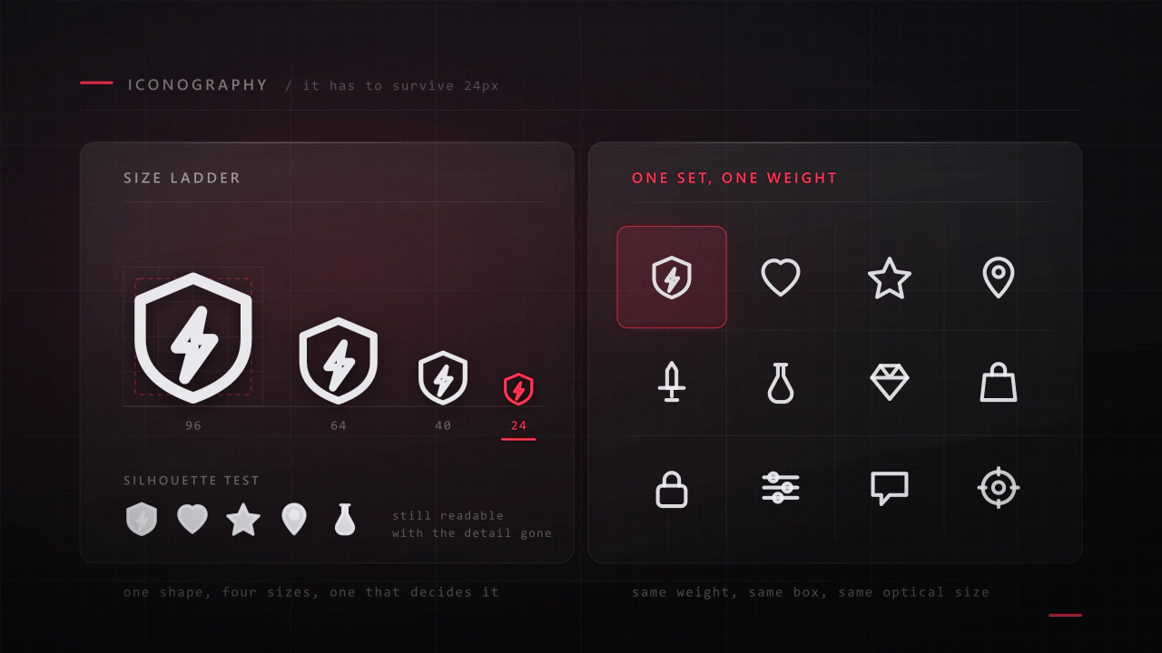
An icon has about a fifth of a second and a few hundred pixels to say what a thing is. Most game icon sets fail not because the drawings are bad, but because they were drawn large, one at a time, by different rules.
Read the article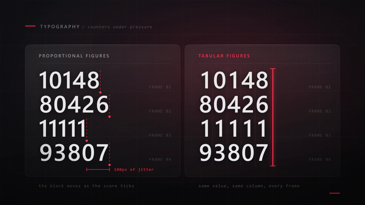
Interface type is read in half a second, at speed, over moving artwork, by somebody who did not come to your game to read. Almost every rule that applies to a book works against you here, and the fixes are specific.
Read the articleMore fonts
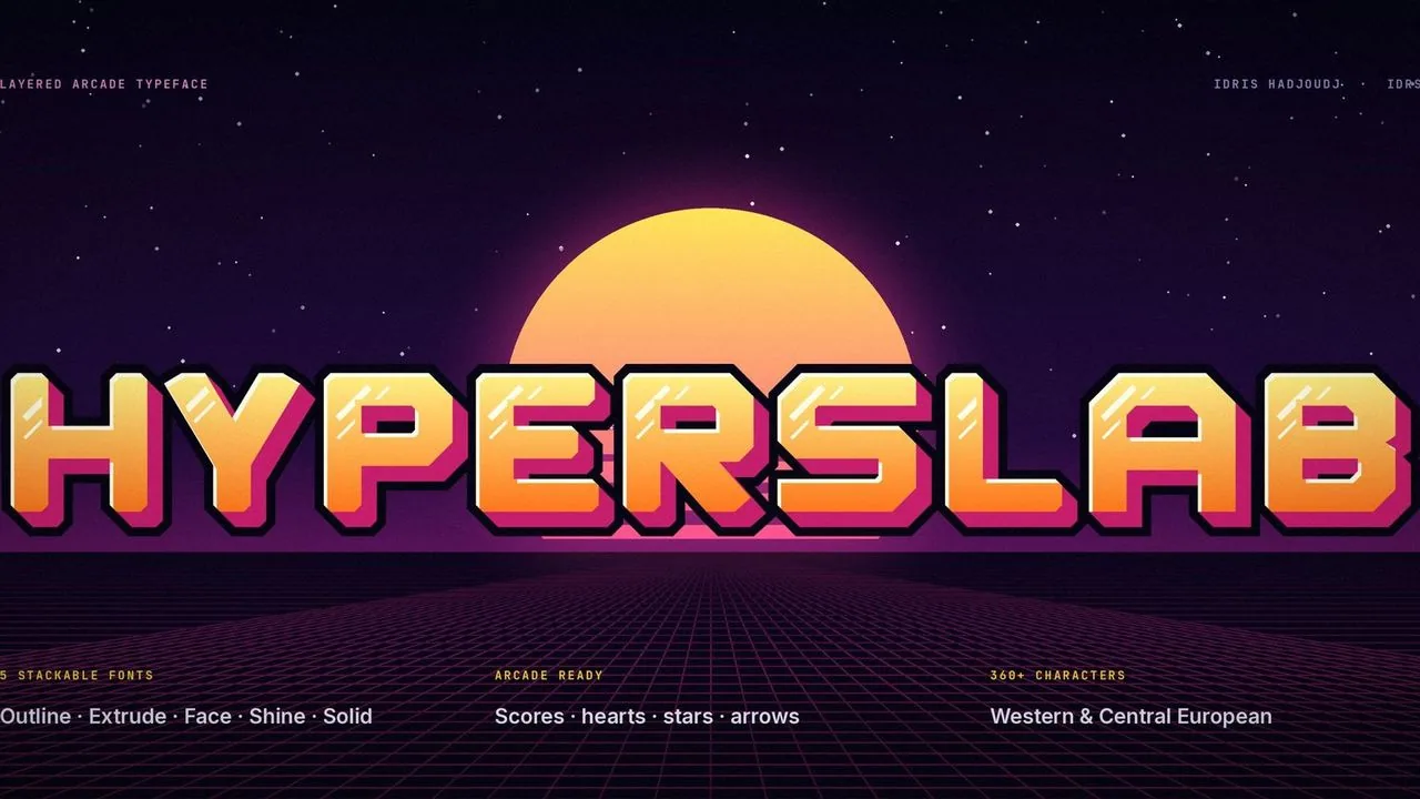 Font · $6.99
Heavy, chamfered 80s arcade letters in five layer fonts that stack into full-colour 3D titles, with tabular scores and arcade symbols.
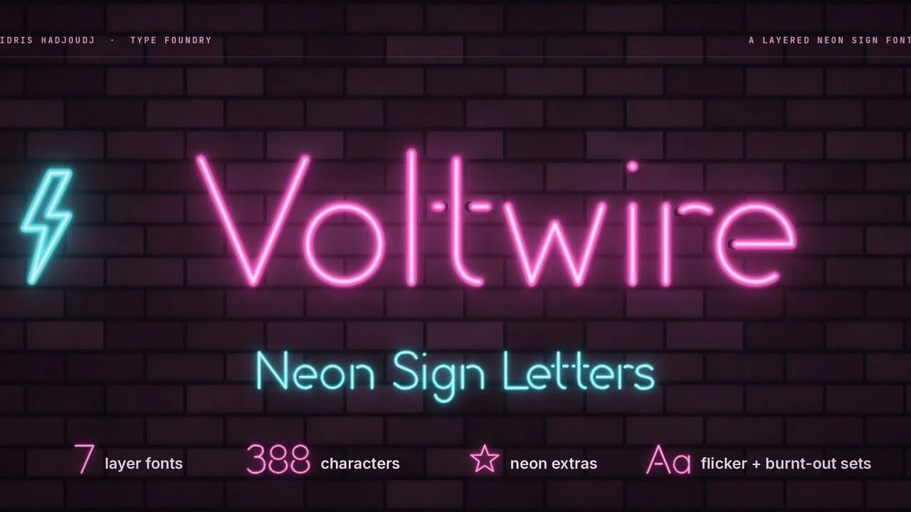 Font · $6.99
A neon sign font of bent glass tubes: seven layer fonts stack into a glowing sign with a hot core, painted tube ends, two flicker sets and neon extras.
Contact
Menus, HUDs, full UI systems or a single screen that isn't working. Tell me what you're building and I'll tell you honestly whether I'm the right fit.