01
The hero
The name in black ink on rice paper, overlapping a red sun, with a red swash underneath and an ink splash.
A fast ink-brush display font with the energy of anime title cards · v1.000
Kazeri is ink-brush lettering for game titles and menus, anime and manga, stream thumbnails, posters and packaging. Every letter is made of real brush strokes that land on a point, swell and lift into a dry flick, all leaning forward as if mid-swing.
Type tester
Type a doubled letter, like BOSS or Zzz: the two takes of the brush alternate. Switch them off to see one take repeated.
Wind Blade! ✸ Round 2, fight
Wind Blade! ✸ Round 2, fight
Wind Blade! ✸ Round 2, fight
Wind Blade! ✸ Round 2, fight
This preview covers Basic Latin and the brush marks. The full font adds every accented letter and the rest of the punctuation.
Features
A fast ink-brush display font for anime-style game titles, manga and thumbnails, with two brush takes per letter that alternate as you type, and brush marks.
Each letter is a set of strokes pulled in writing order: a pointed touch-down, a full loaded body, then a lift into a flick where the bristles run dry.
Every letter is brushed twice, and Contextual Alternates switch between the takes as you type, so doubled letters never look stamped.
The whole alphabet leans forward at nine degrees, and strokes lift and start again at the corners, so even one word feels fast.
An ensō circle, an ink splash, speed lines, a brush slash and a long swash, on standard Unicode codes, to finish a title without leaving the font.
A true lowercase and figures, so it works for menus and short lines as well as shouted titles.
Western and Central European accents, plus stars, a sparkle, music notes, arrows and comic punctuation.
Built-in icons
Each icon is a character in the font. Click one to copy it, then paste it into anything set in Kazeri.
Case study
I love the lettering on anime title cards and the sound effects in manga panels: a few fast strokes that look thrown onto the page. Brush fonts that try for that often end up static, a scanned blot that looks the same on every letter, and the speed is gone.
I wanted a font where each letter still felt like a movement of the hand, fast enough for a fighting-game logo and clear enough for its menu.
Every letter in Kazeri is built from separate brush strokes, in the order a calligrapher would pull them. Each one lands on the tip, swells to the full width of a loaded brush, then lifts away into a long flick where the ink runs out and dry streaks open up.
At each corner the brush lifts and comes back in as a new stroke, instead of turning in one line, and the whole alphabet leans forward at nine degrees. Those two choices are most of what makes it look quick.
Nobody brushes the same letter twice in exactly the same way, so I drew each one twice, as two separate takes. Contextual Alternates swap between them as you type, so the S's in BOSS or the z's in Zzz come out as different strokes.
It works on its own wherever OpenType features are on, which is the default in browsers and most apps. Where they aren't, you get the first take every time.
Brush lettering usually comes with a few gestures around it, so Kazeri includes five you can type: an ensō circle, an ink splash, speed lines, a diagonal slash and a long underline swash. They sit on regular Unicode codes, so they come out of a keyboard map or a character picker like any symbol.
There are also stars, a sparkle, music notes, arrows and comic punctuation, and 382 characters in all, with Western and Central European accents.
The name in black ink on rice paper, overlapping a red sun, with a red swash underneath and an ink splash.
The editable hero layout from the download, here with a red offset behind the letters and a red label.
A samurai game title over a sunset and a torii gate, with the menu in the same font and a red swash under the selected item.
A capital K taken apart: pointed entry, full body, lift and re-enter, dry flick and the nine-degree lean.
The two takes of an S side by side, and doubled letters in BOSS, Killer bees, Moon arrow and Zzz set with both.
A red sound effect over speed lines, a speech bubble, a quiet panel and a chapter title, all lettered in Kazeri.
The ensō circle, ink splash, speed lines, brush slash and swash with their codes, and the other extras.
Capitals, lowercase, figures, punctuation, symbols, arrows, accented letters and the brush marks.
What you get
Included with every purchase
Ask me first
Please don't share or resell the font files. For anything the license doesn't cover, email me. idris.hadjoudj@gmail.com
FAQ
They use Contextual Alternates (calt), which is on by default in most apps, browsers and engines, so the takes alternate as you type. Engines that can't apply OpenType features, such as Unity's TextMeshPro, show the first take every time.
They sit on standard Unicode codes: ensō circle U+25EF (◯), ink splash U+2738 (✸), speed lines U+2630 (☰), brush slash U+2E3A (⸺) and brush swash U+2E3B (⸻). Type them from a character picker, paste them, or copy them from the grid on this page, and keep them in Kazeri so they show the brush drawing.
It is a display font first, but it has a true lowercase and figures, so menus, buttons, chapter names and short lines of dialogue work too. For long paragraphs, pair it with a calmer text font.
Yes. Commercial use is included for games, apps, logos, merch, videos, streams and print, with no limit on sales, and you can embed the fonts and bitmap fonts in games and apps for unlimited copies. Products where your customers type their own text, and resale in asset packs, need an extended license: just ask.
Yes. Use the TTF files in any engine that imports fonts, or the included game engine pack: BMFont bitmap fonts at 32, 64 and 128 px for Godot, Unity, GameMaker, LibGDX, Phaser, MonoGame and Love2D.
Yes. WOFF2 web fonts are included, and web use is unlimited, with no cap on page views or traffic.
Kazeri has 382 characters, covering Western and Central European languages.
Yes. Kazeri is in The Complete Font Collection, every font I've made in one download.
Related reading
Longer write-ups on the craft this font draws on.
A game logo has a harder job than a company logo. It has to work as a Steam capsule, an app icon, a 16-pixel favicon, a watermark on a stream and a print on a t-shirt, often in one colour. Here is what makes one survive that, and what it costs to get.
Read the article
It is the first screen anyone sees, it appears in every screenshot you will ever take, and it is usually designed in an afternoon near the end of production. Here is what belongs on it, in what order, and the decisions that make it feel like a real game rather than a template.
Read the articleMore fonts
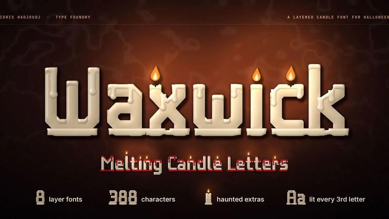 Font · $6.99
Tall candle letters melting as they burn, with drips, wax pools and wicks that light on every third letter, in seven layers that stack into lit candles.
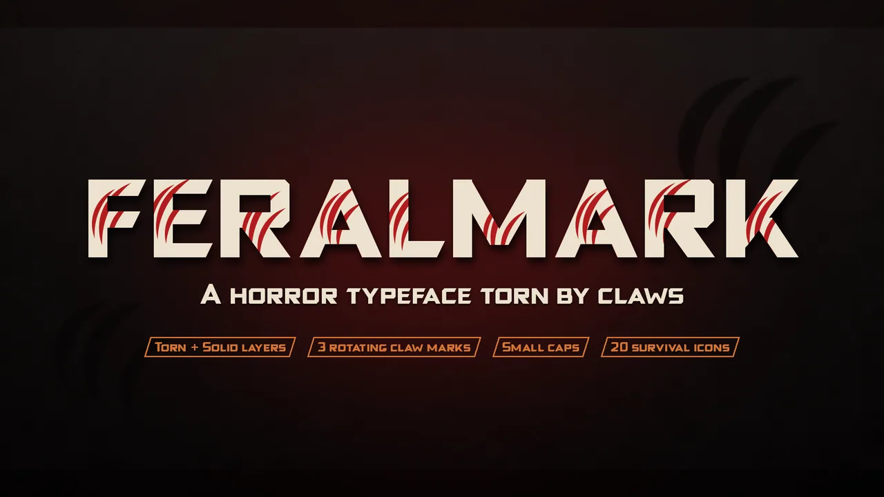 Font · $6.99
A heavy horror display face for creature features and survival horror, in Torn and Solid styles that stack for colour in the claw marks, with 20 survival icons.
Contact
Menus, HUDs, full UI systems or a single screen that isn't working. Tell me what you're building and I'll tell you honestly whether I'm the right fit.