01
The hero
The name in banknote green on guilloche paper, with a stacked gold subtitle and the font's key numbers along the bottom.
A wide Didone engraved like a banknote · v1.000
Denarion is banknote lettering for heist and casino games, whisky labels and certificates: a wide Didone whose strokes are filled with engraved lines, traced by a fine keyline and backed by a hatched shadow. Use it in one ink, or split it into five layers and print it like a note.
Type tester
The five layers are stacked here in the hero's banknote green. Try the other inks, from gold leaf to navy and silver, or switch the layers off to try Solid and Engraved on their own.
Treasury Note ❦ Series 1887Treasury Note ❦ Series 1887Treasury Note ❦ Series 1887Treasury Note ❦ Series 1887Treasury Note ❦ Series 1887
Treasury Note ❦ Series 1887Treasury Note ❦ Series 1887Treasury Note ❦ Series 1887Treasury Note ❦ Series 1887Treasury Note ❦ Series 1887
Treasury Note ❦ Series 1887Treasury Note ❦ Series 1887Treasury Note ❦ Series 1887Treasury Note ❦ Series 1887Treasury Note ❦ Series 1887
Treasury Note ❦ Series 1887Treasury Note ❦ Series 1887Treasury Note ❦ Series 1887Treasury Note ❦ Series 1887Treasury Note ❦ Series 1887
This preview covers Basic Latin and the banknote extras. The full font adds every accented letter.
Features
A wide, high-contrast Didone with banknote engraving, a keyline and a hatched shadow, in seven fonts: two one-colour styles and five layers that stack in colour.
Solid is the clean letter, Engraved has the lines, keyline and hatched shadow in one font. Either one works in a single ink, like a note printed in green.
Shadow, Shadow Lines, Fill, Lines and Outline share every width and kerning pair, so stacked copies line up exactly and each takes its own ink.
The engraving runs on the same horizontal grid in every letter, so the lines continue from one letter to the next and thicken towards the foot of each stroke.
Wide, high-contrast letters with heavy stems, hairline joins, flat bracketed serifs, ball terminals on the lowercase and fine beaks on C, G and S.
A guilloche rosette, florette, starburst seal, two laurel sprigs, crown, key, coin, temple, star, diamond, lozenge and guilloche strips, typed like letters.
386 characters per font, with the accented letters of Western and Central European languages, all engraved the same way.
Built-in icons
Each icon is a character in the font. Click one to copy it, then paste it into anything set in Denarion.
Case study
Money has its own lettering. The big serif names on old notes and share certificates are cut by an engraver, line by line, so they can't be faked, and that fine striped look is what a heist game, a casino or a whisky label reaches for when it wants to feel valuable.
Most fonts that try it are a Didone with a stripe texture laid on top. I wanted the engraving to be the letter itself: lines that follow a grid, a keyline round every stroke and a shadow cut in hatching, so the result reads as printed rather than filtered.
I drew the letter as a printer would separate it. Shadow is the solid drop, Shadow Lines is the diagonal hatching over it, Fill is the tint behind the engraving, Lines is the engraving and Outline is the keyline. Stacked from the bottom up, in that order, they rebuild the full note.
For work that only has one ink, Engraved puts the lines, keyline and hatched shadow into a single font, and Solid gives the plain letter for body copy, buttons and small labels. All seven share their spacing and kerning, so a title and its stacked version set exactly the same.
The engraved lines sit on one horizontal grid across the alphabet, so they run on from letter to letter instead of starting fresh in each one, and they grow heavier towards the foot of every stroke, the way an engraver darkens the bottom of a form.
Underneath is a real Didone: wide proportions, vertical stress, heavy stems against hairline joins, flat bracketed serifs, ball terminals on the lowercase and thin vertical beaks on C, G and S. The shadow always falls down and to the right.
Banknotes are more than words, so the font carries the ornaments too: a guilloche rosette, a florette, a starburst seal, laurel sprigs facing both ways, a crown, a key, a coin, a classical temple, a star, a diamond, a lozenge and two guilloche strips for borders.
They are drawn in every layer, so a stacked crown gets gold under brown engraving like the letters next to it. Some of them sit on emoji code points, so if an app swaps one for a colour emoji, insert it from the glyphs panel instead.
The name in banknote green on guilloche paper, with a stacked gold subtitle and the font's key numbers along the bottom.
The editable hero layout from the download, here with the name stacked in gold over a green hatched shadow and a framed Treasury Note label.
A gold-on-green title screen for The Vault Job, with laurel and temple ornaments and a menu set in the plain style.
A large R labelled with its hairline serifs, engraved lines, thick and thin strokes, keyline and hatched shadow, next to accented Spanish and Czech words.
Solid, Engraved and the five layers on their own, then Shadow Lines, Fill, Lines and Outline stacked into one gold and brown Ag.
The same layers printed as banknote green, gold leaf, burgundy, navy and silver, sepia certificate and copper seal.
A whisky label, a certificate of excellence and a tea tin, each set in a different colour of Denarion.
Every ornament with its code point, from the guilloche rosette and seal to the crown, coin, temple and the two guilloche strips.
Capitals, lowercase, figures, punctuation, currency and the accented letters, in Engraved and Solid.
What you get
Included with every purchase
Ask me first
Please don't share or resell the font files. For anything the license doesn't cover, email me. idris.hadjoudj@gmail.com
FAQ
Seven fonts with the same spacing and kerning. Denarion Solid and Denarion Engraved each work alone in one colour. Shadow, Shadow Lines, Fill, Lines and Outline are layers: stack them on top of each other to print the letters in several colours, such as gold leaf under dark engraving.
Type the same text five times in exactly the same position and set the copies, from bottom to top, to Shadow, Shadow Lines, Fill, Lines and Outline. Give each its own colour and keep the size, tracking and line spacing identical. You can leave Shadow or Shadow Lines out for a lighter shadow.
The engraved lines are fine, so they look best at title and label sizes. For menus, body copy and anything small, use Solid: it's the same letter without the lines, so it sits well next to an engraved title.
Yes. Commercial use is included for games, apps, logos, merch, videos, streams and print, with no limit on sales, and you can embed the fonts and bitmap fonts in games and apps for unlimited copies. Products where your customers type their own text, and resale in asset packs, need an extended license: just ask.
Yes. Use the TTF files in any engine that imports fonts, or the included game engine pack: BMFont bitmap fonts at 32, 64 and 128 px for Godot, Unity, GameMaker, LibGDX, Phaser, MonoGame and Love2D.
Yes. WOFF2 web fonts are included, and web use is unlimited, with no cap on page views or traffic.
Each font has 386 characters, covering Western and Central European languages.
Yes. Denarion is in The Complete Font Collection, every font I've made in one download.
Related reading
Longer write-ups on the craft this font draws on.
A game logo has a harder job than a company logo. It has to work as a Steam capsule, an app icon, a 16-pixel favicon, a watermark on a stream and a print on a t-shirt, often in one colour. Here is what makes one survive that, and what it costs to get.
Read the article
It is the first screen anyone sees, it appears in every screenshot you will ever take, and it is usually designed in an afternoon near the end of production. Here is what belongs on it, in what order, and the decisions that make it feel like a real game rather than a template.
Read the articleMore fonts
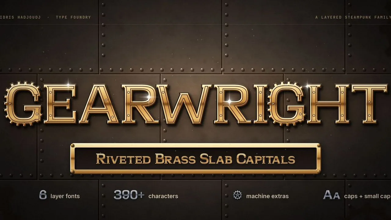 Font · $6.99
Riveted brass slab capitals and small caps in layer fonts that stack into machined metal, with a gear-tooth G, gears, gauges and pipes for steampunk games.
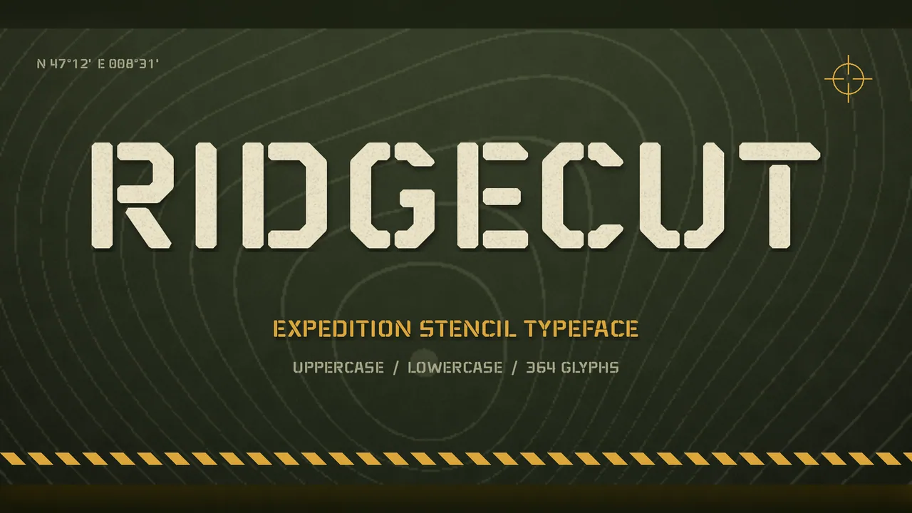 Font · $6.99
A rugged stencil typeface for adventure games, survival titles and outdoor brands, with a full lowercase so the same font runs from the title screen to the inventory.
Contact
Menus, HUDs, full UI systems or a single screen that isn't working. Tell me what you're building and I'll tell you honestly whether I'm the right fit.