Game logo design: what makes one work, and what it costs
A game logo has a harder job than a company logo. It has to work as a Steam capsule, an app icon, a 16-pixel favicon, a watermark on a stream and a print on a t-shirt, often in one colour. Here is what makes one survive that, and what it costs to get.
In this article
Open to new projects
Hadjoudj Idris
Game UI/UX Designer
Upwork100% Job Success
Hire me Browse the workMost game logos are designed as a title screen and then discovered, months later, to be unusable everywhere else. The fix is knowing the full list of places it has to live before you draw anything.
A game logo has a harder job than a company logo
A corporate mark mostly appears on a website, a business card and a slide. A game mark appears on a store page competing with thousands of others, as a tiny icon on a phone home screen, in a launcher list, on a stream overlay, in a press kit, on merchandise, and burned into a splash screen at full resolution.
That range is the whole design problem. Detail that reads beautifully at 1920 pixels turns to mud at 32. A logo that only exists at one size is artwork, not identity.
Every size it has to survive
| Where it appears | Roughly | What it demands |
|---|---|---|
| Steam capsule and store art | Large, wide | Legibility at a glance in a crowded grid, with the name readable in a thumbnail |
| Splash and title screen | Full screen | The full, detailed version. This is the only place it lives at full size |
| App or launcher icon | 512 down to 64 | A square-safe mark, usually the emblem alone, without the wordmark |
| Favicon and small UI | 32 and 16 | One shape, no fine detail, no gradients, no thin strokes |
| Stream overlay or watermark | Small, over anything | Works in one colour, over both light and dark video |
| Press kit and articles | Any size, any background | Light and dark versions, with clear space defined |
| Merchandise and print | Any size, limited colours | One-colour and embroidery-safe versions |
Wordmark, emblem, or both?
| Type | What it is | Strength | Weakness |
|---|---|---|---|
| Wordmark | The game's name as custom or styled lettering. | Nobody has to learn it. It says the name. | Does not reduce to an icon. Poor at 32 pixels. |
| Emblem or symbol | An abstract or pictorial mark, no words. | Works everywhere, scales down, becomes the app icon. | Means nothing until people have seen it a few times. |
| Lettermark | One or two letters treated as a mark. | The compromise most games land on. Square-safe and legible. | Generic if the letterforms are not distinctive. |
| Combination lockup | Emblem plus wordmark, with defined variants. | Covers every placement. What most games actually need. | More work: it is several designs held in one family. |
For a game, the combination is nearly always the right answer, because you genuinely need both: the wordmark for the store page, the emblem alone for the icon and the favicon.
What the shapes signal
Before anyone reads the name they have already read the shape. This is not decoration, it is the fastest genre signal you have.
- Sharp angles, italics, heavy weight: speed, action, competition. Racing and shooters.
- Wide, geometric, technical: science fiction, strategy, simulation.
- Rounded, soft, generous spacing: casual, family, puzzle.
- Irregular, hand-cut, textured: horror, survival, hand-made and narrative games.
- Ornamental serifs and heraldic forms: fantasy, historical, RPG.
- Compressed and stencilled: military and tactical.
You can absolutely work against these on purpose, and doing so deliberately is one of the sharpest tools available. Doing it by accident, so a cosy farming game reads as a tactical shooter, is the most common own goal in game identity.
Type: custom lettering versus a licensed typeface
The fastest route to a distinctive wordmark is drawing the letterforms rather than setting them. It is also what separates a logo from a title typed in a font.
If you do use an existing typeface, this is the part that catches teams out: most font licences do not automatically cover logo use, embedding in a game build, or merchandise. Desktop, web, app and logo rights are frequently sold separately, and a free-for-personal-use font is not licensed for a commercial game at all.
- Check the licence covers commercial use, embedding in software, and use as a logo, explicitly.
- Keep the licence file and the receipt with your project files. You will need them for a publisher, a platform or a merchandise partner.
- Once letterforms are customised enough to be original artwork, the wordmark is yours. Getting there is exactly what commissioning a logo buys.
- The same applies to any icon or ornament you pull from a set: check it can be part of a trademarked mark.
One colour first, colour second
Design it in black on white before anything else. A mark that only works because of a gradient is a mark that fails on a stream overlay, in a print advertisement, embroidered on a cap, and in every context where somebody else controls the background.
- Solid black version. The structural test. If it fails here, colour is hiding a problem.
- Solid white version. For dark backgrounds and video overlays.
- Full colour version. The primary, once the structure is proven.
- Knockout version. Reversed out of a solid shape, for busy backgrounds.
- Defined clear space. How much empty room the mark needs around it, so other people cannot crowd it.
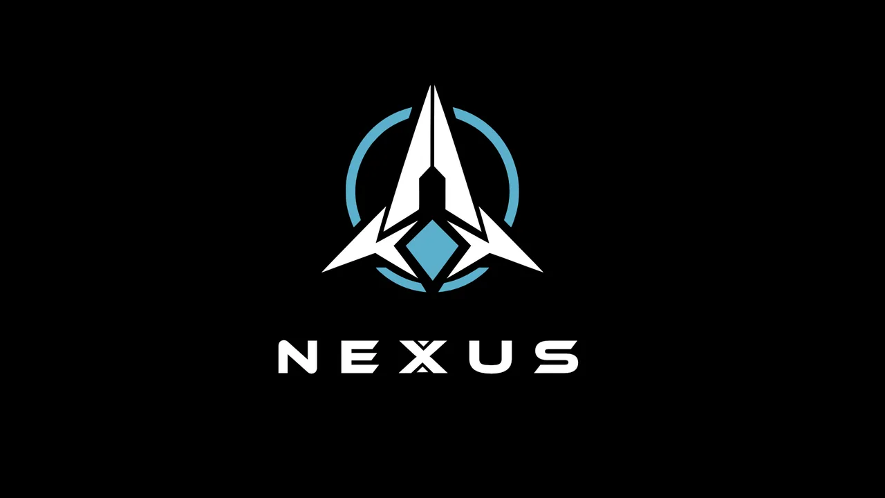
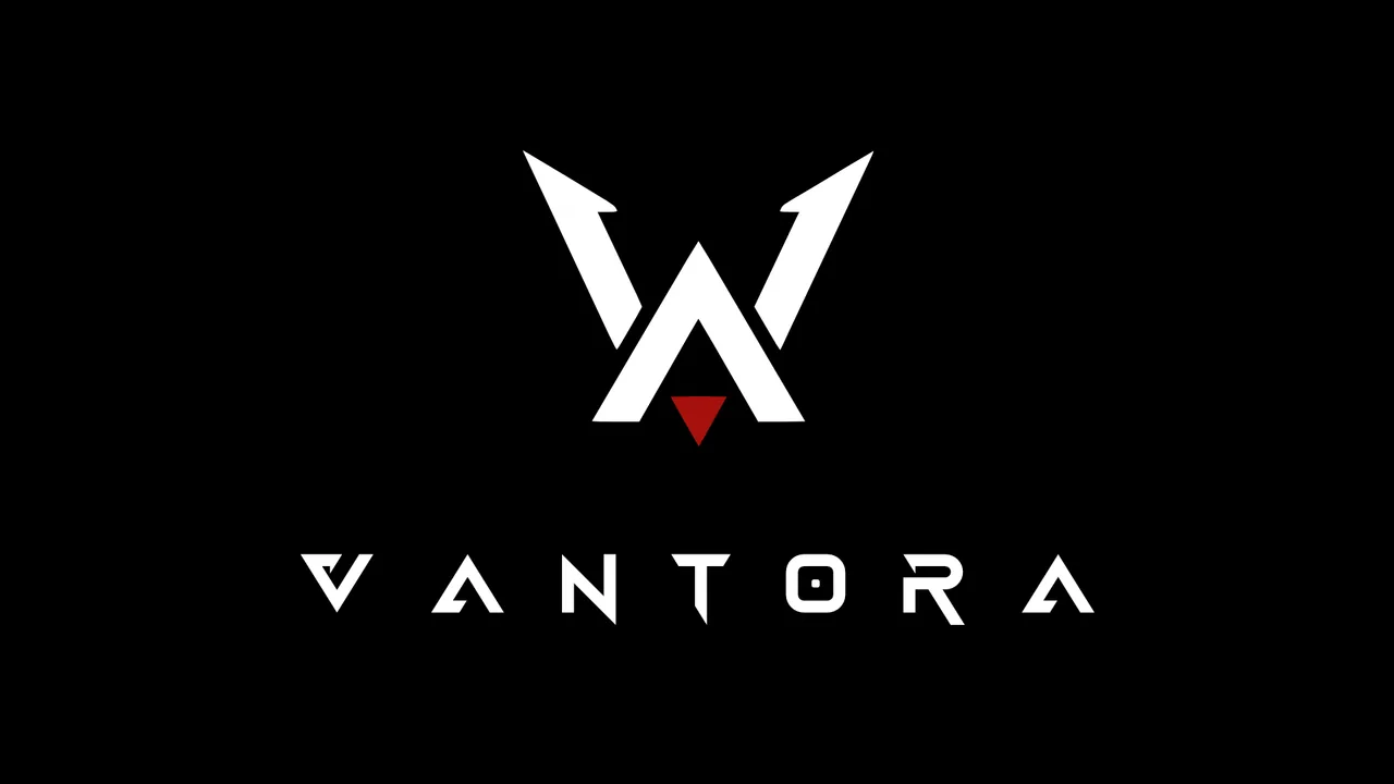
The Nexus and Vantora marks were both built this way: resolved as a single silhouette first, so the colour version is a treatment rather than a crutch.
Eight ways game logos fail
- Detail that dies below 64 pixels. Fine linework, thin strokes, small internal shapes.
- A gradient doing the structural work. Remove it and there is no shape left.
- No square-safe version, so the app icon has to be improvised by whoever ships the build.
- Illegible custom lettering. Distinctive is good, unreadable is not: people have to be able to search for the name.
- Genre mismatch. The shapes promise a different game than the one you made.
- Effects instead of form. Bevels, outer glows and drop shadows compensating for a weak silhouette.
- Only one version delivered, so every future placement becomes a small crisis.
- Unlicensed type, discovered at the worst possible moment, usually by a publisher's legal team.
What a proper logo package contains
This is what to ask for, and what to check you received. Missing pieces here are the reason logos get quietly redrawn later.
- Vector master (SVG, AI or EPS), the source everything else is generated from.
- The lockups: horizontal, stacked, emblem-only, and wordmark-only.
- Colour versions: full colour, solid black, solid white, knockout.
- Raster exports at the sizes you actually use, including square icon sizes, transparent PNG.
- A favicon-grade version, simplified by hand rather than scaled down.
- Clear space and minimum size rules, one page is enough.
- Colour values: HEX, RGB and CMYK if anything will be printed.
- Font files or an outlined version, plus the licence if a licensed face was used.
The process, start to finish
- 01
Brief and references
Genre, tone, the name, where it will appear, and three marks you like with one sentence each on why. Half an hour of your time that shapes everything after it.
- 02
Sketch and direction
Several distinct directions in black and white. The point is to choose a direction, not a favourite drawing, which is why they are not in colour yet.
- 03
Refinement
One direction taken properly: proportions, spacing, letterform corrections, and the small-size version drawn separately rather than scaled.
- 04
Colour and variants
Colour applied to a structure that already works, then every lockup and version generated from the master.
- 05
Package and handoff
All formats, all sizes, the usage rules, and the files organised so a future collaborator can find what they need.
What it costs and how long
| Scope | Typical cost | Elapsed |
|---|---|---|
| Simple wordmark or lettermark | $300 – $700 | 1 week |
| Full game logo, combination lockup, complete package | $700 – $1,500 | 1 – 2 weeks |
| Logo plus a small identity: palette, type, key art direction | $1,500 – $3,500 | 2 – 4 weeks |
| Studio identity alongside the game mark | $2,000 – $5,000 | 3 – 5 weeks |
A logo is also the cheapest way to find out whether you want to work with a designer before committing to a full interface project. Broader ranges are in what game UI/UX design actually costs.
How much does a game logo cost?
Roughly $300 to $700 for a straightforward wordmark, and $700 to $1,500 for a full game logo with every lockup, one-colour versions and a complete file package. Studio identity work alongside it runs higher.
How long does a game logo take?
One to two weeks for most projects. The design work itself is two to five days; the rest is review time, which is worth taking because a logo is expensive to change once a store page and a build are using it.
Should the logo be a wordmark or a symbol?
For a game, usually both, delivered as a combination lockup with defined variants. You need the wordmark for the store page and the symbol alone for the app icon and favicon, and they have to be designed to work together.
Can I use a font I downloaded for my game's logo?
Only if the licence explicitly permits commercial use, embedding and logo use. Many free fonts allow personal use only, and desktop licences frequently exclude logo and app embedding. Check before you build a store page around it.
When should I design the logo?
Once the game's tone is settled and before the Steam page goes up, since the capsule needs it. Too early and you are designing for a game that has not decided what it is yet.
Do I need a trademark?
That is a legal question rather than a design one, but from a practical angle: search the name early, before you build an identity around it. Finding a conflict after your store page is live is a genuinely expensive way to learn.
What file formats should I insist on?
A vector master (SVG, AI or EPS) plus transparent PNG exports at the sizes you use, including square icon sizes. If you only receive a PNG, you have received one placement, not a logo.
Can a logo be redesigned later?
Yes, but it costs more than the original in practice, because by then it is on a store page, in a build, on social accounts and in press coverage. It is the strongest argument for getting the small-size versions right the first time.
Will an AI-generated logo do?
It will produce an image. It will not produce a vector master, a small-size version drawn for legibility, a set of lockups, clear-space rules, or any answer about typeface licensing. Those are the parts that make a logo usable across a real product, and they are most of the job.
Hadjoudj Idris
Game UI/UX Designer, Remote, worldwide
Need this done properly on your game?
Menus, HUDs, a full UI system, or one screen that isn't working. Tell me what you're building and I'll tell you honestly whether I'm the right fit, and what it would cost.
Upwork100% Job Success