01
The hero
The name in stacked silver with green vines and leaves sprouting from the l, b, h and g, on a forest-green night full of fireflies.
Broad-nib elven letters in silver, with vines that grow · v1.000
Silverbough is a tall broad-nib script for elven kingdoms and quiet forests: thick and thin strokes in polished silver, with vines and fresh leaves curling off the ascenders and descenders. Each part is its own layer font, so the silver and the leaves can turn gold, mithril, rose or bronze.
Type tester
All five layers are stacked here in the hero's moonlit silver, with its satin shading and the soft glow on top. Try the other metals and seasons, switch Effects off for flat layers, or the layers off for Solid. Plain letters (Stylistic Set 1) takes the vines away.
The Hidden Glade ☾The Hidden Glade ☾The Hidden Glade ☾The Hidden Glade ☾The Hidden Glade ☾
The Hidden Glade ☾The Hidden Glade ☾The Hidden Glade ☾The Hidden Glade ☾The Hidden Glade ☾
The Hidden Glade ☾The Hidden Glade ☾The Hidden Glade ☾The Hidden Glade ☾The Hidden Glade ☾
The Hidden Glade ☾The Hidden Glade ☾The Hidden Glade ☾The Hidden Glade ☾The Hidden Glade ☾
This preview covers Basic Latin and the forest extras. The full font adds every accented letter.
Features
Elven calligraphy in polished silver, with curling vines, leaves and a moonlight glow on separate layers, plus forest extras for fantasy RPG titles.
Shadow, Silver, Vines, Leaves and Glow stack into polished letters with green tendrils and a thin line of light; Solid keeps the whole letter in one colour.
Tall letters with real thick and thin strokes, wedge-shaped tops and feet that sweep forward, like a pen held at a steady angle.
Tendrils grow from ascenders, descenders and a few capitals and curl back over their own letter, so they never tangle with the next one.
Stylistic Set 1 removes the vines for long titles, body lines and small sizes, with the spacing left exactly as it was.
Recolour the silver and the leaves as elven gold with autumn leaves, mithril with frost, rose gold with rose leaves, or bronze in spring green.
A moon, leaf, mushroom, acorn, feather, lantern, butterfly, flower, ivy leaf and sprout, two vine dividers and four corner flourishes for frames.
Built-in icons
Each icon is a character in the font. Click one to copy it, then paste it into anything set in Silverbough.
Case study
Elves in games tend to get one of two fonts: a stiff blackletter that belongs to dwarves and knights, or a thin wedding script that falls apart on a title screen. I wanted something in between, the calligraphy a scribe in a forest city might write, with enough weight to hold a logo.
And I wanted the forest in the letters themselves. A few vines and leaves growing from the strokes say elven faster than any ornament placed around the word.
Each letter started as a broad-nib form: tall, narrow, with heavy downstrokes, hairline joins and feet that kick forward. Only then did the vines go on, and only where a letter already reaches up or down, on the ascenders, the descenders and a handful of capitals.
Every tendril curls back over its own letter. That was the rule that took the most redrawing, because it's what keeps a word like Silverbough readable when three vines sit side by side.
The stack is Shadow at the bottom for the dark outline and depth, then Silver for the pen letter, Vines for the stems, Leaves on top of them and Glow last, a thin line of moonlight along the thick strokes. They share every width and kerning pair, so five copies of a title line up exactly.
That split is what makes the recolours work: the silver and the leaves are separate colours, so the same title can be moonlit silver in spring, elven gold in autumn or mithril with frosted leaves.
Stylistic Set 1 takes the vines away for subtitles, long names and anything small, with the same spacing, so a plain line and a vined one can share a layout. Both come with a full lowercase, so names and quest text don't have to shout in capitals.
The forest extras are drawn in every layer too: the moon's crescent is silver with a sprig of leaves, the lantern has a vine climbing its side, and the corner flourishes build a leafy frame around a word.
The name in stacked silver with green vines and leaves sprouting from the l, b, h and g, on a forest-green night full of fireflies.
The editable hero layout from the download, with light rays behind the silver name and a gold subtitle in a framed plate.
Song of the Silver Wood: a vined silver title, a gold chapter line and three menu buttons over a moonlit treeline.
An h with its curling vine, fresh leaves, moonlight shine and broad-nib strokes, next to Elder Wood with vines and in the plain set.
Solid and the five layers on their own as bh, then stacked, with the colour of each layer.
Moonlit Silver, Elven Gold, Mithril Halls, Rose Garden and Bronze Oak, each with its five swatches.
The moon, leaf, mushroom, acorn, feather, lantern, butterfly, flower, ivy leaf and sprout, two vine dividers and the corner flourishes framing Glade.
Capitals, lowercase, figures, symbols and accented letters, in silver, gold and mithril.
What you get
Included with every purchase
Ask me first
Please don't share or resell the font files. For anything the license doesn't cover, email me. idris.hadjoudj@gmail.com
FAQ
Silverbough comes as 6 layer fonts (Shadow, Silver, Vines, Leaves, Glow, Solid) with the same spacing and kerning. Type the same text in each, stack the copies exactly on top of each other and give each its own colour. Silverbough Solid also works on its own in one colour.
Yes. Stylistic Set 1 (ss01) swaps every letter for a plain version without vines, with the same spacing and kerning. Turn it on for all the layers at once, and use it for long titles, subtitles and small sizes.
Stack the five layers. The outline, the vines, the leaves and the moonlight line are all drawn into the fonts. The satin shading on the silver and the soft blur around the Glow layer are effects you add on top, a gradient and an outer glow in a design app, or leave them out for flat colour.
Yes. Commercial use is included for games, apps, logos, merch, videos, streams and print, with no limit on sales, and you can embed the fonts and bitmap fonts in games and apps for unlimited copies. Products where your customers type their own text, and resale in asset packs, need an extended license: just ask.
Yes. Use the TTF files in any engine that imports fonts, or the included game engine pack: BMFont bitmap fonts at 32, 64 and 128 px for Godot, Unity, GameMaker, LibGDX, Phaser, MonoGame and Love2D.
Yes. WOFF2 web fonts are included, and web use is unlimited, with no cap on page views or traffic.
Each font has 392 characters, covering Western and Central European languages.
Yes. Silverbough is in The Complete Font Collection, every font I've made in one download.
Related reading
Longer write-ups on the craft this font draws on.
A game logo has a harder job than a company logo. It has to work as a Steam capsule, an app icon, a 16-pixel favicon, a watermark on a stream and a print on a t-shirt, often in one colour. Here is what makes one survive that, and what it costs to get.
Read the article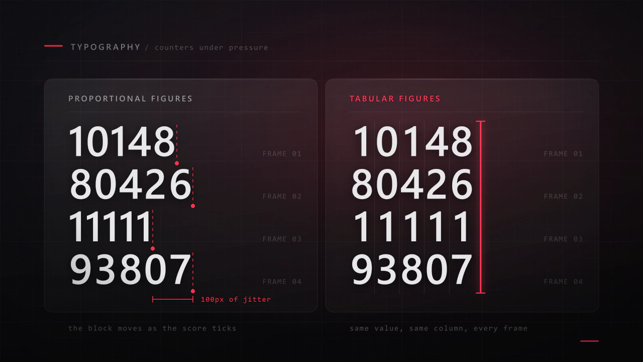
Interface type is read in half a second, at speed, over moving artwork, by somebody who did not come to your game to read. Almost every rule that applies to a book works against you here, and the fixes are specific.
Read the articleMore fonts
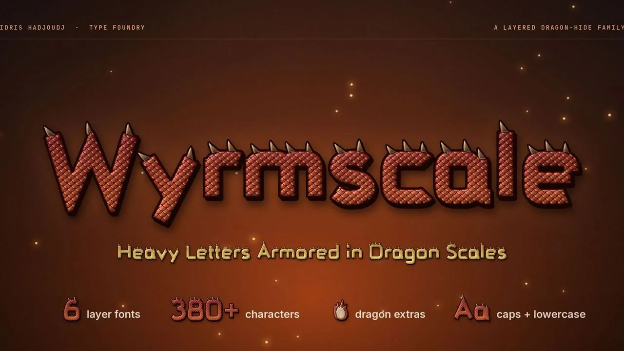 Font · $6.99
Heavy dragon-hide letters covered in overlapping scales with bone horn spines, in layer fonts that stack in any colour, plus dragon lair extras for RPG titles.
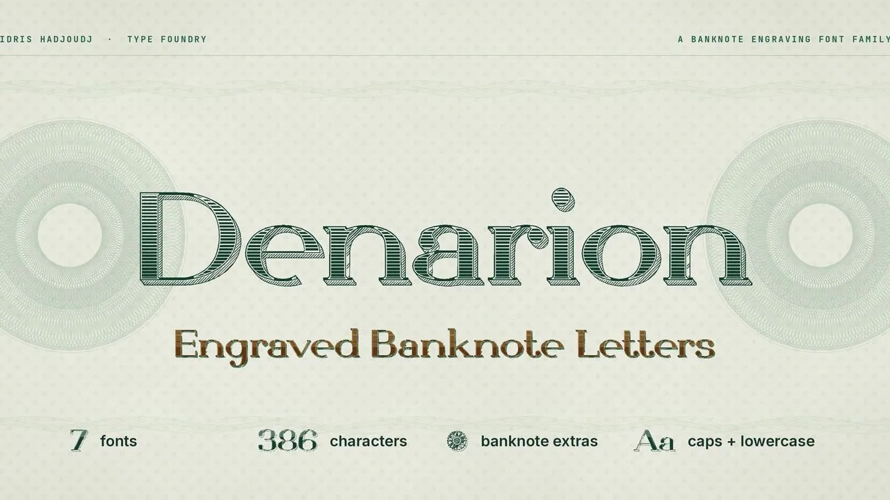 Font · $6.99
A wide, high-contrast Didone with banknote engraving, a keyline and a hatched shadow, in seven fonts: two one-colour styles and five layers that stack in colour.
Contact
Menus, HUDs, full UI systems or a single screen that isn't working. Tell me what you're building and I'll tell you honestly whether I'm the right fit.