In a game
A title, a HUD and a dialogue box, all set in Lorewick. The heading is Bold with a drop shadow, the dialogue is Regular, and the hearts, coin and A-button prompt are typed characters from the same font.
A fantasy RPG pixel font · v1.001
Give your adventure a voice. Lorewick is a 7-pixel medieval-serif font built for dialogue boxes, menus, quest logs and title screens.
Type tester
Every row is a whole multiple of 10 px, the sizes where Lorewick is pixel-perfect.
Welcome, traveler! The old king's crown was lost in the Whispering Woods.
This preview covers Basic Latin and the icons. The full font adds every accented letter and symbol.
Features
A 7-pixel medieval-serif font built for dialogue boxes, menus, quest logs and title screens, with 28 RPG icons you can type like letters.
Regular for dialogue and body copy, Bold for names, titles and anything that has to win a fight for attention.
A–Z, a–z, numbers, punctuation and symbols, with the accented letters Western and Central European languages need.
Hearts, mana, stars, coins, gems, potions, keys, chests and controller buttons, sitting on the baseline like any other letter.
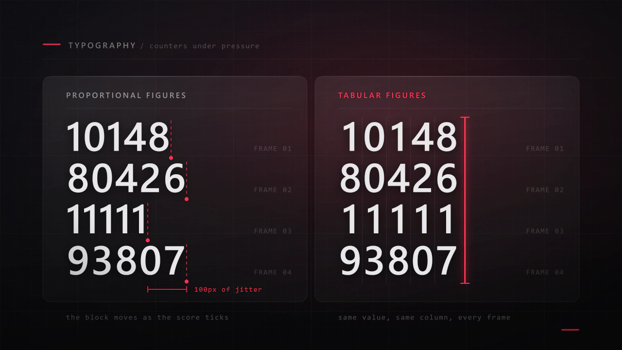
Every digit is the same width, so scores, timers and gold counters never jiggle as they change.
Awkward pairs are tightened by whole pixels, never fractions, so spacing stays even and edges stay crisp.
One font pixel is one screen pixel at 10 px, a 2 × 2 block at 20 px, and so on at every multiple of 10.
Built-in icons
Each icon is a character in the font. Click one to copy it, then paste it into anything set in Lorewick.
Case study
Fantasy games ask two opposite things of a pixel font, and as a UI designer I run into that on every RPG screen. The title wants character, something that feels hand-lettered and a little storybook. The dialogue box wants the opposite: paragraph after paragraph that a player can read quickly at a tiny size without ever thinking about the type.
Most pixel fonts pick one side. The clean ones read well but feel like a computer terminal, and the ornate ones look great right up until there are three lines of quest text in them. I wanted one family that could carry the whole interface, from the title screen down to the gold counter, so that's what I set out to make.
I settled on capitals seven pixels tall and a lowercase of five. Every stroke is one pixel wide, so the insides of the letters stay open even at the smallest size, and the serifs are single pixels too. That's just enough to give the letters a storybook voice without clogging them up.
Bold wasn't just Regular made thicker. I gave it its own details: dots and accents are 2 × 2 pixels, and I redrew the small marks that clog first, like superscripts and the asterisk, so names and headings stand out without the letters closing up into blocks.
Every point sits on the pixel grid, and that's what makes it pixel-perfect at 10, 20, 30 and 40 px. At 10 px one font pixel is exactly one screen pixel, and every multiple of 10 simply scales it by a whole number.
Game text changes while the player is looking at it, which you learn quickly when you design HUDs. So all ten digits share one width, six pixels in Regular and seven in Bold, and a score ticking up or a timer counting down never nudges the numbers next to it.
The icons are the part I'd point to first. They're characters in the font rather than a separate sprite sheet, so a line like “3 hearts, 120 coins, press A” is just text: it wraps, aligns and gets translated along with everything around it. Hearts and stars also work with the standard ♥ ♡ ★ ☆ symbols.
A font ends up inside other people's games, in places I'll never see, so I tested it the way I'd test code. Both styles pass the OpenType Sanitizer that Chrome and Firefox use, and Font Bakery reports no failures.
I also set every pair of letters and punctuation, 83,521 per style, and checked them for collisions, including the accented letters, which got over 1,350 kerning pairs of their own. None of them touch. Kerning ships twice, as modern OpenType kerning and as a classic kern table for older engines, and I validated the bitmap fonts and rendered them in a test engine before release.
A title, a HUD and a dialogue box, all set in Lorewick. The heading is Bold with a drop shadow, the dialogue is Regular, and the hearts, coin and A-button prompt are typed characters from the same font.
Hearts, stats, loot and a full set of controller prompts. Each icon is a character, so it takes the colour, size and position of the text it sits in.
Upper and lowercase, fixed-width numbers, punctuation, currency and the accented capitals Western and Central European languages need.
Hungarian double acutes, Polish ogoneks, Czech carons, Romanian comma-below letters, the French œ, German ß, Danish ø and Spanish ñ, each drawn to fit the same seven-pixel line.
What you get
Included with every purchase
Ask me first
Please don't share or resell the font files. For anything the license doesn't cover, email me. idris.hadjoudj@gmail.com
FAQ
Use sizes that are multiples of 10 px (10, 20, 30, 40…), turn anti-aliasing off where your app or engine allows it, and place text on whole pixels. The bitmap fonts in the engine pack are pixel-exact at 1×, 2× and 4×.
Any engine that loads TTF files, including Godot, Unity and GameMaker. The bitmap fonts work directly in Godot, LÖVE, LibGDX, Defold and Phaser, and in Unity and MonoGame through a BMFont importer.
They live in the Unicode Private Use Area, from U+E000 to U+E02B, so in most code you write them as an escape such as \uE000. The cheat sheet lists every code, and you can copy any icon straight from the grid on this page. They show as icons only when Lorewick is the active font.
Yes. Commercial games and apps are included with no limit on copies sold, as long as the font files are packaged inside the game rather than handed to players as installable fonts.
Western and Central European languages written in the Latin alphabet, including French, German, Spanish, Portuguese, Italian, Dutch, the Nordic languages, Polish, Czech, Slovak, Hungarian, Romanian, Croatian and Turkish.
Related reading
Longer write-ups on the craft this font draws on.
Interface type is read in half a second, at speed, over moving artwork, by somebody who did not come to your game to read. Almost every rule that applies to a book works against you here, and the fixes are specific.
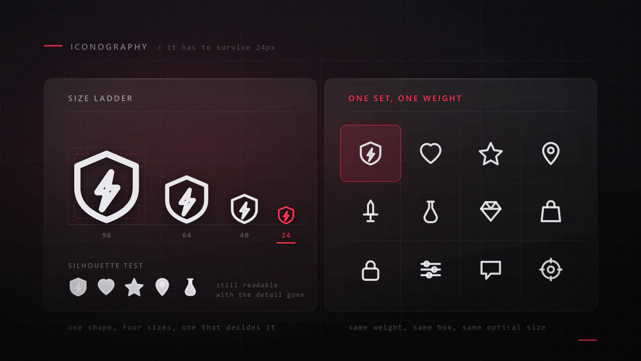
Read the articleAn icon has about a fifth of a second and a few hundred pixels to say what a thing is. Most game icon sets fail not because the drawings are bad, but because they were drawn large, one at a time, by different rules.
Read the articleMore fonts
Font · $6.99
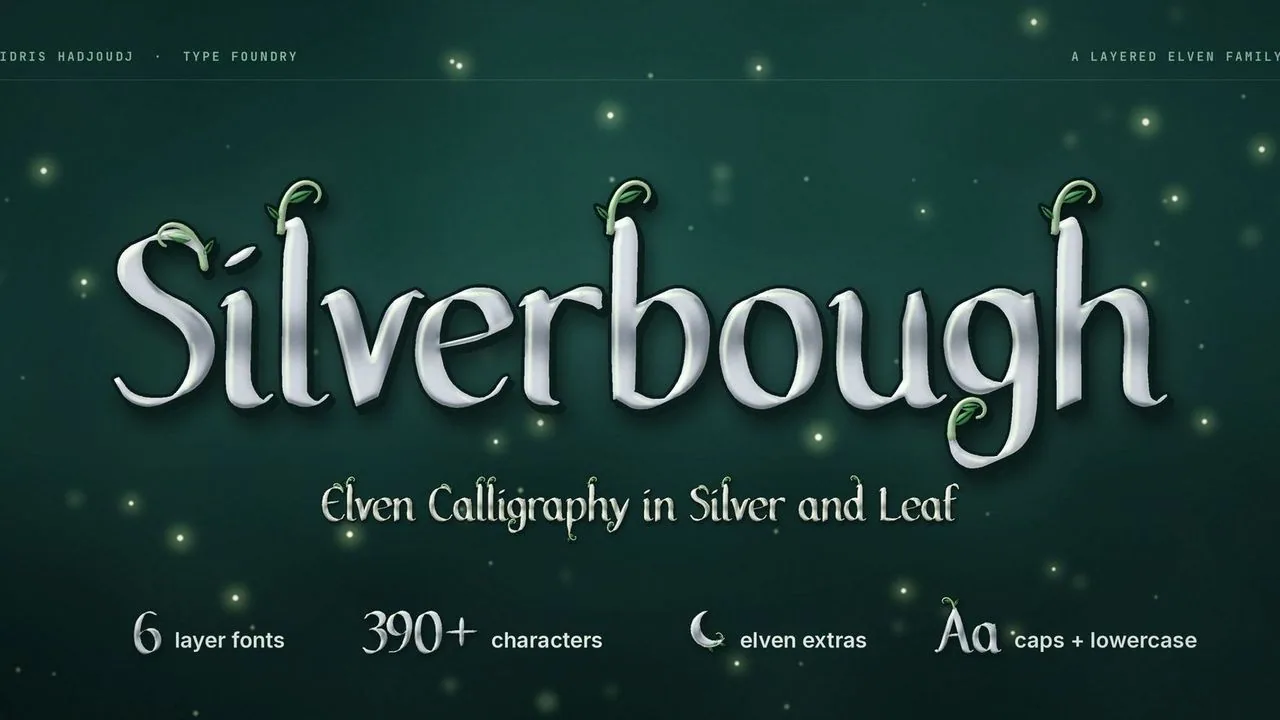
Elven calligraphy in polished silver, with curling vines, leaves and a moonlight glow on separate layers, plus forest extras for fantasy RPG titles.
Font · $6.99
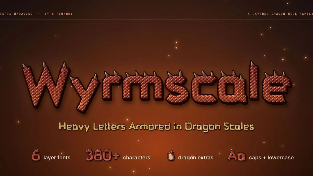
Heavy dragon-hide letters covered in overlapping scales with bone horn spines, in layer fonts that stack in any colour, plus dragon lair extras for RPG titles.
Contact
Menus, HUDs, full UI systems or a single screen that isn't working. Tell me what you're building and I'll tell you honestly whether I'm the right fit.