Progression that keeps players: unlocks, upgrades and pacing
Progression is the reason a player opens the game tomorrow. It is also the system most often designed as a list of numbers and then handed to somebody to fit on a screen, which is why so many upgrade trees feel like admin rather than reward.
In this article
Open to new projects
Hadjoudj Idris
Game UI/UX Designer
Upwork100% Job Success
Hire me Browse the workEvery game with a second session has progression, whether or not it was designed. The player got better, or the character did, or something opened up. When it works nobody notices the machinery. When it does not, players describe the game as grindy, or shallow, or say they ran out of things to do, which are three symptoms of the same thing.
What progression is for
- A reason to return. Something in flight, visible, and close enough to be worth a session.
- A sense of growth. The player is measurably better off than an hour ago, and can see how.
- A structure for your content. Progression is the schedule that decides when each part of the game arrives.
A system that delivers numbers but no felt growth fails the second job, and that is the most common failure. If a player cannot tell you what changed after ten upgrades, the upgrades were arithmetic.
The three curves
Most games run three progressions at once, and problems usually come from one of them being out of step with the others.
| Curve | What grows | Failure mode |
|---|---|---|
| Power | The character, the ship, the deck | Power creep, or a flat stretch where nothing improves |
| Content | New places, enemies, modes, mechanics | Running out, or new content arriving faster than it can be learned |
| Mastery | The player's own skill | Ignored entirely, so skilled players get the same handholding as new ones |
Mastery is the one teams forget, and it is free: the player is improving whether or not you acknowledge it. Games that recognise it, by opening harder options or removing training wheels, feel generous. Games that ignore it feel padded, because the player's own growth is being offset by systems that assume they are still new.
Pacing: the gap between rewards
The design question is not what the rewards are, it is how far apart they sit, and the answer changes as the session count grows.
- The first session is dense on purpose. Several visible steps in the first twenty minutes, because the player has no reason to trust that the game will pay out later.
- Gaps widen as investment grows. A player forty hours in will accept a long climb; a player forty minutes in will not.
- Never let the gap outlast the session. If a player can play a full session with nothing progressing, they have had a session with no reason to return.
- Multiple timescales overlap. Something completing this run, this session, this week. Each one covers the gaps in the others.
- Watch the second wall. Most games have a specific point, often two to five hours in, where the early flow stops and the long grind starts. It is the largest drop-off after onboarding and it is almost always a pacing decision nobody made deliberately.
Players do not quit when the reward is small. They quit when they cannot see the next one.
The kinds of unlock, and what each one does
| Type | Example | Good for |
|---|---|---|
| Vertical power | +10% damage, a stat point | A sense of accumulation. Cheap to produce, easy to overdo |
| Horizontal option | A new weapon with different rules | Changing how the game is played, which is what players remember |
| Access | A new area, mode or difficulty | Structuring content and pacing discovery |
| Convenience | Faster travel, bigger inventory, auto-collect | Removing friction the player has already felt. Enormously appreciated |
| Cosmetic | Skins, colours, titles | Expression and long-tail goals, with no balance cost |
| Knowledge | A recipe, a map, an enemy weakness | Progression that survives even if power is reset |
A progression built entirely from the first row is the one players call grindy. The rows that change how the game is played, or remove a friction the player has personally suffered, are worth several times their design cost.
Trees, tracks and lists
The shape you choose is a design decision that determines the screen, and picking a tree because trees look impressive is how games end up with a hundred nodes that are all plus-two-percent.
| Shape | Says to the player | Costs |
|---|---|---|
| Linear track | Keep going, the next thing is close | Little. It is the clearest shape there is |
| Branching tree | Choose an identity, give something up | A big screen, comparison support, and real balance work per branch |
| Grid or web | Explore, plan a route, optimise | Navigation, zooming, and a serious controller problem |
| Tiered list | Save up, pick what you need next | Low. Under-used, and often the right answer |
| Milestone track with rewards | Play this week, collect the visible thing | Season maintenance, and a battle-pass shaped screen |
The test for a branching tree is whether two players would end up meaningfully different. If every player takes roughly the same route because one branch is obviously stronger, you have paid for a tree and shipped a track.
The screen decides whether it feels good
This is where progression design and interface stop being separable. The same system feels generous or stingy depending on four things on screen.
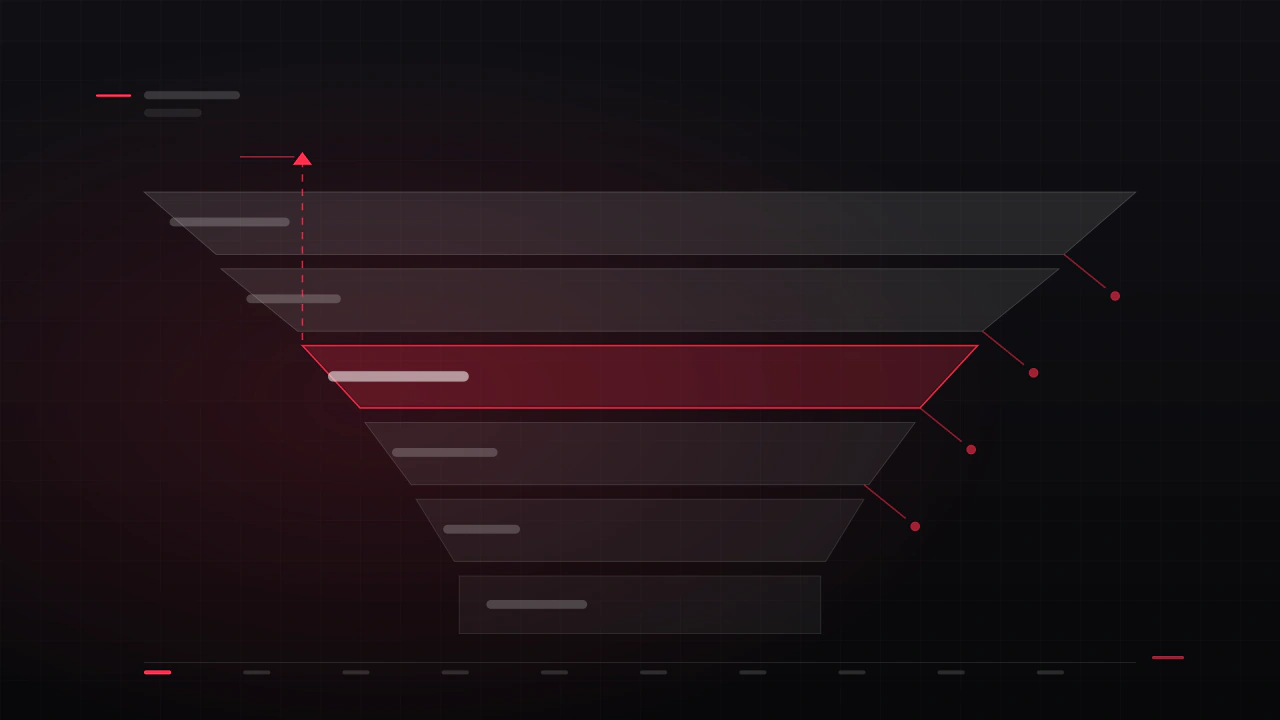
- The next step is always visible. Not the whole tree, the next thing, with its cost and what it does. A player should never have to search for what they are working towards.
- Cost is legible in what they have. "240 of 500" beats a price the player has to compare against a number in another corner.
- The effect is stated in player terms. "Reload one shot faster" rather than "+8% reload speed", unless your audience is optimising deliberately.
- Comparison is built in. Better or worse than what I have now, marked in shape as well as colour, per game UI accessibility.
- Acquisition is celebrated at the moment it happens, not summarised later, which is the feedback rule from how a game tells the player it heard them.
- The path is previewable. In a tree, showing the route to a distant node, and its total cost, turns a wall of icons into a plan.
The Nocturne Drive career hub was built around the first and last of those: the next objective is always on screen, and the route through the season is readable in a glance rather than assembled from four menus.
Anti-patterns
- Fake choice. Branches where one option is strictly better. Players find out, follow a guide, and stop reading your tree.
- Progress you cannot see. Hidden thresholds and unstated requirements turn effort into guesswork.
- The convenience paywall. Selling the removal of friction you added deliberately is the pattern players resent most, and it belongs in the monetisation conversation.
- Power creep with no cap. Each release outdoing the last until old content is meaningless and balance is unrecoverable.
- Retroactive nerfs to earned things. Numbers change, but taking away something a player already earned costs more trust than the balance gains.
- Everything unlocked at once. A hundred options at hour one is not generosity, it is a decision the player is not equipped to make.
Run-based games are a different problem
Roguelikes and session-based games run two progressions at once, and confusing them is the usual failure.
- In-run progression is fast, dramatic, and lost at the end. It is what makes the run interesting.
- Meta progression persists, and its job is to make the next run start slightly better, or slightly different.
- Keep them visually distinct. Players must always know which of the two they are spending into, and which they are about to lose.
- Every run must pay something out. A run that ends with nothing gained is the most common reason players stop after a bad streak.
- Meta power is a difficulty dial in disguise. Handle it deliberately, or your game gets easier for the players who needed it least.
Measuring it
| What to look at | What it tells you |
|---|---|
| Session count where players stop | Where your pacing wall is, precisely |
| Time between unlocks, per hour played | Whether the gaps widen at the rate you intended |
| Unlocks never taken | Dead branches, or options nobody can find on the screen |
| Unlocks taken by nearly everyone | A fake choice, or a genuinely correct answer you should just give away |
| Currency held at the point of quitting | Players saving for something they never reached, which is a pacing signal |
| Respec rate, if you have one | How often the tree punished a choice players could not evaluate |
A progression audit
- Play your own game for one hour and write down every moment something improved. Count the gaps.
- Ask a player two hours in what they are working towards. If they hesitate, the next step is not visible.
- Open the progression screen and time how long it takes to find the cheapest useful upgrade.
- List your unlocks by type. What proportion are plus-a-percentage?
- Find your longest gap between rewards. Is it early or late? Early is a problem.
- Check whether any branch is taken by more than about 80 percent of players.
- Look at the screen on the smallest supported display, and with a controller only.
- Count how many currencies feed progression. More than two needs a defence.
- Check what happens when a player can afford nothing on the screen.
- Check what happens when they have finished everything. Is there an ending, or a blank?
How often should a player be rewarded?
Densely in the first session, then widening as investment grows, with overlapping timescales so something is always close to completing. The rule that matters most is that a player should never finish a session with nothing having progressed and nothing visibly close.
Skill tree or linear upgrades?
Linear unless two players would genuinely end up playing differently. Trees cost a large screen, comparison support, balance work per branch and a controller navigation problem, and they are worth all of that only when the choices are real. A tiered list is under-rated and frequently the right answer.
How do I stop power creep?
Cap the vertical curve early and move growth into horizontal options, access and convenience. Most of the felt progression in a long game comes from playing differently rather than from bigger numbers, and horizontal unlocks do not invalidate your existing content the way vertical ones do.
Should progression be visible from the start?
The shape should be, the detail should not. Showing that a system exists and that it has depth is motivating; showing a hundred nodes at hour one is paralysing. Reveal branches as they become reachable, and always keep the immediate next step on screen.
What is the difference between grind and progression?
Grind is repetition where the player cannot see the payoff approaching. The same repetition with a visible, close, meaningful next step reads as progression. That means a large share of grind complaints are legibility problems rather than balance ones, and the cheapest fix is on the screen.
How much of this is design and how much is UI?
The curves, the gaps and the unlock types are design. Whether any of it feels good is largely interface: visible next step, legible cost, stated effect, built-in comparison and a reward moment that lands. That is why I prefer to work on both together rather than receiving a finished spreadsheet.
Hadjoudj Idris
Game UI/UX Designer, Remote, worldwide
Need this done properly on your game?
Menus, HUDs, a full UI system, or one screen that isn't working. Tell me what you're building and I'll tell you honestly whether I'm the right fit, and what it would cost.
Upwork100% Job Success