Designing game UI for controllers: focus, navigation and console requirements
A gamepad has no cursor. The player cannot point at anything, so every screen has to know where focus starts, where it goes next, and what it looks like when it lands. Get that wrong and a menu that looked perfect in Figma feels broken in the hand.
In this article
Open to new projects
Hadjoudj Idris
Game UI/UX Designer
Upwork100% Job Success
Hire me Browse the workMouse interfaces let the player solve the layout themselves: whatever you draw, they can reach it. A controller removes that. The player moves through a graph you defined, one step at a time, and if you did not define it, the engine invented one. That invented order is why so many console menus feel subtly wrong for reasons players cannot articulate.
Focus is not hover
This is the mistake underneath most of the others. A mouse interface has hover, which follows the pointer and disappears when it leaves. A controller interface has focus, which is a persistent property of exactly one element on screen at all times, and it is the player's only way of knowing where they are.
- Focus always exists. There is never a moment on a controller-driven screen where nothing is focused. If a panel opens, focus moves into it. If it closes, focus returns to what opened it.
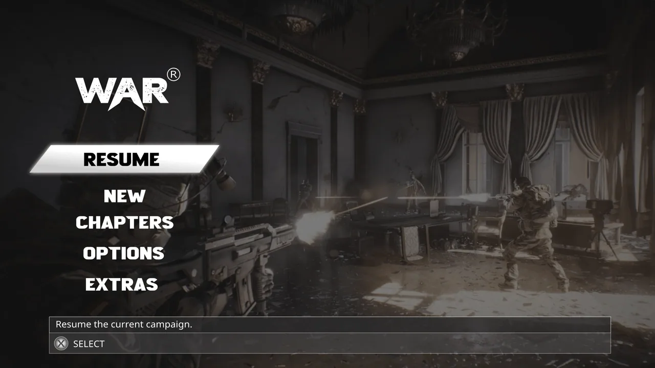
- Focus has to be visible from across the room, not a subtle tint. It is the cursor, and a cursor you cannot find is a broken interface.
- Focus is different from selected. A toggle can be on while focus is elsewhere; a tab can be the active tab without holding focus. Designs that use one treatment for both make it impossible to tell what a press will do.
- Focus survives navigation. Coming back to a list should return you to where you were, not to the top of it.
The states every control actually needs
A design that ships one state per button will be built as one state per button. This is the table I put on the handoff for every console project.
| State | When | What it must communicate |
|---|---|---|
| Default | Idle, not focused | It is interactive |
| Focused | The controller is on it | Where the player is, visible at distance |
| Pressed | Held down | The input was received, immediately |
| Selected / active | It is the current tab, toggle or choice | State of the thing, independent of focus |
| Focused + selected | Both at once | Both, without ambiguity. This is the one that gets forgotten |
| Disabled | Not available now | Unavailable, and ideally why. Skipped by navigation |
Disabled items should be skipped by navigation, not focusable dead ends. If an option matters enough to show while unavailable, it needs a reason attached, because on a controller the player cannot hover it to find out.
Button glyphs: never draw them, look them up
Confirm and cancel are not the same button everywhere. On Xbox, confirm is the bottom face button. On Nintendo hardware the physical positions of A and B are mirrored relative to Xbox. Sony standardised on cross for confirm on PlayStation 5, after years of that varying by region. A PC player might be on any of those pads, or a keyboard, and they can remap it.
- Bind prompts to actions, not to letters. The interface asks for
confirm, and the glyph system answers with whatever that is on the current device. - Detect the active device and swap glyphs live. A player who unplugs a pad mid-session should see keyboard prompts on the next screen, not before they act.
- Respect remapping. If a player rebinds confirm, the prompt has to follow. Hardcoded glyphs make your own accessibility settings lie to the player.
- Give glyphs their own sprite set with consistent optical size, so a round PlayStation glyph and a letter-based Xbox glyph do not change the width of the prompt bar.
- Keep the prompt bar in one place, bottom of the screen, same order on every screen. It is the closest thing a console interface has to a menu bar.
Practically this means the design delivers a prompt component with slots, not a picture of a button. It is the difference between one system and forty screens that each need editing when a platform is added.
Ten feet away, on a television
A console player sits two to four metres from the screen. Everything that was comfortable on a desk monitor is now roughly half the apparent size, and televisions add their own problems on top.
| Constraint | What it means for the design |
|---|---|
| Viewing distance | Body text usually needs to be around double its desktop size. Test by standing back, not by zooming out |
| Title-safe margin | Keep text and critical elements roughly 5 percent in from every edge. Older TVs and some overscan modes still crop |
| TV colour and contrast | Consumer sets are not calibrated. Subtle greys collapse into each other. Increase the steps between your tones |
| Motion handling | Smoothing and low refresh rates smear fast animation. Fades and short slides survive, rapid flicker does not |
| Burn-in on OLED | Static high-contrast HUD elements at full brightness for hours. Fade or dim persistent elements where you can |
The same discipline that keeps a racing HUD readable at speed keeps a console menu readable across a room: contrast that belongs to the element rather than borrowed from the background, and a hierarchy strong enough to survive a bad panel. That was the whole design constraint on Nocturne Drive.
The screens that cannot survive a controller
Some patterns from PC and mobile simply do not translate, and every one of them shows up in ports.
- Free-floating cursors. An emulated mouse driven by a stick is the last resort, not a design. If a screen genuinely needs one, such as a map or a large strategy board, add snapping to points of interest.
- Drag and drop. Replace it with pick up, move focus, place. Two presses beat a held stick every time.
- Text entry. Every text field means a platform keyboard and a slow, painful interaction. Cut the field, or offer presets, or use the platform's native input dialog rather than building your own.
- Dense tables and spreadsheets. A strategy game's data screens need a focus-friendly rebuild, usually as a list with a detail panel.
- Right-click, middle-click, hover tooltips, and scroll wheels. Each of these needs an explicit controller equivalent and a visible prompt for it.
- Timed inputs that assume a mouse's precision. A stick has an acceleration curve and a dead zone. Anything requiring pixel accuracy needs a bigger target or a snap.
If a screen needs a cursor, it was designed for a different machine. Rebuild the screen, do not simulate the mouse.
Steam Deck and handhelds
The handheld PC has quietly become a console tier of its own, and it fails games for reasons that are almost entirely interface reasons: text too small on a seven-inch screen, menus that need a mouse, no sensible default controller mapping, launchers and dialogs that assume a keyboard.
- Check every screen at 1280 × 800 on a small panel. The usual failure is not layout, it is type size. Design body text with that panel in mind and it is comfortable everywhere.
- Everything must be reachable with the pad, including first launch, settings, save management and any error dialog.
- Provide a sane default controller layout, so the player never opens a mapping screen before they play.
- Show the right glyphs. A handheld with console-style controls showing keyboard prompts reads as unfinished.
- Watch persistent brightness and contrast. Handhelds are played in variable light and on battery, and heavy interfaces cost both.
What certification actually checks
Each platform holder publishes its own technical requirements under NDA, and the specifics differ, but the interface-facing categories are consistent enough to plan around. None of these are difficult if they are known at design time, and all of them are expensive if they surface in a submission failure two weeks before launch.
| Category | What gets checked |
|---|---|
| Terminology and glyphs | Correct names for hardware, buttons and services, correct glyphs, correct confirm and cancel behaviour |
| Interruptions | Controller disconnect, suspend and resume, account or profile change, network loss. Each needs a correct message and a correct recovery |
| Storage and saving | Save failure, storage full, do-not-power-off messaging while writing |
| Safe area | Nothing critical outside the title-safe margin |
| Accessibility | Platform-level features respected, plus increasingly a baseline of in-game options. See game UI accessibility |
| Localisation | Every string translated and still fitting, in every supported language |
The practical takeaway for a designer: every one of those categories needs a screen or a state that nobody puts on a screen list. The controller disconnect overlay, the storage full dialog, the save-in-progress indicator. Add them to the list at the start and they cost a day. Add them at submission and they cost a milestone.
How I run a controller pass
- 01
Map the graph
Every screen gets its first focus, its navigation order, its wrap rule, its shoulder mapping, and its back behaviour written directly on the design. This is the deliverable that most changes what gets built.
- 02
Build the states
Focus, pressed, selected, focused-and-selected, disabled, for every component in the kit rather than every screen. Six states on twelve components covers a hundred screens.
- 03
Rebuild what needs a cursor
The screens from the list above get redesigned around focus, not adapted. Usually a handful per game, and they are the ones players complain about in reviews.
- 04
Add the prompt system
One prompt bar component, action-bound, device-aware, in a fixed position, with the platform's own glyph sets slotted in.
- 05
Fill the gaps in the screen list
Disconnect, suspend, save failure, storage, network loss. Designed once, in the same visual language as everything else.
- 06
Test in the hand, on the hardware
Across the room on a TV, and on a handheld at native resolution. Every screen, pad only, keyboard unplugged, no exceptions.
Can I just turn on my engine's automatic UI navigation?
For a single vertical list it is fine. For anything else it derives an order from screen geometry that rarely matches intent, especially in grids with an uneven last row, layouts with side panels, and screens where elements appear conditionally. Explicit navigation is a few minutes per screen and it is the difference between a menu that feels considered and one that feels approximate.
Which button should confirm, and which should cancel?
Bind the action, not the button, and let the platform decide the glyph. Xbox and PlayStation put confirm on the bottom face button; Nintendo hardware mirrors the physical positions of A and B relative to Xbox. Hardcoding a letter guarantees you are wrong somewhere, and it also breaks the moment a player remaps their controls.
How much bigger does text need to be on console?
As a working rule, around double the size that is comfortable on a desktop monitor, because the viewing distance is roughly double. Verify by standing at real playing distance from a real television rather than by scaling the design in your tool, since a TV's contrast and processing change legibility as much as size does.
Do I need a separate design for console and PC?
Rarely a separate design, usually a separate layout pass plus the states and navigation. The components, colours and typography carry across. The screens that genuinely differ are the ones that assumed a cursor: inventory grids, map screens, anything with drag and drop or text entry.
What does a controller pass cost?
It depends almost entirely on screen count and on how many screens need rebuilding rather than annotating. As a rough shape, a menu-light action game is a few days; a systems-heavy game with inventory, crafting and a map is two to four weeks including the missing platform states. The pricing logic is the same as in the cost article.
When should the controller work happen?
At design time, not at port time. Deciding focus order and states while the screens are being designed costs almost nothing, because you are writing down decisions you are already making. Retrofitting them after a hundred screens are built is where the expensive rework lives.
Do I need to support mouse and controller at the same time?
On PC, yes, and on handheld PCs it is unavoidable. The reliable pattern is that the last input used owns the interface: touching the mouse shows a cursor and hover states, touching the pad hides the cursor and shows focus. Trying to display both at once produces two competing cursors and confuses everyone.
How do I handle a controller disconnecting mid-game?
Pause immediately, show a clear modal that names the problem, and hold focus in that modal until a controller reconnects. It is a certification item on every console, and it is one of the screens that is missing from almost every screen list I am sent.
Hadjoudj Idris
Game UI/UX Designer, Remote, worldwide
Need this done properly on your game?
Menus, HUDs, a full UI system, or one screen that isn't working. Tell me what you're building and I'll tell you honestly whether I'm the right fit, and what it would cost.
Upwork100% Job Success